- Home
- /
- Article

Thanks for your feedback.

Create custom desktop layout
 In this article
 Feedback?
This article helps in creating a custom layout by editing a JSON file and offers sample use cases to help you get started with widgets like the Customer Experience Management Metrics widget and the Customer Experience Journey widget. To effectively work with custom desktop layouts, you should have a solid understanding of HTML structure, the document tree model in a browser, and the JSON format.
Overview
The Desktop Layout feature allows you to configure the Webex Contact Center Desktop as per your business requirements. You can customize elements such as logo, title, and widgets. You can create a desktop layout and assign it to a team. This layout generates the agent experience on the desktop for all agents who sign in as part of that team.
There are two types of layouts:
-
Global Layout: This layout is a system-generated layout that gets assigned by default when you create a team. For more information, see Manage teams. When you create a team, the Global Layout is automatically set as the desktop layout for the team. You cannot delete this layout.
-
Custom Layout: A layout that provides a customized desktop experience. You can create a custom layout for one or more teams.
If you assign a new desktop layout when an agent is signed in, the agent must reload the page to see the new layout.
The Webex Contact Center Desktop supports three personas:
-
Agent
-
Supervisor
-
Supervisor and an Agent
The JSON layout file has separate sections for each of the personas. The administrator should configure the settings for each persona in the corresponding section of the JSON layout file. For more information about a sample JSON layout file, see JSON Layout Top-Level Properties.
When Cisco adds a new feature to the Desktop Layout, the unmodified layout is updated automatically with the new features. The updated desktop layout is automatically available to the existing teams that use the unmodified desktop layout. The Desktop users using the unmodified desktop layout receive the new layout-based features when they sign in or reload the browser.
If you are using the Default Desktop Layout.json file without
any modification, then it is considered an unmodified layout. However, if you
download the Default Desktop Layout.json file and upload it
again, it is considered a modified layout even if the file content or filename is
not modified.
For teams that use a custom desktop layout, administrators must periodically refresh the layout definition to incorporate new features. When administrators view an unmodified layout or a team that uses an unmodified layout, a message is displayed indicating that new Desktop features are automatically applied.
In the Desktop, there are two types of widgets—iframe-based and web component-based. The header, navigation (custom page), persistent area, headless area, and aux panel are the customizable area in a Desktop. These are not widgets.
The following list details the spaces that you can configure. The images illustrates the layout of the Desktop:
-
Title and Logo area: This space displays the Webex Contact Center logo and name (default) at the top-left corner of your screen.
-
Horizontal Header area: This space has a configurable area that is populated with custom widgets. These widgets can display, for example, inline information and drop-down menus. As the height of this header is only 64 pixels, the widget height cannot cross the header height.
-
Workspace area: This space changes as per the selection on the navigation bar or when an agent is interacting with customers. When an agent is on a call, this area displays the interaction control and auxiliary information pane (that includes custom widgets and persistent widgets). When an agent is interacting on email, chat, or social channels, this area displays the workspace area and auxiliary information pane (that includes the persistent widget area).
Custom Page displays on the Desktop interface in the workspace pane. You can access the custom page through icons on the navigation bar. Each custom page can contain one or more custom widgets.
Custom Widget is a third-party application that is configured in the JSON layout. You can place the custom widget on the custom page, custom tab (Auxiliary Information pane), or on the horizontal header of the Desktop.
-
Navigation Bar area: Use this space to add navigation items to access custom pages.
JSON Layout Top-Level Properties
Roles
The default JSON layout has following three roles.
-
agent—To set the Desktop Layout to be displayed when an agent signs in to the Webex Contact Center Desktop to handle agent activities.
-
supervisor—To set the Desktop Layout to be displayed when a supervisor signs in to the Webex Contact Center Desktop to handle only supervisor capabilities.
When a supervisor signs in to the Desktop, the desktop layout that is specified for the primary team is applied. If you do not provide a primary team, the global layout applies. By default, APS reports are disabled.
-
supervisorAgent—To set the Desktop Layout to be displayed when a supervisor signs in to the Webex Contact Center Desktop to handle both supervisor capabilities and agent activities.
You can either add or modify widgets for each role in the corresponding persona of the relevant JSON layout file.
The following are the top-level properties for JSON layout based on the role:
{
    "agent": {
        "version": "0.1.0",
        "appTitle": "Webex Contact Center",
        "logo": "",
        "taskPageIllustration": "https://www.abc.com/image/logo.jpg",
        "stopNavigateOnAcceptTask": false,
        "dragDropEnabled": false,
        "notificationTimer": 8,
        "maximumNotificationCount": 3,
        "browserNotificationTimer": 8,
        "wxmConfigured": false,
        "desktopChatApp": {
            "webexConfigured": false,
        }
        "headerActions": ["outdial", "notification"],
        "area": {
            "advancedHeader": {
                ...
            },
            "panel": {
                ...
            },
            "navigation": {
                ...
            },
            "persistent": {
                ...
            },
            "headless": {
                ...
            }
        },
    },
    "supervisor": {
        "version": "0.1.0",
        "appTitle": "Webex Contact Center",
        "logo": "",
        "taskPageIllustration": "https://www.abc.com/image/logo.jpg",
        "stopNavigateOnAcceptTask": false,
        "dragDropEnabled": false,
        "notificationTimer": 8,
        "maximumNotificationCount": 3,
        "browserNotificationTimer": 8,
        "wxmConfigured": false,
        "desktopChatApp": {
            "webexConfigured": false,
        }
        "headerActions": ["outdial", "notification"],
        "area": {
            "advancedHeader": {
                ...
            },
            "panel": {
                ...
            },
            "navigation": {
                ...
            },
            "persistent": {
                ...
            },
            "headless": {
                ...
            },
            "homePage": {
                ...
            }
        },
    }
    "supervisorAgent": {
        "version": "0.1.0",
        "appTitle": "Webex Contact Center",
        "logo": "",
        "taskPageIllustration": "https://www.abc.com/image/logo.jpg",
        "stopNavigateOnAcceptTask": false,
        "dragDropEnabled": false,
        "notificationTimer": 8,
        "maximumNotificationCount": 3,
        "browserNotificationTimer": 8,
        "wxmConfigured": false,
        "desktopChatApp": {
            "webexConfigured": false,
        }
        "headerActions": ["outdial", "notification"],
        "area": {
            "advancedHeader": {
                ...
            },
            "panel": {
                ...
            },
            "navigation": {
                ...
            },
            "persistent": {
                ...
            },
            "headless": {
                ...
            }
        },
    }
},- The changes made to the JSON layout properties take effect when the Desktop browser is refreshed.
- If a feature that you enabled on JSON layout is not available on the Desktop, contact Cisco Support to enable the feature.
- All the properties in the JSON layout are case sensitive.
appTitle
To specify a title on the horizontal header of the Desktop. The default title is Webex Contact Center.
Example:
"appTitle": "Webex Contact Center"The default appTitle is changed from Contact Center Desktop to Webex Contact Center. There is no impact on the existing custom layouts that use the old default appTitle (Contact Center Desktop). To use the new appTitle, you must modify the custom layout. However, the new global layout uses the default appTitle as Webex Contact Center.
The title can either be text, an image, or an empty string. The title text appears in two rows. If the text extends beyond the second row, an ellipsis icon is displayed, and the tooltip displays the complete title. Styles cannot be applied to the title.
You can either use data URIs (Uniform Resource Identifier) or host a custom title image on a content delivery network (CDN), Amazon Web Services (AWS) Simple Storage Service (S3) bucket, or a similar hosting service, and then specify the URL to the hosted image. The supported title image formats are PNG, JPG, JPEG, GIF, SVG, and WebP. The supported title image size is 184 x 32 pixels (width x height).
logo
To specify a URL for the company logo. If you do not provide a URL, then the Webex Contact Center logo appears by default.
Example:
"logo": "https://my-cdn.com/logo.png"You can host a custom logo image on a CDN, Amazon Web Services (AWS) Simple Storage Service (S3) bucket, or a similar hosting service, and then specify the URL to the hosted image. The supported logo image formats are PNG, JPG, JPEG, GIF, SVG, and WebP. The supported logo image size is 96 x 32 pixels (width x height).
| Condition | Example | appTitle | logo |
|---|---|---|---|
| If appTitle and logo are not configured |
|
No title | Default logo |
| If appTitle and logo are configured |
|
Configured text | Configured logo |
| If appTitle is configured and logo is not configured |
|
Configured text | Default logo |
|
If appTitle is not configured and logo is configured
|
|
No title | Configured logo |
| If appTitle is configured and logo is not preferred |
|
Configured text | No logo |
|
If appTitle is not configured and logo is not preferred
|
|
No title | No logo |
| If appTitle is added as an image and logo is configured |
|
Configured image | Configured logo |
|
If appTitle is added as an image and logo is not configured
|
|
Configured image | Default logo |
|
If appTitle is added as an image and logo is not preferred
|
|
Configured image | No logo |
- The custom image size is adjusted based on the aspect ratio. The custom title text that is configured earlier may now appear in two rows on the Desktop. To avoid this, you can modify the custom title text.
- If title and logo are not configured in the horizontal header of the Desktop, that space is used by the header widgets. The header widgets must be configured correctly to use the title and logo space.
- The title and logo together cannot exceed the maximum width of 304 pixels (including padding). If the logo width is lesser than 96 pixels, the remaining width can be used for the title.
- If the custom image size is higher than the supported size, the image size is adjusted based on the aspect ratio in the horizontal header. If the custom image size is lesser than the supported size, the actual image size is retained in the horizontal header.
taskPageIllustration
To specify a custom illustration for the task page based on organization preferences and brand alignment. When an agent signs in, the task page displays the configured illustration as a background. By default, the task page appears without illustration.
Example:
"taskPageIllustration": "https://www.abc.com/image/logo.jpg",You can either use data URIs or host a custom illustration on a content delivery network (CDN), Amazon Web Services (AWS) Simple Storage Service (S3) bucket, or a similar hosting service, and then specify the URL to the hosted illustration. The illustration can be configured at the global or team level based on the layout definition. Ensure to configure the correct URL to prevent the broken image from being displayed on the Desktop.
The supported task page illustration formats are PNG, JPG, JPEG, GIF, SVG, and WebP. The recommended illustration size is 400 x 400 pixels (width x height). If the custom illustration size is larger than the recommended size, the illustration size is adjusted based on the aspect ratio in the task page. If the custom illustration size is smaller than the recommended size, the actual illustration size is retained in the task page.
stopNavigateOnAcceptTask
To determine whether to shift the focus to a newly accepted task, when the agent accepts the new task while working on a previous task. The default value is false.
Example:
"stopNavigateOnAcceptTask": falseIf the value is set as true, when the user accepts a new task on the Desktop, the focus is retained on the previous task and does not shift to the newly accepted task. This setting prevents the user from losing any data when accepting a new request.
For example, consider that Agent 1 is on chat with Customer 1 and simultaneously on a voice call with Customer 2. During the voice call, Agent 1 is updating the details of Customer 2 in the Interaction Control pane. Currently, Agent 1 has two active tasks in the Task List pane, and the focus is on the Interaction Control pane. When Agent 1 accepts a new chat request from Customer 3, the focus remains on the Interaction Control pane with Customer 2 and does not shift to the newly accepted chat request.
To retain the focus on the previous task and not to shift to the newly accepted task, select the custom layout with the stopNavigateOnAcceptTask property value set to true.
If the stopNavigateOnAcceptTask property value is not entered in the JSON layout, the Desktop shifts the focus to the newly accepted task. The behavior is similar to when the stopNavigateOnAcceptTask property value is set to false.
- The setting applies to all tasks (voice and digital channels) performed on the Desktop—such as accepting a task, conference, consult, or transfer, and for outdial calls, outbound campaign calls, auto wrap up, and so on.
- The setting does not apply if the Desktop user is on the Home page, with no active task in the Task List pane. In such a case, when a new task is accepted, the focus is shifted from the Home page to the newly accepted task.
dragDropEnabled
To enable the drag-and-drop and resizing of the widgets on the custom pages, set the value to true. The default value is false.
Example:
"dragDropEnabled": falseFor more information about enabling the drag-and-drop feature for the tabs in the Auxiliary Information pane, see Auxiliary Information Pane.
notificationTimer
To set the duration (in seconds) after which the desktop notifications on the Desktop are automatically dismissed. The notification appears at the top-right corner of the Desktop. The default timeout value is 8 seconds. The valid range for timeout values is 1-10 seconds. For the timeout changes to take effect, the browser must be refreshed after the changes are made.
Example:
"notificationTimer": 8maximumNotificationCount
To set the number of desktop notifications to be displayed at a time on the Desktop. The default value is 3. The range for desktop notifications is 1-10. The desktop notifications are stacked. If there are many notifications, they appear with a slight delay depending on the notificationTimer settings.
Example:
"maximumNotificationCount": 3browserNotificationTimer
To set the duration (in seconds) after which the browser toaster notifications on the Desktop are automatically dismissed. Toaster is a native browser notification that appears only if the Desktop is not the active browser window or tab. The Desktop browser window or tab is inactive when
-
You are working on other browser windows or tabs.
-
You are working on other applications.
-
You have minimized the Desktop browser window.
The notification appears at the top-right corner of the Desktop. The default timeout value is 8 seconds. The recommended range for timeout values is 5-15 seconds. For the timeout changes to take effect, the browser must be refreshed after the changes are made.
Example:
"browserNotificationTimer": 8The configured timeout for browser notifications depends on the operating system and browser settings. The timeout value is honored in the Chrome browser across Windows OS, Chrome OS, and macOS. However, the other supported browsers do not honor the configured notification timeout value consistently.
wxmConfigured
(Optional) To configure Webex Experience Management, set the value to
true. The default value is false.
Example:
"wxmConfigured": truedesktopChatApp
To configure multiple Cisco-offered chat applications such as Webex App.
webexConfigured
Webex App along with its messaging and meeting functionalities can be configured within the Desktop. This configuration allows agents to collaborate with other agents, supervisors, and subject matter experts (SMEs) in their organization without navigating away from the Desktop.
- The site administrator manages Webex Meeting users and assigns privileges only if the users have Webex Enterprise Edition. For more information, see Manage Webex Meetings Users in Cisco Webex Control Hub.
- The supervisors and SMEs must download the Webex Client on their system (personal device) or access Webex App using Webex App for Web ( https://web.webex.com/). For more information, see Download the App.
- You can access the Webex App within the Agent Desktop to collaborate with other agents, supervisors, and subject matter experts (SMEs) of your organization without navigating away from the Agent Desktop. The call control feature isn't available. To receive and make calls, you require the external, non-embedded Webex App. For more information, see Calling Apps.
To configure Webex App within the Desktop:
-
In Cisco Webex Control Hub, when adding services for a user, select the Advanced Messaging check box (). For more information, see Manage User Accounts in Cisco Webex Site Administration.
-
In the custom Desktop Layout, set the
webexConfiguredproperty value totrue.Example:
"desktopChatApp": {
    "webexConfigured": true
},
The default value of the
webexConfiguredproperty isfalse.Webex App is available for the agent, supervisor, and supervisorAgent roles only if you set the
webexConfiguredproperty value totruefor each of these roles. The agent, supervisor, or supervisorAgent can't sign out of Webex App.To display the
 (Webex) icon on the horizontal header of the Desktop, enter the value
 webexin theheaderActionsproperty. For more information, see headerActions.To enable Webex App for a specific team, select the custom layout with the
webexConfiguredproperty value set totrue. For more information, see Create a team.
You can configure Webex App in the Auxiliary Information pane, custom page, and custom widget also. For more information, see Auxiliary Information Pane.
Webex App Notification
The values that are specified using the notificationTimer and browserNotificationTimer properties for the notification timer are applicable for Webex App. The default timeout value is 8 seconds for these properties. For more information, see notificationTimer and browserNotificationTimer.
headerActions
To change the order of the icons on the horizontal header of the Desktop. The default order is as follows:
-
(Webex)
-
 (Outdial Call)
 -
 (Notification Center)
Set the value of the headerActions property as follows:
|
Icon Name |
headerActions Property Value |
|---|---|
|
Webex App |
webex |
|
Outdial Call |
outdial |
|
Notification Center |
notification |
Example:
"headerActions": ["webex", "outdial", "notification"],
The headerActions property value is case sensitive.
To change the default order of the icons, enter the headerActions property and the values in the custom layout accordingly.
Example:
"headerActions": ["notification", "outdial", "webex"],
- If you do not enter the
headerActionsproperty and values in the custom layout, the icons are displayed in the default order. - To remove the header icons and the associated functionalities from the Desktop, set an empty value for the
headerActionsproperty ("headerActions": []). However, if you have added Webex App to the Auxiliary Information pane or a custom page, or as a custom widget, the agent can still access Webex App although Webex App is not available in the horizontal header of the Desktop. - If the
webexConfiguredproperty value is set asfalse, the Webex App icon is not displayed on the horizontal header of the Desktop, even if thewebexvalue is added in theheaderActionsproperty. For more information, see webexConfigured.
area
The area property is the core section of the Desktop Layout. You can define the layout as per the area.
"area": {
    "header": {
        ...
    },
    "advancedHeader: {
        {
          "comp": "widget-1",
          "attributes": { ... },
          "script": ....
        }
    },
    "panel": {
        ...
    },
    "navigation": {
        ...
    },
    "persistent": {
        ...
    },
    "headless": {
        ...
    }
},
You can configure the following area objects:
-
Panel: Represents the second panel or the right-most panel in the Auxiliary Information pane.
-
Navigation: Represents custom pages and their navigation elements that are related to the pages.
-
Persistent: Represents the page-level widgets that are persistent and display on all pages of the Desktop.
-
Headless: Represents the widgets that do not have a visual interface, but execute logic in the background.
If advancedHeader property is configured, the header and headerActions properties must be removed.
advancedHeader
To customise the visibility and change the order of the icons on the horizontal header of the Desktop. The default order is as follows:
-
(Webex)
-
(Outdial Call)
-
(Notification Center)
-
 (Agent State Selector)
Set the value of the advancedHeader property as follows:
|
Icon Name |
headerActions Property Value |
|---|---|
|
Webex App |
agentx-webex |
|
Outdial Call |
agentx-outdial |
|
Notification Center |
agentx-notification |
|
Agent State Selector |
agentx-state-selector |
Example:
"advancedHeader": [
        {
          "comp": "agentx-webex"
        },
        {
          "comp": "agentx-outdial"
        },
        {
          "comp": "agentx-notification"
        },
        {
          "comp": "agentx-state-selector"
        }
        {
          "comp": "widget-1",
          "attributes": { ... },
          "script": ....
        }
      ]
The advancedHeader property value is case sensitive.
To change the default order of the icons, enter the advancedHeader property and the values in the custom layout accordingly.
The widgets flow into the dropdown menu from left to right.
-
If you do not enter the
advancedHeaderproperty in the custom layout, the default header is displayed. -
When advanced header is enabled, you should move the widgets from the exisiting header to the advanced header as per the example.
-
When advanced header is enabled, old header will not be displayed.
-
Every widget icon has a default padding and margin that is defined through CSS and cannot be customised through desktop.
-
The location of the logo, title, and profile icons are fixed and cannot be customised.
-
To remove the header icons and the associated functionalities from the Desktop, set an empty value for the associated component in the
advancedHeaderproperty ("advancedHeader": []).If you have added Webex App to the Auxiliary Information pane or a custom page, or as a custom widget, the agent can still access Webex App although Webex App is not available in the horizontal header of the Desktop.
-
If you add a widget with a long label, a truncated label name is displayed according to the space available.
You can use the attribute
textContentto add a label to a widget.Example:
{
          "comp": "timer-widget",
          "attributes": { "duration": "08:00:00" },
          "textContent": "Count Down Timer for Current Shift",
          "script": "https://wxcc-demo.s3.amazonaws.com/widgets/timer-widget.js"
        }
The label "Count Down Timer for Current Shift" will be truncated and displayed according to the space available.
-
Avoid adding widgets with a long label.
-
When a widget flows to the drop-down, only the widget icon is clickable.
-
-
If the
webexConfiguredproperty value is set asfalse, the Webex App icon is not displayed on the horizontal header of the Desktop, even if thewebexvalue is added in theadvancedHeaderproperty. For more information, see webexConfigured.
Home Page
When you sign in to the Desktop, you land on the Home Page.
The Home Page is only applicable to Supervisors and SupervisorAgent persona.
You can view the following widgets on the Home Page. Analyzer widgets are provided by default, but the administrator can also configure Persistent and Custom widgets. For more information, see JSON Layout Top-Level Properties.
Analyzer Widgets
By default, Analyzer widget displays on the Desktop Home Page.
Home Page Layout Configuration
You can configure the Home Page of the Desktop to display layout that is based on your organization preferences and brand alignment. Edit the Homepage field to configure the home page. You can configure the following components to be displayed in the Home Page when a user signs in to the Desktop:
-
A Welcome message
-
The Task icon on the Navigation bar to navigate to the Task pane. The Task icon is displayed for the Supervisor and Supervisor & Agent role with the call monitoring feature enabled. Task pane displays incoming customer requests, active and past customer interactions, and active monitoring requests.
-
Filter sections such as Queue Name, Channel Type, and Managed Teams.
The following table describes the page properties that are required to configure the Home Page:
|
Property |
Description and Code |
|---|---|
|
page > useFlexLayout |
Flex layout is a new web component. It doesn't change the existing widgets. The new flex layout uses the same layout configuration format in a simplified way. It's backward compatible and doesn't impact existing widgets. You need to configure the JSON layout. To configure the JSON layout, provide the height and width of the widget. The widget is rendered in the same sequence as it's configured inside the JSON layout. Widgets have a default margin of 8 px. The JSON layout is based on the dimensions (width x height) and coordinates (X, Y, and Z) of the widgets. The flexible layout supports capabilities such as individual widget resize, maximize widgets, and so on. The height of individual widgets is measured in pixels. 1 unit of height = 40 pixels. The width of the widget depends on the number of columns in the container and the number of columns that change based on the container width. Widgets are displayed from the left to the right. The advanced layout engine uses custom logic to apply both horizontal and vertical space adjustment of widgets. Initially, the layout loads horizontally. After loading horizontally, the widget loads vertically and ensures that space utilization is optimal. Configure the widgets based on the screen size. You can either increase or decrease the width of the widgets, based on the screen size. This renders the widgets more readable and usable. Flex layout provides standard breakpoints such as large, medium, small, and extra small.
These pixels might vary based on the operating system and the broswer. |
|
page > comp |
Ensure you provide a unique custom component. The |
|
page > pageHeader |
Ensure to specify a title string that can be static, dynamic, or both. The
|
|
page > pageSubHeader |
Ensure to add Sub Header that displays on the Desktop. The user can add Go to Analyzer in the Sub Header.
|
Navigation (Custom Pages)
In this section, you can add pages that appear on the left navigation bar. You specify a navigation icon and a unique URL for the widget to appear on the navigation bar. We recommend using a specific prefix for the URL to avoid conflicts. For more details, see the nav property section.
You can also have a collection of widgets that can display on this page. The page can have a single widget that appears on the screen or a collection of widgets in a grid. For more details on grid arrangement, see the layout property section.
You do not need to add a dynamic-area wrapper to the widget tree. This means that you can drag and drop and resize widgets on custom pages when you enable this option.
Example:
{
    "nav": {
        "label": “Custom Page”,
        "icon": "stored-info",
        "iconType": "momentumDesign",
        "navigateTo": "dynamic-tabs",
        "align": "top",
        "isDefaultLandingPage": true
             },
    "page": {
        "id": “my - custom - page“,
        "useFlexLayout": true,
        "widgets": {
            “
            comp1”: {
                "comp": "md-tabs",
                "children": [{
                        "comp": "md-tab",
                        "textContent": "Shift Timer",
                        "attributes": {
                            "slot": "tab"
                        }
                    },
                    {
                        "comp": "md-tab-panel",
                        "attributes": {
                            "slot": "panel"
                        },
                        "children": [{
                            "comp": “my - custom - timer”,
                            “source”: http: //my-cdn.com/my-custom-timer.js
                                "wrapper": {
                                    "title": "Shift Timer",
                                    "maximizeAreaName": "app-maximize-area"
                                }
                        }]
                    },
                    {
                        "comp": "md-tab",
                        "textContent": "Stock Market",
                        "responsive": "false"
                        "attributes": {
                            "slot": "tab"
                        },
                    },
                    {
                        "comp": "md-tab-panel",
                        "attributes": {
                            "slot": "panel"
                        },
                        "children": [{
                            "comp": "agentx-wc-iframe",
                            "responsive": "false"
                            "attributes": {
                                "src": "https://widget-kad.s3.amazonaws.com/Trading.htm"
                            },
                            "wrapper": {
                                "title": "Stock Market",
                                "maximizeAreaName": "app-maximize-area"
                            }
                        }],
                    },
                    {
                        "comp": "md-tab",
                        "textContent": "Widget3",
                        "attributes": {
                            "slot": "tab"
                        }
                    },
                    {
                        "comp": "md-tab-panel",
                        "textContent": "Three Content",
                        "attributes": {
                            "slot": "panel"
                        }
                    }
                ]
            },
            “comp2”: {
                "comp": “my - google - maps - component“,
                “source”: "https://my-cdn.com/my-google.maps.js
                "wrapper": {
                    "title": "Google Map",
                    "maximizeAreaName": "app-maximize-area"
                }
            }
        },
        "layout": {
            "areas": [
                ["left", "right"]
            ],
            "size": {
                "cols": [1, 1],
                "rows": [1]
            }
        }
    }
},
The following table describes nav and page properties along with their child properties:
|
Property |
Description and Code |
|---|---|
|
nav > label |
This property indicates the page navigation identifier. The screen reader reads this property and it appears in the tooltip. These parameters are necessary to display your custom page on the navigation bar. The |
|
nav > iconType |
This property represents the type of icon that displays in the navigation bar for the custom page. The following types of icons are available:
|
|
nav > icon |
This property represents the name of the icon in the Momentum library or the CDN URL. |
|
nav > align |
This property helps you align the icon to the top or bottom of the navigation bar. Currently, the property allows top alignment only. |
|
nav > isDefaultLandingPage | This property specifies the default landing page for the agents in Agent Desktop. Set this property to true to make the navigation bar page the default Landing page that appears for the agents after signing in to the Agent Desktop. If more than one navigation bar page has this property set to true, the system considers the first navigation bar page to become the default Landing page. If no navigation bar page has this property set to true, the Home page acts as the default Landing page. You can't set Analyzer and Agent Performance Statistics reports as the default landing page. |
|
nav > navigateTo |
This property specifies the name of the custom page. This name appears in the address bar when the agent navigates. The navigateTo must not include the following values: images, fonts, css, build_info, help, app, i18n, icons, images-mfe-wc, and sounds. |
|
Property |
Description and Code |
|---|---|
|
page > id |
In The |
|
page > useFlexLayout |
Flex layout is a new web component. It doesn't change the existing widgets. The new flex layout uses the same layout configuration format in a simplified way. It's backward compatible and doesn't impact existing widgets. You need to configure the JSON layout. To configure the JSON layout, provide the height and width of the widget. The widget is rendered in the same sequence as it's configured inside the JSON layout. Widgets have a default margin of 8 px. The JSON layout is based on the dimensions (width x height) and coordinates (X, Y, and Z) of the widgets. The flexible layout supports capabilities such as individual widget resize, maximize widgets, and so on. The height of individual widgets is measured in pixels. 1 unit of height = 40 pixels. The width of the widget depends on the number of columns in the container and the number of columns that change based on the container width. Widgets are displayed from the left to the right. The advanced layout engine uses custom logic to apply both horizontal and vertical space adjustment of widgets. Initially, the layout loads horizontally. After loading horizontally, the widget loads vertically and ensures that space utilization is optimal. Configure the widgets based on the screen size. You can either increase or decrease the width of the widgets, based on the screen size. This renders the widgets more readable and usable. Flex layout provides standard breakpoints such as large, medium, small, and extra small.
These pixels might vary based on the operating system and the broswer. |
|
page > widgets page > comp |
Helps you define your custom widgets. To place multiple widgets, specify widget options in sequence. Ensure that you give each widget a unique area name. Use it in the layout section later. This property represents the name of the custom HTML element (known as a Web Component or any other element - if you want to use it as a wrapper). For more information, see Sample Use Case Examples. Enter your custom element name here without angular brackets (“<” or “>”). For example, “my-custom-element.” Each entry under the widgets section supports the following format: |
|
page > script |
(Optional) This property is required only when you load the widget or component from a remote location such as a CDN. Don’t change the script URL for the same component. If you need to change the script URL for the same component, do one of the following:
|
|
page > properties |
You can specify properties that you must pass for the Web component. |
|
page > responsive |
Determines whether a web component or an iFrame based widget that is added in the custom layout at the Configure this property with one of the following values:
Nonresponsive widgets cannot ensure the best user experience and are not displayed in the smaller view. The agent must increase the size of the browser window to view any widgets that are configured as nonresponsive. |
|
page > attributes |
You can specify the Web component attributes in this section. |
|
page > visibility |
Specifies whether the Cisco-offered widgets added in the custom layout at the Cisco-offered widgets are Contact History, Cisco Webex Experience Management, IVR Transcript, Preview Campaign Call Guide, and Screen Pop.
|
|
page > children |
This property is the core part of the layout. In the To know about passing STORE values as properties, see Share Data from Desktop to Widgets. The advantage of the “children” array section is that you can use existing Web Components in your layout specification, which is already part of the Desktop bundle. A few of the Desktop bundle Web Components include:
For more information on the attributes for the persistent tab, see Attributes for Persistent Tabs. |
|
page > textContent |
Helps you to add your text content. |
|
page > style |
Helps you to assign a particular CSS style to your component. |
|
page > wrapper |
Widget wrapper allows you to add a toolbar on top of your widget. The toolbar can contain a title and the Ensure that you use the default value as "app-maximize-area". Currently, only the default value is available. If the layout is configured using |
|
page > wrapper> id |
(Optional) The web component widget wrapper allows you to update the dynamic widget title using a unique identifier. Enter the widget wrapper Ensure that you use the same unique identifier for the JavaScript CustomEvent. For more information, see the Asynchronous Events section in the Agent Contact Module chapter of the Cisco Webex Contact Center Desktop Developer. To update the iFrame-based widget title, use the iFrame content from the same domain. The following is a sample example: |
|
page > agentx-wc-iframe |
Allows you to embed a web page in an iFrame that appears as a widget on the Desktop. You can use the iFrame widget called “agentx-wc-iframe”. |
|
page > layout | Allows you to arrange the widgets on a page. The following format represents a grid layout: Here you can define the grid with the area names that you defined in the widgets section. The following example shows how the layout of three rows and three columns is specified:  In the size section, numbers represent the fraction of space that a widget can occupy, relative to the other widgets. All three columns occupy equal 1 fraction of space. With 100% as available width, each widget occupies 33.33% of horizontal space. 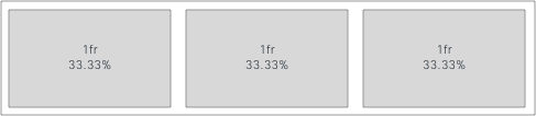 Another use case example, if you set as "cols": [1, 2, 2], it means that overall space is divided by 5 (1+2+2) and the first widget occupies 20% of horizontal space. The second and third widgets take 40% each. For more information, see Basic Concepts of Grid Layout. 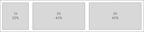 |
|
page > ROOT |
Nesting of layouts is called a sublayout. In case you have nested layouts in your layout configuration, you must have a single "ROOT" object as a parent for sublayouts. Otherwise, your layout configuration can be flat if no nesting is required. This sublayout provides more control over the layout resize behavior. The page layout property must be of type Record<string, Layout>. The layout property allows you to arrange the widgets on a page. This setup creates a grid in the ROOT layout with two subgrids that you can resize independently. 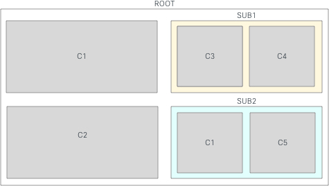 Resizing a component affects the components within that sublayout. 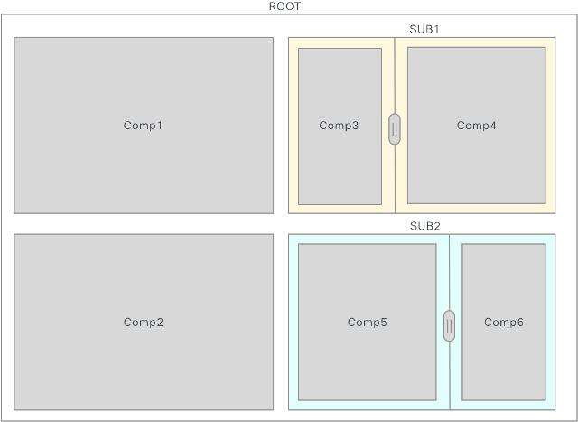 Be aware of the following cases: Infinite loop: If you include ROOT layout as a sublayout of ROOT, it causes a "call stack exceeded" error and runs into an infinite loop. 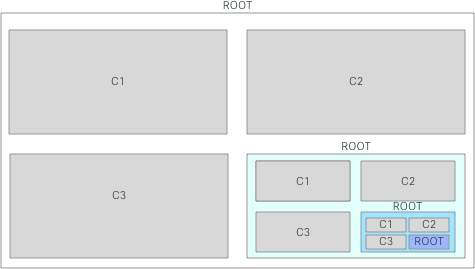 Same Sub-Layout (N) times: If you include the sublayout into your grid more than once with the same name, and if you resize one of them, all the sublayouts get resized automatically. If this is not the desired behavior, rename each of the sublayouts with a unique name. 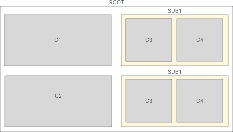 |
 (
(Attributes for Persistent Tabs
To set the tabs in the custom pages and custom widgets as persistent, enter the attributes for md-tabs in the custom layout.
Example: Set Tabs as Persistent
{
    "comp": "md-tabs",
    "attributes": {
        "persist-selection": true,
        "tabs-id": "unique-id for all the tabs together in the container"
    },
}|
Property |
Description |
|---|---|
|
persist-selection |
To set |
|
tabs-id |
Unique identification for all the tabs together in the container. |
When you set md-tabs to be persistent (persist-selection: true), Agent Desktop retains the tab selection even if an agent switches between pages or widgets in the Desktop.
- The
persist-selectionproperty is not applicable for the tabs in the Auxiliary Information pane and Agent Performance Statistics reports page, because the persistent tab behavior is already set in the Desktop. - The tab selection is reset to the default tab when you sign out of the Desktop, reload/refresh the browser, or clear the browser cache.
Persistent Widgets Configuration
You can configure any custom widget to be persistent. Persistent widgets display on all pages of the Desktop. Persistent widgets display as a new tab in the Auxiliary Information pane only when you have an active contact request or conversation. For example, Sample Persistent widget.
Persistent widgets do not display on the Home page in the way they display on the other pages. However, if you have an active interaction, the persistent widgets display in the Home page as part of the Auxiliary Information pane. For example, when you have answered a call, the Interaction Control pane displays, and the Sample Persistent widget displays as part of the Auxiliary Information pane.
Example:
"area": {
    "persistent": [{
            "comp": "md-tab",
            "attributes": {
                "slot": "tab"
            },
            "children": [{
                    "comp": "md-icon",
                    "attributes": {
                        "name": "emoticons_16"
                    }
                },
                {
                    "comp": "span",
                    "textContent": "Custom Page Widget"
                }
            ]
        },
        {
            "comp": "md-tab-panel",
            "attributes": {
                "slot": "panel"
            },
            "children": [{
                "comp": "dynamic-area",
                "properties": {
                    "area": {
                        "id": "dw-panel-two",
                        "widgets": {
                            "comp1": {
                                "comp": "agentx-wc-iframe",
                                "attributes": {
                                    "src": "https://blog.logrocket.com/the-ultimate-guide-to-iframes/"
                                },
                                "wrapper": {
                                    "title": "AgentX iFrame",
                                    "maximizeAreaName": "app-maximize-area"
                                }
                            },
                            "comp2": {
                                "comp": "uuip-widget-two",
                                "script": "./dynamic-widgets/widget-two.js",
                                "attributes": {
                                    "title": "WIDGET 2 content"
                                },
                                "wrapper": {
                                    "title": "Widget 2 title",
                                    "maximizeAreaName": "app-maximize-area"
                                }
                            }
                        },
                        "layout": {
                            "areas": [
                                ["comp1", "comp2"]
                            ],
                            "size": {
                                "cols": [1, 1],
                                "rows": [1]
                            }
                        }
                    }
                }
            }]
        }
    ]
}
When you customize a widget, you can choose either one of the options:
-
Host an application on a web page that can be embedded within an iframe.
-
Build a custom widget.
The technical widget requirements are described in the Desktop Widget Development Documentation. As a layout editor, ensure that you have these details:
-
What is the name of the custom HTML element (known as Web Component)?
-
What is the URL to the content delivery network (CDN) source that hosts the JavaScript bundle?
Header Widgets
The header is used to display inline information, to add drop-down menus, and so on. As the header container has limited vertical space, the overall header height is only 64 pixels. For more information on the layout alignment, see the layout property section.
Example:
"header":{
   "id":"header",
   "widgets":{
      "head1":{
         "comp":"header-widget-one",
         "script":"https://my-cdn.com/dynamic-widgets/header-widget-one.js",
      },
      "head2":{
         "comp":"header-widget-two",
         "script":"https://my-cdn.com/dynamic-widgets/header-widget-two.js",
      }
   },
   "layout":{
      "areas":[[ "head1", "head2" ]],
      "size": { "cols": [1, 1], "rows": [1] }
      }
}
To add a tooltip for a header widget, wrap the component with md-tooltip. Enter tooltip information in the message property.
Example:
"header": {
    "id": "dw-header",
    "widgets": {
        "head1": {
            "comp": "md-tooltip",
            "attributes": {
                "message": "Netlify"
            },
            "children": [{
                "comp": "agentx-wc-iframe",
                "attributes": {
                    "src": "https://keen-jackson-8d352f.netlify.app"
                }
            }]
        },

    },
}
You must add the style attributes display and height to configure any widgets through iFrame in the customizable widget area in the header. The best fit value of the height attribute is 64 pixels.
Ensure that you add the style attributes to the existing header widgets for them to load as expected within the iFrame.
Example:
"head1": {
    "comp": "agentx-wc-iframe",
    "attributes": {
        "src": "https://widget-kad.s3.amazonaws.com/Headers/Timer/Timer.htm",
        "style": "height:64px;display:flex;"
    }


},
We recommend that you use only a single row with multiple columns for the header because the header height is only 64 pixels. For more information on the alignment, see the layout property section.
Auxiliary Information Pane
The Auxiliary Information pane of the Desktop displays the tabs which include the Cisco-offered (default) widgets and custom widgets. The following Cisco-offered widgets appear in the predefined tabs:
-
Contact History
-
IVR Transcript
-
Customer Experience Journey
-
Screen Pop
You can use the Auxiliary Information pane to:
-
Add tabs
-
Change the tab order
-
Remove predefined tabs
-
Mark the custom tabs as draggable
-
Add tooltips to the custom tabs
-
Add the Reset Tab Order option
Example:
"panel": {
    "comp": "md-tabs",
    "attributes": {
        "class": "widget-tabs"
    },
    "children": [{
            "comp": "md-tab",
            "attributes": {
                "slot": "tab",
                "class": "widget-pane-tab"
            },
            "children": [{
                "comp": "slot",
                "attributes": {
                    "name": "CONTACT_HISTORY_TAB"
                }
            }]
        },
        {
            "comp": "md-tab-panel",
            "attributes": {
                "slot": "panel",
                "class": "widget-pane"
            },
            "children": [{
                "comp": "slot",
                "attributes": {
                    "name": "CONTACT_HISTORY"
                }
            }]
        },
        {
            "comp": "md-tab",
            "attributes": {
                "slot": "tab",
                "class": "widget-pane-tab"
            },
            "children": [{
                    "comp": "md-icon",
                    "attributes": {
                        "name": "pop-out_16"
                    }
                },
                {
                    "comp": "span",
                    "textContent": "Screen Pop"
                }
            ],
            "visibility": "SCREEN_POP"
        },
        {
            "comp": "md-tab-panel",
            "attributes": {
                "slot": "panel",
                "class": "widget-pane"
            },
            "children": [{
                "comp": "#SCREEN_POP"
            }],
        },
        {
            "comp": "md-tab",
            "attributes": {
                "slot": "tab"
            },
            "children": [{
                    "comp": "md-icon",
                    "attributes": {
                        "name": "emoticons_16"
                    }
                },
                {
                    "comp": "span",
                    "textContent": "Custom Widget"
                }
            ]
        },
        {
            "comp": "md-tab-panel",
            "attributes": {
                "slot": "panel"
            },
            "children": [{
                "comp": "dynamic-area",
                "properties": {
                    "area": {
                        "id": "dw-panel-two",
                        "widgets": {
                            "comp1": {
                                "comp": "agentx-wc-iframe",
                                "attributes": {
                                    "src": "https://blog.logrocket.com/the-ultimate-guide-to-iframes/"
                                },
                                "wrapper": {
                                    "title": "AgentX iFrame",
                                    "maximizeAreaName": "app-maximize-area"
                                }
                            },
                            "comp2": {
                                "comp": "widget-one",
                                "script": "https://my-cdn.com/dynamic-widgets/widget-one.js",
                                "wrapper": {
                                    "title": "Widget title",
                                    "maximizeAreaName": "app-maximize-area"
                                }
                            }
                        },
                        "layout": {
                            "areas": [
                                ["comp1"],
                                ["comp2"]
                            ],
                            "size": {
                                "cols": [1],
                                "rows": [1, 1]
                            }
                        }
                    }
                }
            }]
        }
    ]
},
You can configure the Customer Experience Journey widget after you enable the Customer Experience Management Metrics on the Management Portal.
In the Auxiliary Information pane, add new tabs to place your custom widgets. No special rules apply here and the component nesting is as expected and described in the children section. For more information, see the Children property of the page.
The following are the specific examples to customize your tab headers:
Example to Place Icons and Labels in the Children Property
{
    "comp": "md-tab",
    "attributes": {
        "slot": "tab",
        "class": "widget-pane-tab"
    },
    "children": [{
            "comp": "md-icon",
            "attributes": {
                "name": "transcript_16"
            }
        },
        {
            "comp": "span",
            "textContent": “My Widget Tab”
        }
    ],
},
Example to Place Image (with CSS) and Labels in the Children Property
{
    "comp": "md-tab",
    "attributes": {
        "slot": "tab"
    },
    "children": [{
        "comp": "span",
        "attributes": {
            "style": "align-items: center; display: flex;"
        },
        "children": [{
                "comp": "img",
                "attributes": {
                    "src": “http: //my-cdn.com/icon.svg”,
                        "width": 16,
                    "height": 16,
                    "style": "margin-right: 0.5rem;"
                }
            },
            {
                "comp": "span",
                "textContent": “My Widget Tab”
            }
        ]
    }],
},
The More Tabs drop-down list appears automatically when the Auxiliary Information pane contains multiple tabs.
You must add a custom tab tooltip for readability and accessibility. To add a tooltip for a custom tab, wrap the component with md-tooltip. Enter the tooltip information in the message property and apply the style property values as shown in the following example.
"comp": "md-tooltip",
"attributes": {
    "class": "widget-tabs",
    "message": "Sample Tab 1",
    "style": "max-width: 252px; min-width: 110px; overflow: hidden; text-overflow: ellipsis; white-space: nowrap; display: inline-block; margin-bottom: -10px;"
},
For a custom tab, we recommend a maximum width of 252 pixels and a minimum width of 110 pixels.
To enable the drag-and-drop feature within the custom tab, add the following property within the attributes:
"comp": "md-tabs",
"attributes": {
    "class": "widget-tabs",
    "draggable": true,
    "comp-unique-id": "sample-dynamic-custom-tabs"
},-
draggable: Set thedraggableproperty value to true. -
comp-unique-id: Enter a unique value to identify the component.Example:
"comp-unique-id": "sample-dynamic-custom-tabs"
If you enable drag-and-drop for a custom tab, the agent can drag and drop the tab to the required position within the Auxiliary Information pane. To reset the tabs to the default tab order, add the following property:
"comp": "agentx-wc-more-actions-widget",
"attributes": {
    "slot": "settings",
    "class": "widget-pane",
    "tabs-unique-id": "sample-dynamic-custom-tabs"
},-
agentx-wc-more-actions-widget: Enter the component that is displayed as the More Actions ( ) icon in the Auxiliary Information pane.
 -
slot="settings": Enter an attribute within the component that is displayed as the Reset Tab Order option in the More Actions drop-down list. Agents can reset the tabs in the Auxiliary Information pane to the default order by clicking the > Reset Tab Order. -
tabs-unique-id: Enter the same unique value defined for thecomp-unique-idproperty to map and reset themd-tabscomponents.
The following sample code uses the More Actions and Reset Tab Order functions.
"comp": "agentx-wc-more-actions-widget",
"attributes": {
    "slot": "settings",
    "class": "widget-pane",
    "tabs-unique-id": "sample-dynamic-custom-tabs"
},
"children": [{
    "comp": "div",
    "attributes": {
        "textContent": "custom action",
        "slot": "custom-action"
    },
    "children": [{
            "comp": "agentx-wc-notes-header-widget"
        },
        {
            "comp": "agentx-wc-menu-notification"
        }
    ]
}],

}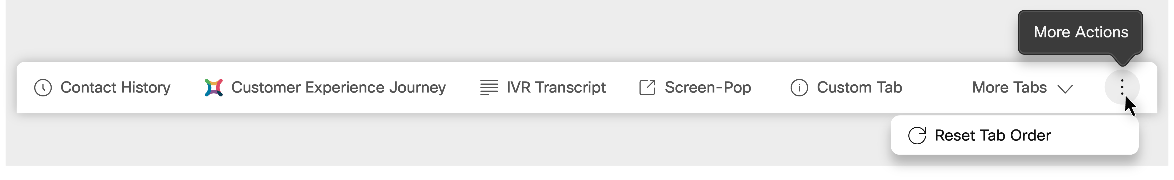
By default, the tooltip, ellipsis icon, and tab order reset for predefined tabs are defined.
The More Actions drop-down list can be extended to add additional custom components or widgets after the Reset Tab Order option. The following is a sample set of style property values that can be applied to additional components.
"comp": "md-tooltip",
"attributes": {
    "class": "widget-tabs",
    "message": "Sample Element",
    "style": "max-width: 252px; min-width: 110px; overflow: hidden; text-overflow: ellipsis; white-space: nowrap; display: inline-block; margin-bottom: -10px;"
},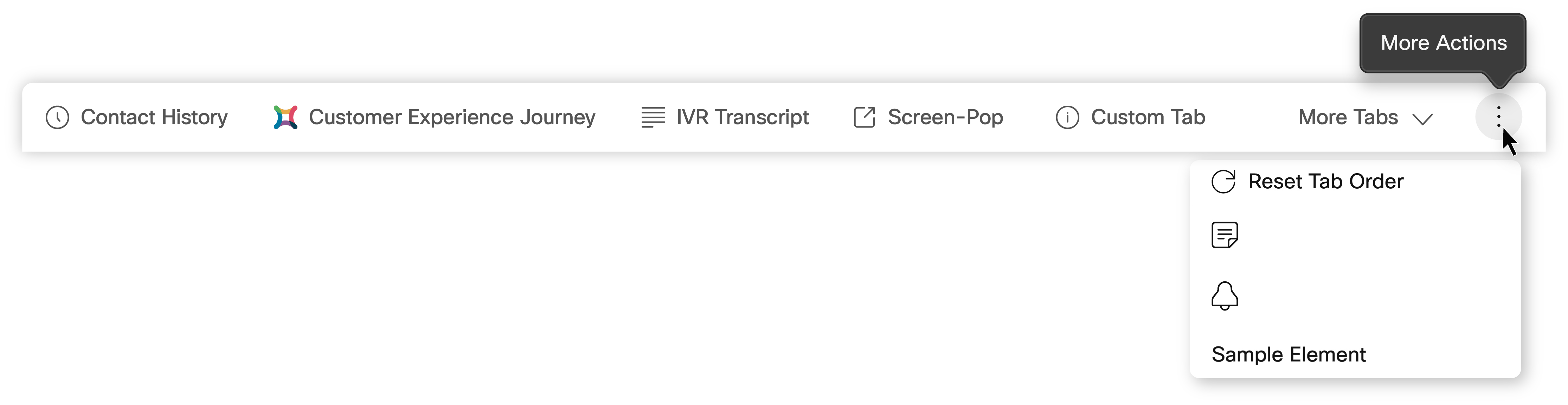
The drag-and-drop feature is not supported for the additional custom components or widgets that are added to the More Actions drop-down list.
Headless Widgets
In the headless section, you can add widgets that are hidden and do not appear on the Agent Desktop. These widgets are used to execute logic in the background. This section is useful to trigger events that occur on the Desktop and execute widget-specific logic. For example, opening a custom CRM Screen Pop for an SMS on its arrival.
Example:
"headless":{
   "id":"headless",
   "widgets":{
      "comp1":{
         "comp":"headless-widget-one",
         "script":"https://my-cdn.com/dynamic-widgets/headless-widget-one.js",
      },
      "comp2":{
         "comp":"headless-widget-two",
         "script":"https://my-cdn.com/dynamic-widgets/headless-widget-two.js",
      }
   },
   "layout":{
      "areas":[[ "comp1", comp2" ]],
      "size": { "cols": [1, 1], "rows": [1] }
      }
}
Share Data from Desktop to Widgets
To receive real-time data through properties or attributes inside a custom widget, assign appropriate STORE values in the layout JSON configuration.
In addition, to access the data through JavaScript SDK subscribers, you can also pass the data through properties or attributes. If your component is built to react to property or attribute changes, you get real-time data updates from Agent Desktop, which is called a data provider.
Currently, we have a single data provider under a key STORE. For more information, see the Data Provider—Widget Properties and Attributes section in the Cisco Webex Contact Center Desktop Developer Guide.
Preview Campaign Call
The administrator creates campaigns, configures the dialing mode (preview), and assigns the campaigns to teams. If an agent is part of a team to which campaigns are assigned, then the agent can make an outbound preview campaign call. For more information, see Configure Voice Outbound Campaign Modes in Webex Contact Center.
The administrator configures the following in the custom layout to enable preview campaign contact for an agent.
Campaign Contact
The administrator adds the Campaign Contact widget in the header container of the custom layout. The campaign contact displays the customer's contact information based on the defined properties. For more information on the layout alignment, see the layout property row of the page Property Details table.
Example:
"advancedHeader": [
  {
    "comp": "agentx-preview-campaign",
    "properties": {
      "isCampaignManagementEnabled": "$STORE.agent.isCampaignManagementEnabled",
      "agentDbId": "$STORE.agent.acqueonAgentId",
      "lcmUrl": "$STORE.agent.lcmUrl",
      "isCallInProgress": "$STORE.agentContact.isActiveCall",
      "outdialEntryPointId": "$STORE.agent.outDialEp",
      "teamId": "$STORE.agent.getAcqueonTeamId",
      "campaignManagerAdditionalInfo": "$STORE.agent.campaignManagerAdditionalInfo",
      "orgId": "$STORE.agent.orgId",
      "dialerProxyHost": "$STORE.envVaribles.serviceUrls.dialerProxyHost",
      "isProgressiveCampaignEnabled": "$STORE.app.featuresFlags.isProgressiveCampaignEnabled"    }
  },
  {
    "comp": "agentx-webex"
  },
  {
    "comp": "agentx-outdial"
  },
  {
    "comp": "agentx-notification"
  },
  {
    "comp": "agentx-state-selector"
  }
]
Call Guide
The Call Guide widget displays in the Auxiliary Information pane on the Desktop. The call guide displays the questions and answers at the campaign level. The agent is prompted to read through the set of questions in the call guide and submit the responses.
Example:
"panel":{
   "comp":"md-tabs",
   "attributes":{
      "class":"widget-tabs"
   },
   "children":[
      {
         "comp":"md-tab",
         "attributes":{
            "slot":"tab",
            "class":"widget-pane-tab"
         },
         "children":[
            {
               "comp":"md-icon",
               "attributes":{ "name":"icon-note_16"
               }
            },
            {
               "comp":"span", "textContent":"Call Guide"
            }
         ],
         "visibility":"CALL_GUIDE"
      },
      {
         "comp":"md-tab-panel",
         "attributes":{
            "slot":"panel", "class":"widget-pane"
         },
         "children":[
            {
               "comp": "acqueon-call-guide",
               "script": "http://localhost:5555//index.js", // include CDN link here
               "wrapper":{
                  "title":"Call Guide", "maximizeAreaName":"app-maximize-area"
               },
               "properties":{
                  "lcmKey":"$STORE.agentContact.getCallGuideProps.LCMKey",
                  "agentDbId":"$STORE.agent.acqueonAgentId",
                  "lcmUrl":"$STORE.agent.lcmUrl",
                  "campaignManagerAdditionalInfo":"$STORE.agent.campaignManagerAdditionalInfo"
                  "orgId": "$STORE.agent.orgId",
                  "dialerProxyHost": "$STORE.envVaribles.serviceUrls.dialerProxyHost",
                  "isProgressiveCampaignEnabled": "$STORE.app.featureFlags.isProgressiveCampaignEnabled"
               }
            }
         ],
         "visibility":"CALL_GUIDE"
      }
   ]
}- The following
compproperty references have changed.agentxin the property value is replaced withacqueon:agentx-preview-campaignis renamed toacqueon-preview-campaignagentx-call-guideis renamed toacqueon-call-guide
- You must host List and Campaign Manager (LCM) on a CDN and then specify the URL in
the
scriptproperty.
Screen Pop
In the Desktop Layout, you can configure Screen Pop in one of the following ways:
-
As a custom page
-
As one of the widgets in the custom page
-
As a tab in the Auxiliary Information pane
The Screen Pop is displayed on the Desktop based on the following factors:
For the Voice channel:
-
The configuration defined in the Desktop Layout
-
The Screen Pop activity defined in the Flow Designer
For the New Digital Channels:
-
The configuration defined in the Desktop Layout
-
The Screen Pop node defined in the Connect Flow Builder
For more information on configuring Screen Pop, see Screen Pop.
Configuring Screen Pop in the Navigation Bar
You can configure Screen Pop as a custom page, or as one of the widgets in a custom page. To access the Screen Pop custom page, click the Screen Pop icon on the Navigation bar. To access the Screen Pop widget in the custom page, click the custom icon on the Navigation bar. For more information on nav properties, see Navigation (Custom Pages).
Example: Screen Pop as a Custom Page
{
    "nav": {
        "label": "Screen Pop",
        "icon": "pop-out",
        "iconType": "momentum",
        "navigateTo": "/screenpop",
        "align": "top"
    },
    "page": {
        "id": "agentx-wc-screen-pop",
        "widgets": {
            "comp1": {
                "comp": "agentx-wc-screen-pop",
                "properties": {
                    "screenPopUrl": "$STORE.session.screenpop.screenPopSelector"
                }
            }
        },
        "layout": {
            "areas": [
                ["comp1"]
            ],
            "size": {
                "cols": [1],
                "rows": [1]
            }
        }
    },
    "visibility": "SCREEN_POP"
}
Example: Screen Pop as a Widget in the Custom Page
"comp1": {
    "comp": "agentx-wc-screen-pop",
    "properties": {
        "screenPopUrl": "$STORE.session.screenpop.screenPopSelector"
    }
If the Screen Pop is not configured in the Flow Designer, the custom page appears blank. For more information on configuring Screen Pop in the Flow Designer, see Screen Pop.
Configuring Screen Pop in the Auxiliary Information Pane
You can configure Screen Pop to appear as a tab in the Auxiliary Information pane.
By default, Screen Pop appears as a new sub tab in the Screen Pop tab of the Auxiliary Information pane if Screen Pop is configured to be displayed as Inside Desktop in the Flow Designer.
Add the following attribute in the panel section to include Screen Pop as a tab in the Auxiliary Information pane. For more information on panel details, see Auxiliary Information Pane.
Example: Screen Pop as a tab in the Auxiliary Information Pane
 {
         "comp":"md-tab",
         "attributes":{
            "slot":"tab",
            "class":"widget-pane-tab"
         },
         "children":[
            { "comp": "md-icon", "attributes": { "name": "pop-out_16" }},
            { "comp": "span", "textContent": "Screen Pop" }],
          "visibility": "SCREEN_POP"
        },
        {
          "comp": "md-tab-panel",
          "attributes": { "slot": "panel", "class": "widget-pane" },
          "children": [{ "comp": "#SCREEN_POP"
            }
         ],
      }
The Screen Pop display option defined in the Flow Designer takes precedence over the configuration defined in the Desktop Layout.
For example, consider you have configured the following Screen Pop settings:
- Flow Designer—Display settings as In the new browser tab
- Desktop Layout—As a tab in the Auxiliary Information pane
When the event for which screen pop is configured occurs, the Screen Pop is displayed outside the Desktop - that is, in a new browser tab.
Sample Use Case Examples
-
Configure and Access Customer Experience Management Metrics Widget From the Navigation Bar
-
Default Auxiliary Information Pane with Contact History, and Screen Pop
-
Auxiliary Information Pane with Customer Experience Journey Widget
Configure and Access Customer Experience Management Metrics Widget From the Navigation Bar
Example:
{
    "nav": {
        "label": "Customer Experience Management Metrics",
        "icon": "/app/images/wxm.bcd45cc3.svg",
        "iconType": "other",
        "navigateTo": "wxm-metrics",
        "align": "top"
    },
    "page": {
        "id": "wxm-metrics",
        "widgets": {
            "comp1": {
                "comp": "agentx-wc-cloudcherry-widget",
                "attributes": {
                    "metrics": true
                },
                "properties": {
                    "userModel": "$STORE.app.userModel",
                    "spaceId": "",
                    "metricsId": "",
                    "teamId": "$STORE.agent.teamName",
                    "ani": "$STORE.agentContact.taskSelected.ani",
                    "isDarkMode": "$STORE.app.darkMode"
                },
                "wrapper": {
                    "title": "Customer Experience Journey",
                    "maximizeAreaName": "app-maximize-area"
                }
            }
        },
        "layout": {
            "areas": [
                ["comp1"]
            ],
            "size": {
                "cols": [1],
                "rows": [1]
            }
        }
    }
},
To get the spaceId and metricsId, see the Webex Experience Management documentation.
Using Tabs on the Custom Page
Example:
{
    "nav": {
        "label": "Dynamic Tabs",
        "icon": "stored-info",
        "iconType": "momentum",
        "navigateTo": "dynamic-tabs",
        "align": "top"
    },
    "page": {
        "id": "page-id-tabs",
        "widgets": {
            "comp1": {
                "comp": "md-tabs",
                "children": [{
                        "comp": "md-tab",
                        "textContent": "One",
                        "attributes": {
                            "slot": "tab"
                        }
                    },
                    {
                        "comp": "md-tab-panel",
                        "attributes": {
                            "slot": "panel"
                        },
                        "children": [{
                            "comp": "widget-two",
                            "script": "http:/my-cdn.com/dynamic-widgets/widget-two.js"
                        }]
                    },
                    {
                        "comp": "md-tab",
                        "textContent": "Two",
                        "attributes": {
                            "slot": "tab"
                        }
                    },
                    {
                        "comp": "md-tab-panel",
                        "textContent": "Two Content",
                        "attributes": {
                            "slot": "panel"
                        }
                    }
                ]
            },
            "comp2": {
                "comp": "widget-two",
                "script": " http:/my-cdn.com/dynamic-widgets/widget-two.js"
            }
        },
        "layout": {
            "areas": [
                ["comp1", "comp2"]
            ],
            "size": {
                "cols": [1, 1],
                "rows": [1]
            }
        }
    }
}
Default Auxiliary Information Pane with Contact History and Screen Pop
Example:
"panel": {
    "comp": "md-tabs",
    "attributes": {
        "class": "widget-tabs"
    },
    "children": [{
            "comp": "md-tab",
            "attributes": {
                "slot": "tab",
                "class": "widget-pane-tab"
            },
            "children": [{
                "comp": "slot",
                "attributes": {
                    "name": "CONTACT_HISTORY_TAB"
                }
            }]
        },
        {
            "comp": "md-tab-panel",
            "attributes": {
                "slot": "panel",
                "class": "widget-pane"
            },
            "children": [{
                "comp": "slot",
                "attributes": {
                    "name": "CONTACT_HISTORY"
                }
            }]
        },
    ]
}, {
    "comp": "md-tab",
    "attributes": {
        "slot": "tab",
        "class": "widget-pane-tab"
    },
    {
        "comp": "md-tab",
        "attributes": {
            "slot": "tab",
            "class": "widget-pane-tab"
        },
        "children": [{
            "comp": "slot",
            "attributes": {
                "name": "SCREEN_POP_TAB"
            }
        }],
        "visibility": "SCREEN_POP"
    },
    {
        "comp": "md-tab-panel",
        "attributes": {
            "slot": "panel",
            "class": "widget-pane"
        },
        "children": [{
            "comp": "slot",
            "attributes": {
                "name": "SCREEN_POP"
            }
        }],
        "visibility": "SCREEN_POP"
    }
},
Auxiliary Information Pane with Customer Experience Journey Widget
Example:
"panel": {
    "comp": "md-tabs",
    "attributes": {
        "class": "widget-tabs"
    },
    "children": [{
                "comp": "md-tab",
                "attributes": {
                    "slot": "tab"
                },
                "children": [{
                    "comp": "slot",
                    "attributes": {
                        "name": "WXM_JOURNEY_TAB"
                    }
                }],
                "visibility": "WXM_JOURNEY"
            },
            {
                "comp": "md-tab-panel",
                "attributes": {
                    "slot": "panel",
                    "class": "widget-pane"
                },
                "children": [{
                    "comp": "agentx-wc-cloudcherry-widget",
                    "properties": {
                        "userModel": "$STORE.app.userModel",
                        "spaceId": "",
                        "metricsId": "",
                        "teamId": "$STORE.agent.teamName",
                        "ani": "$STORE.agentContact.taskSelected.ani",
                        "isDarkMode": "$STORE.app.darkMode"
                    },
                    "wrapper": {
                        "title": "Customer Experience Journey",
                        "maximizeAreaName": "app-maximize-area"
                    }
                }],
                {
                    "comp": "md-tab",
                    "attributes": {
                        "slot": "tab",
                        "class": "widget-pane-tab"
                    },
                    "children": {
                        "comp": "md-tab",
                        "attributes": {
                            "slot": "tab",
                            "class": "widget-pane-tab"
                        },
                        "children": [{
                            "comp": "slot",
                            "attributes": {
                                "name": "CONTACT_HISTORY_TAB"
                            }
                        }]
                    },
                    {
                        "comp": "md-tab-panel",
                        "attributes": {
                            "slot": "panel",
                            "class": "widget-pane"
                        },
                        "children": [{
                            "comp": "slot",
                            "attributes": {
                                "name": "CONTACT_HISTORY"
                            }
                        }]
                    },
                    {
                        "comp": "md-tab",
                        "attributes": {
                            "slot": "tab",
                            "class": "widget-pane-tab"
                        },
                        "children": [{
                            "comp": "slot",
                            "attributes": {
                                "name": "SCREEN_POP_TAB"
                            }
                        }],
                        "visibility": "SCREEN_POP"
                    },
                    {
                        "comp": "md-tab-panel",
                        "attributes": {
                            "slot": "panel",
                            "class": "widget-pane"
                        },
                        "children": [{
                            "comp": "slot",
                            "attributes": {
                                "name": "SCREEN_POP"
                            }
                        }],
                        "visibility": "SCREEN_POP"
                    }
                    "visibility": "SCREEN_POP"
                },
            },
Localization
The following are the supported languages:
Bulgarian, Catalan, Chinese (China), Chinese (Taiwan), Croatian, Czech, Danish, Dutch, English (UK), English (US), Finnish, French, German, Hungarian, Italian, Japanese, Korean, Norwegian, Polish, Portuguese (Brazil), Portuguese (Portugal), Romanian, Russian, Serbian, Slovak, Slovenian, Spanish, Swedish, and Turkish.
The Desktop UI language is based on the language preference settings on your browser. For example, let us consider that you have selected the preferred language as French on the Firefox browser. When you launch the Desktop in the Firefox browser, the Desktop UI appears in Français (French). However, the horizontal header, navigation bar, and other components added in the Desktop Layout are not localized based on the language preference settings on your browser.
Localize Desktop Components
To localize desktop components,
-
Use the existing localization keys set in the
app.jsonfile. If the localization keys are not set, the default language English (US) is used. You can submit a service request to Cisco Support to add a localization key to theapp.jsonfile.Example: Localization Key
{ "common": { "buttonTitle": "Stop Timer" } } -
Enter the following case-sensitive property in the Desktop Layout JSON file to localize a component:
"textContent": "$I18N.<key>",where <key> refers to the corresponding localization key in the
app.jsonfile.
Example: Localize Header Component
"header": {
    "id": "header",
    "widgets": {
        "head1": {
            "comp": "md-button",
            "attributes": {
                "slot": "menu-trigger",
                "style": "height: 64px"
            },
            "children": [{
                    "comp": "span",
                    "textContent": "$I18N.common.buttonTitle",
                }
            },

        },
    }
Example: Localize Tab Component in the Auxiliary Information Pane
"panel": {
    "comp": "md-tab",
    "attributes": {
        "slot": "tab"
    },
    "children": [{
        "comp": "span",
        "textContent": "$I18N.panelTwo.screenPopTitle"
    }]
}


