- Home
- /
- Article

Thanks for your feedback.

Workspace insights in Control Hub
 In this article
 Feedback?
Get an overview of all workspaces within your organization, know the state-of-affairs, and make data-driven decisions about your workplace resources.
In workspace insights, you can see how your organization is set up for collaboration. Starting with a snapshot of your workspace inventory, you can know how many different types of workspaces there are. Inventory shows you how all workspaces are set up and Utilization let's you know what are the most popular devices in your workspaces. In the Issues tab, you can see which of workspaces are in most need of attention to focus on the most pressing issues, resolving them before they affect the workforce.
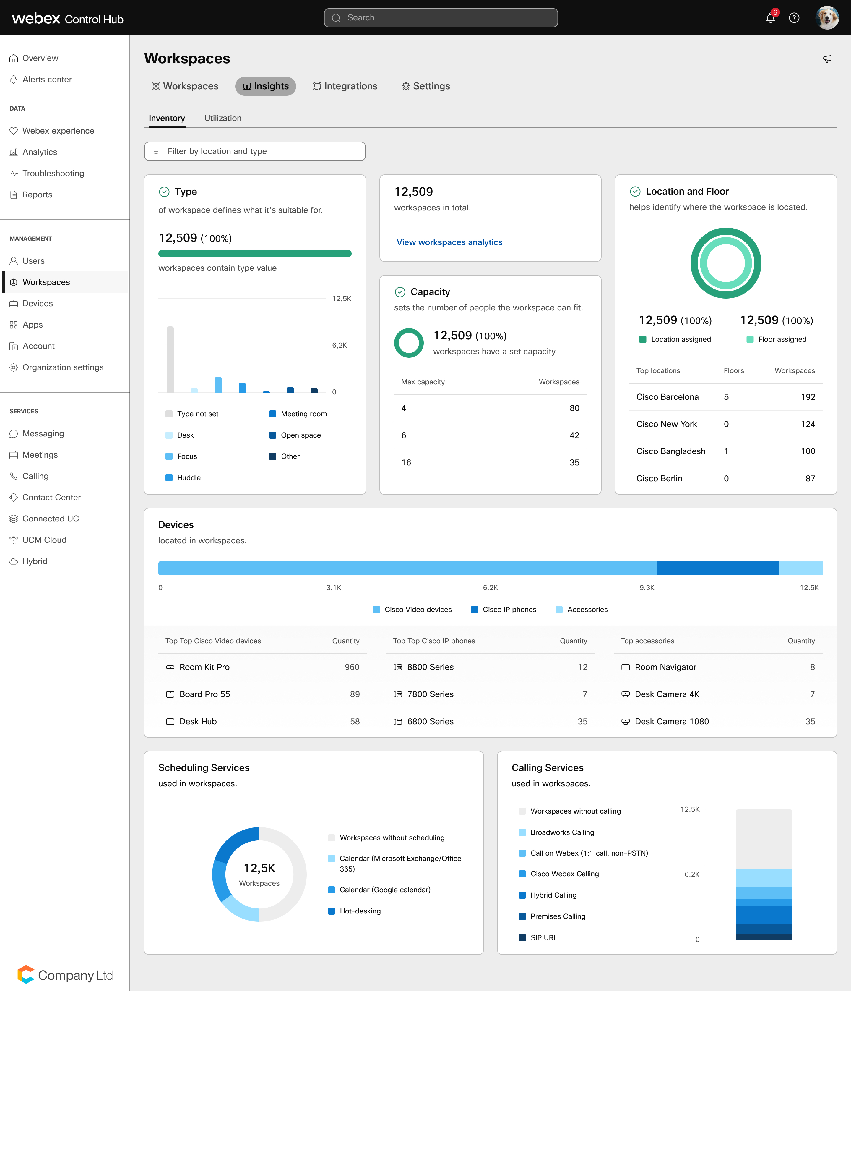
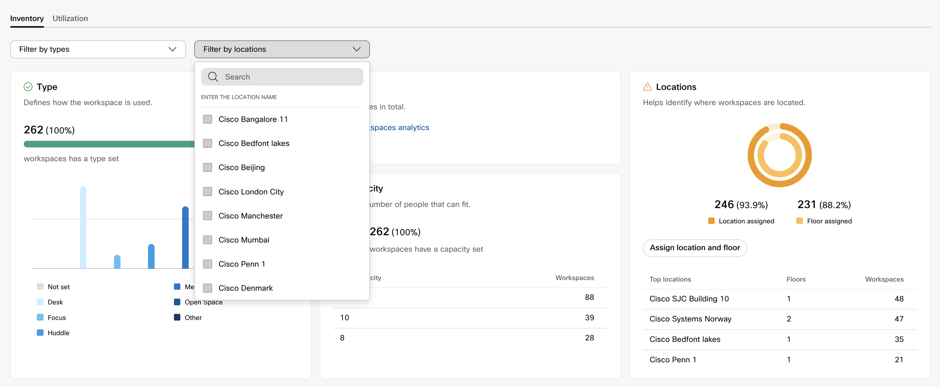
Inventory
-
The type of workspace defines what it’s suitable for:
-
Open space
-
Meeting room
-
Huddle
-
Focus
-
Desk
-
-
Capacity sets the number of people the workspace can fit. Max capacity is the maximum number of people who are allowed in the workspace.
-
Location helps identify where the workspace is located. View locations with the most workspaces in them.
-
Scheduling used in workspaces:
-
Without scheduling
-
Calendar (Microsoft Exchange/Office 365, Google)
-
Hot-desking
-
-
Calling services used in workspaces:
-
None
-
BroadWorks
-
Call on Webex (1:1 call, non-PSTN)
-
Webex Calling
-
Hybrid Calling
-
On-premises Calling
-
Third-party SIP Calling
-
Colorful indicators
Green indicates that you have all your metadata that is filled out for that data point. Yellow indicates that there are some workspaces with missing fields (above 50% but below 100%). Red indicates that less than 50% of your metadata is complete and you have some work to do to get your Inventory into a “healthy” state.
Filter Insights by Location and workspace Type to drill down.
Hover over the graphs to get a more detailed view.
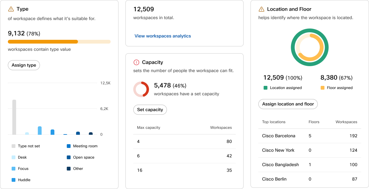
If you have workspaces without Type, Capacity, or Location set, you can configure them individually or in the Workspaces’ bulk settings’ menu.
Read more about Locations.
Utilization
Discover how workspaces are used by your organization, identify scheduling behavior, and uncover which workspaces are the most and least popular. The information depends on whether the workspaces have calendaring, hot-desking, or people presence enabled.
You can filter the results by workspace type and location to get more detailed insights on room utilization.
Utilization insights are by default available for 24 hours. You can extend the period up to 30 days. Extended period requires Pro Pack.
You can export individual charts as CSV, PNG, or PDF files to share utilization data and visuals. Click on the more button  on the chart you want to export and choose the format. The chart is downloaded to your computer.
Workspaces in use
The usage data is collected from people presence the devices report back if it has been enabled.
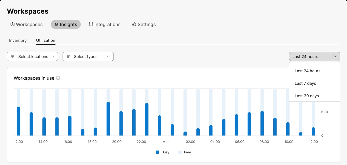
Hover over the graphs to get a more detailed view.
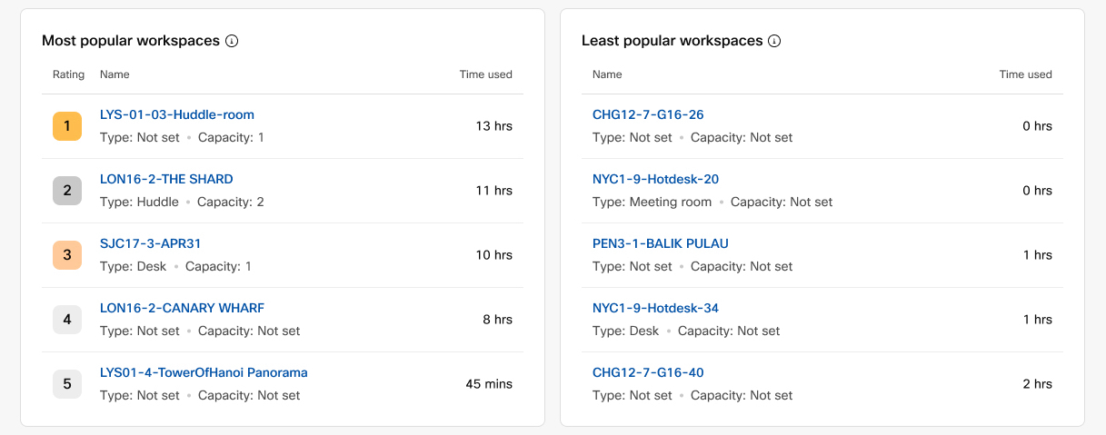
Most and least popular workspaces
In this section you can see which workspaces are most and least used. It shows data based on the people presence sensors from devices which have it enabled.
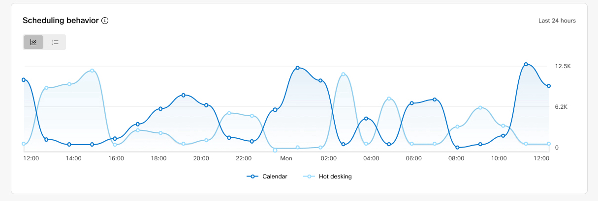
Scheduling behavior
The graph shows the scheduling that the devices report back for the period you have chosen for the Utilization insights. It only shows data from devices that have been scheduled during that time period, either through calendar bookings or hot-desking.
You can toggle between the overview of bookings and hot-desking, and the most and least popular workspaces to book.
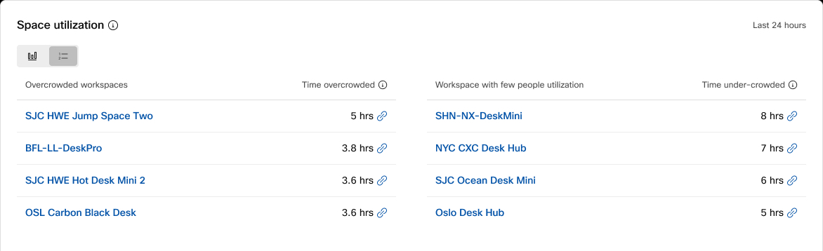
Space utilization
The space utilization gives you insight to whether or not rooms are being optimally used. You can toggle between a chart and a list overview on space utilization for the period you have chosen for the Utilization insights.
The space utilization insights apply to workspaces set with capacity and report people count data.
-
Overcrowded means that the people count is greater than the capacity for more than 5 minutes.
-
Few people means that the people count is less than 20% of the capacity for more than 5 minutes.
The insights are updated periodically, so the most recent data points may not be reflected.
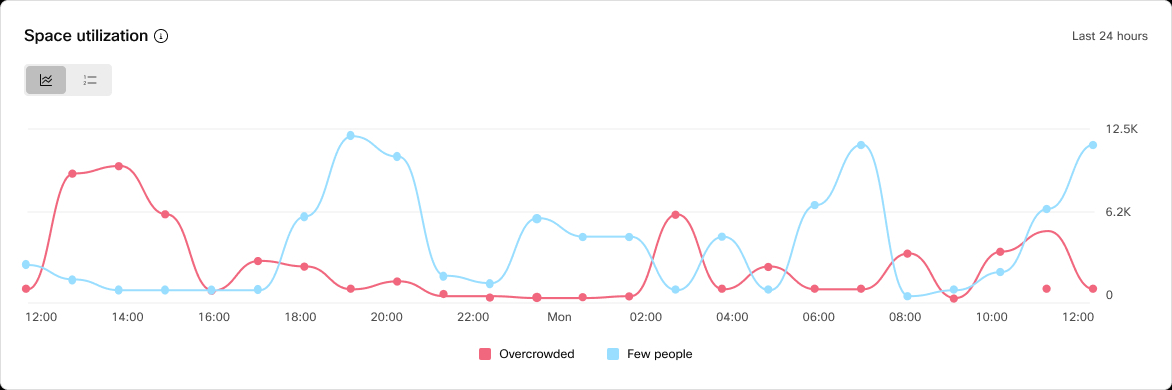
The list view gives you information on specific spaces that are overcrowded or with few people to pinpoint which spaces may need a closer look. Use these data points to evaluate the overall room experience and how you can get the most out of the building.
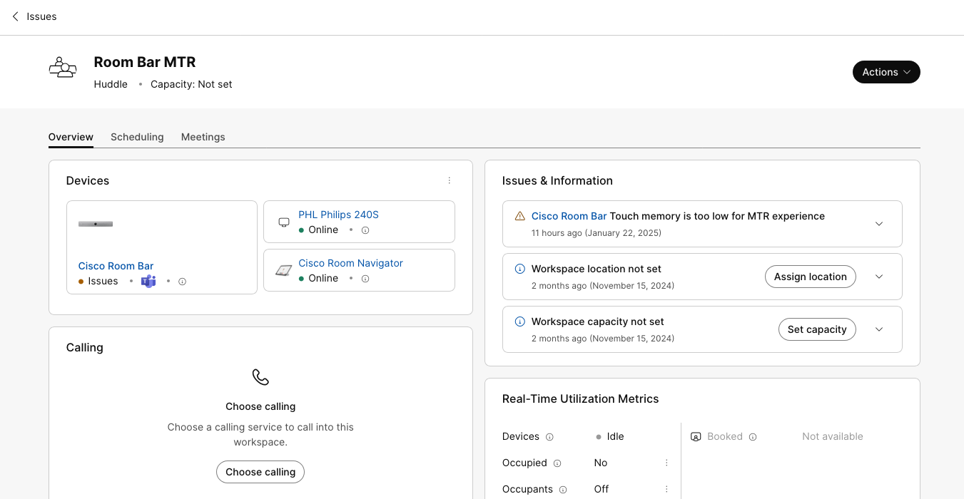
Issues
In the Issues tab you can see how the devices in your organization are ranked. Ranking is based on issue type, workspace popularity, and historical usage data.
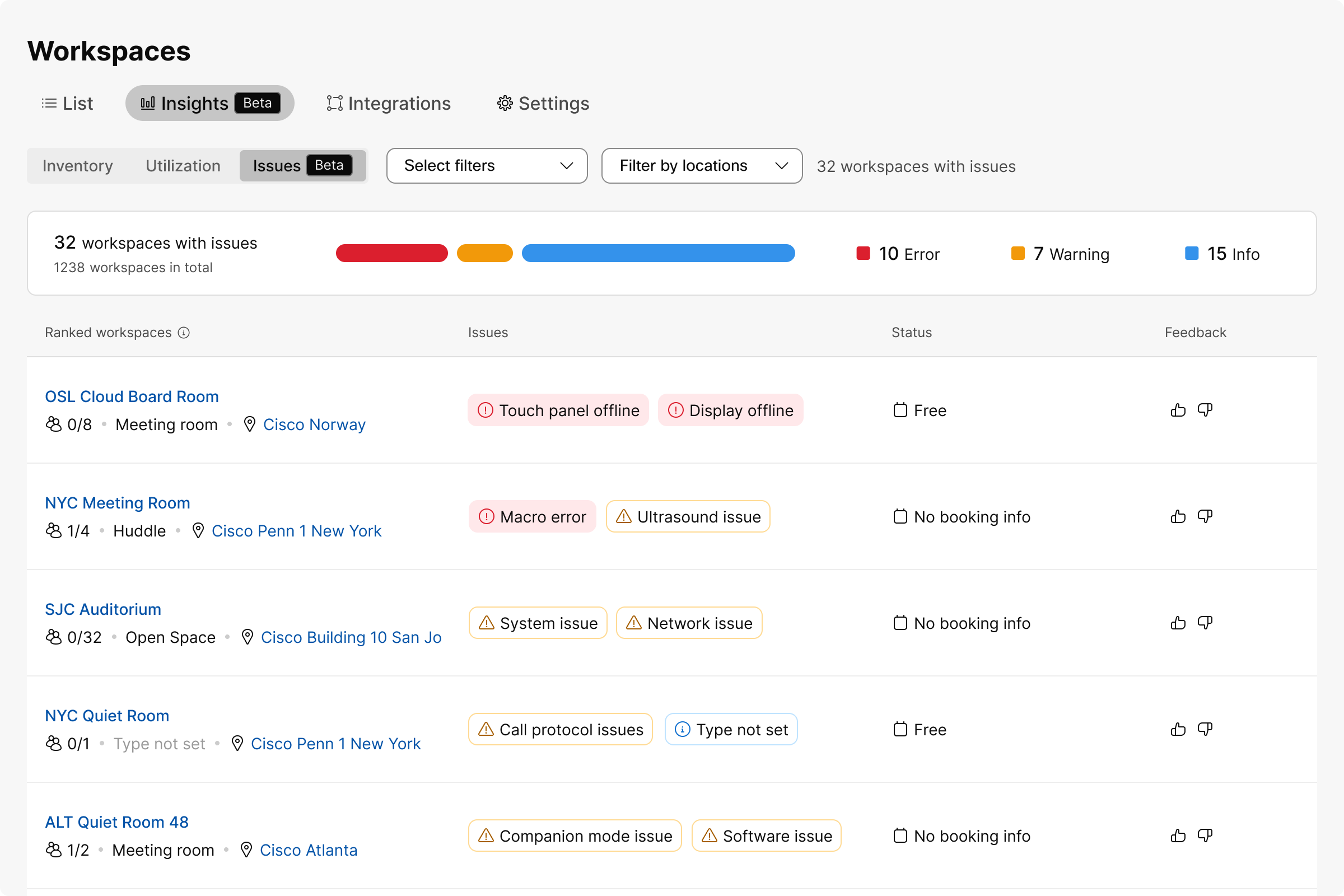
You can filter the device list with different filters, such as issue type, workspaces with devices, room type, calendering setup, and so on. Or you can use the location filter.
Workspace issues are divided in three categories:
-
Warning
-
Error
-
Info
| Issue type | Summary | Message |
|---|---|---|
|
Warning |
Device hosted meetings not supported |
Room Navigator in standalone mode does not support device hosted meetings. |
|
Warning |
Hot-desking not supported |
Room Navigator in standalone mode does not support hot-desking. |
|
Warning |
Calling not supported |
Room Navigator in standalone mode does not support calling. |
|
Warning |
Hot-desking and Microsoft Teams Room |
Hot-desking is not supported for workspaces with Microsoft Teams Rooms. |
|
Warning |
Device hosted meetings not supported |
Phones do not support device hosted meetings. |
|
Warning or Error (depends on the device issue severity) |
Devices with issues |
There are devices with issues in the workspace. |
|
Error |
Offline devices |
There are offline devices in the workspace. |
|
Error |
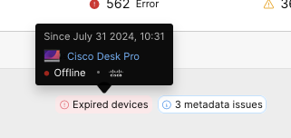
Expired devices |
There are expired devices in the workspace. |
|
Error |
Offline peripherals |
There are offline peripherals in the workspace. |
|
Error |
Calendar service error |
The calendar service is reporting an error that might affect the One Button To Push and room booking features. |
|
Info |
Workspace location not set |
Adding a location and floor specifies where the workspace is physically located. |
|
Info |
Workspace capacity not set |
Adding a capacity specifies how many people can fit in the workspace. |
|
Info |
Workspace type not set |
Adding a type specifies what the workspace is used for. |
If you hover over an issue indicator, you can see when the issue started and which devices are affected.
Click on the workspace you're interested in to open the workspace page. On the workspace page you can see the issues listed under Issues & Information. Click on an issue to expand it to see suggested actions you can take to fix the issue.