
Thanks for your feedback.
Analytics for Your Webex for Government Portfolio
 Feedback?
As a full administrator, read-only administrator, or support administrator of an organization, you have access to various charts, graphs, and reports in Control Hub, depending on your deployment. You can use this information to evaluate how Webex services and devices are being used in your organization and how often. For example, you can use analytics to track and measure services in your cloud collaboration portfolio.
Historical charts and graphs are standard in Control Hub. Most charts and graphs are available in daily, weekly, and monthly format. All charts are in Greenwich Mean Time (GMT). The amount of data you have access to depends on the type of customer you are. If you're a standard customer, you have access to 3 months of data. If you're a Pro Pack customer, you have access to 13 months of data.
Data for the Quality tab in Meetings Analytics only goes back to June 30, 2021. Data for the rest of the tabs in Meetings Analytics goes back to January 1, 2021.
Analytics data, except for Meetings, is batch processed each day. Data is made available within 24 hours and metrics are available by 1:00PM GMT the next day. Meetings data is updated every 10 minutes.
| 1 |
To view your Analytics data:
|
| 2 |
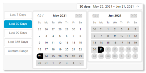
Select which date range you want to view the data for with the calendar date selector.
If the charts don't load, enable third-party cookies in your browser. If you prefer to control which third-party cookies your browser accepts, you can add *.webex.com to the list of exceptions. If third-party cookies are already enabled, try clearing your browser cache. |
| 3 |
To save an individual chart or graph, click the more If you choose CSV, you'll export all of the data for the selected chart. If you select PNG or PDF, you get a copy of the data shown on the screen only. |
 button, and then choose a file type.
Meetings Analytics provides you with details and descriptions about who's using Cisco Webex meetings, regardless of whether it's a Personal Room Meeting or a standard Webex meeting. You can also find out how many minutes people are spending in meetings, the quality of those meetings, and what type of audio people are using.
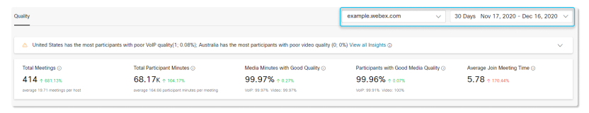
Use the Webex site selector and calendar date selector at the top-right corner of the page to select the metrics you want to view.
Data for the Quality tab only goes back to June 30, 2021. Data for the rest of the tabs in Meetings Analytics goes back to January 1, 2021.
Insights
These insights provide you with a quick glance of where participants experienced the most poor media quality during meetings. You can use this information to get a sense of what filters and charts to look at so you can help diagnose and mitigate the problem.

Key Performance Indicators (KPIs)
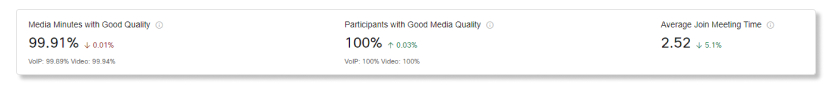
There are three KPIs that show at the top of the Meetings Quality tab. The range of data they measure changes as you select a new date range.
The three KPIs are:
-
Media Minutes with Good Quality—Use this KPI to see what the average VoIP and video quality are for participants during meetings. If the percentages for either quality are low, you can take a more in-depth look with the charts below to determine what caused the drop in quality, such as if the poor media minutes are limited to a specific connection or location.
-
Participants with Good Media Quality—Use this KPI to see if participants are having any issues during meetings when they join with VoIP or enable video. Similar to the above KPI, you can determine if a specific set of participants is having issues, or if it's a widespread issue within your organization.
-
Average Join Meeting Time—Use this KPI to see if there's a spike in how long participants take to join a meeting. A longer than average Join Meeting Time (JMT) could indicate that some participants might be having network connection issues. If that's the case, you can use the graphs below to find out if that spike is coming from a certain location or platform type.
Filters
There are two levels of filter that you can select from. The first is you can choose if you want view metrics for VoIP or Video Quality by Participants or Minutes.

After you select one of those filters, you can drill down further by filtering out the metrics by a certain threshold, region, or location. These filters can help you find out the if there's a correlation with certain metrics that are causing participants to have poor media quality. For example, if participants from North America are having trouble with VoIP quality, but participants from other regions are doing fine, then you can determine that there might be an outage at a data center.
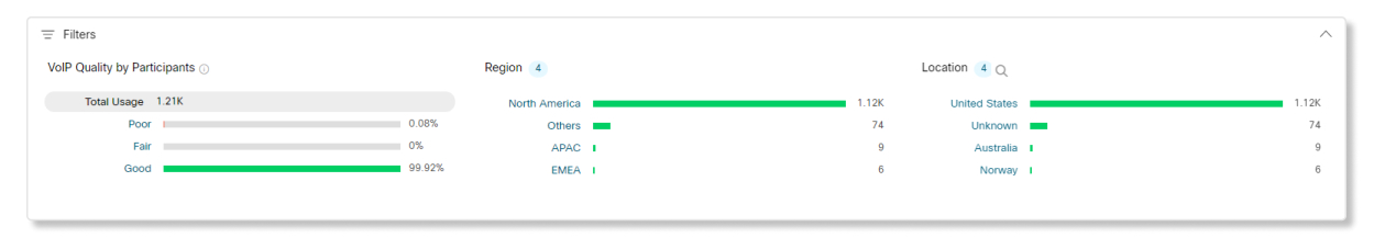
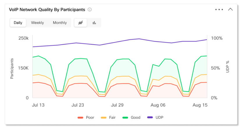
VoIP or Video Quality by Participants or Minutes
Use this chart to see a trend of what the media quality for participants or minutes is like in your organization. If there's a sudden spike of participants or minutes with poor or fair media quality, you can view the metrics for that specific date range and compare the metrics between all the other charts available to you and see if there are any common anomalies.
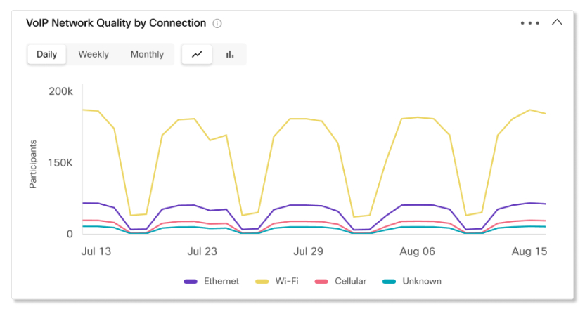
VoIP or Video Quality by Connection
This chart shows you a trending breakdown of participants or minutes by connection type. You can use this chart to help determine if media quality issues are affecting all participants in your organization, or if it's limited to specific connection types.
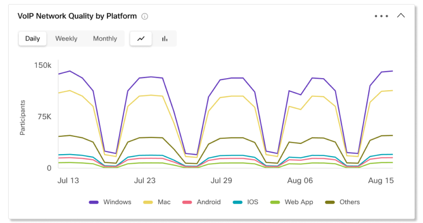
VoIP or Video Quality by Platform
This chart shows you a trending breakdown of participants or minutes by platforms. You can use this chart to help determine if media quality issues are affecting all participants in your organization, or if it's limited to specific platforms.
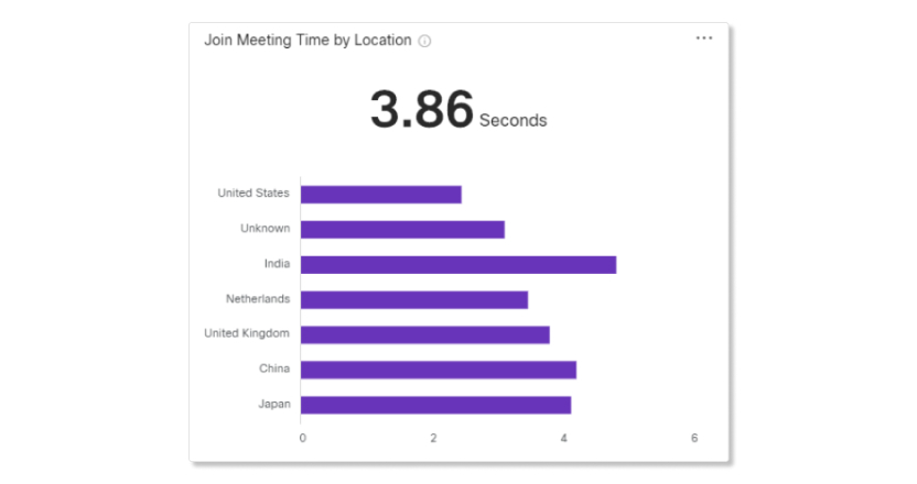
Join Meeting Time by Location
Use this chart to determine if a specific location has a higher than average JMT. This could indicate that a connection problem is limited to a certain area. You can then filter out the metrics for only that location, and then compare the metrics from the other charts to see what the problem could be.
The location for users who join meetings with the Webex app and video devices will show up as unknown.
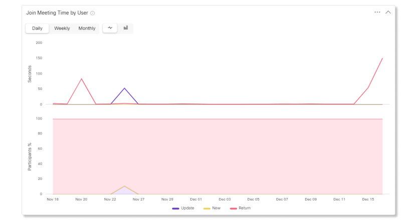
Join Meeting Time by Users
Use this chart to determine what the average JMT is like for a specific type of user. New users might take longer than returning users to join a meeting since they haven't used Webex before. Users who had to update their Webex app might take longer than average to join a meeting since any new changes can cause confusion. By seeing how long each type of users takes to join a meeting, you can take proactive steps on how to mitigate these issues, like sending out information on what changed before a new update rolls out, or sending out instructions to new users on how to join a Webex meeting.
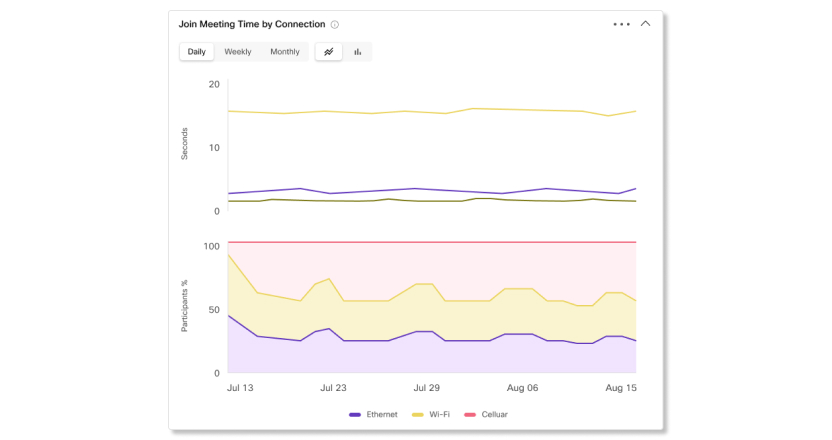
Join Meeting Time by Connection
Use this chart to determine what the average JMT is like for a specific type of connection. Knowing what type of connection participants are having issues with can help narrow down where an issue might be. For example, if participants that joined meetings with ethernet and Wi-Fi have an average JMT, but cellular has higher than average, then that could be a problem with either the Webex mobile app or with a mobile provider's network.
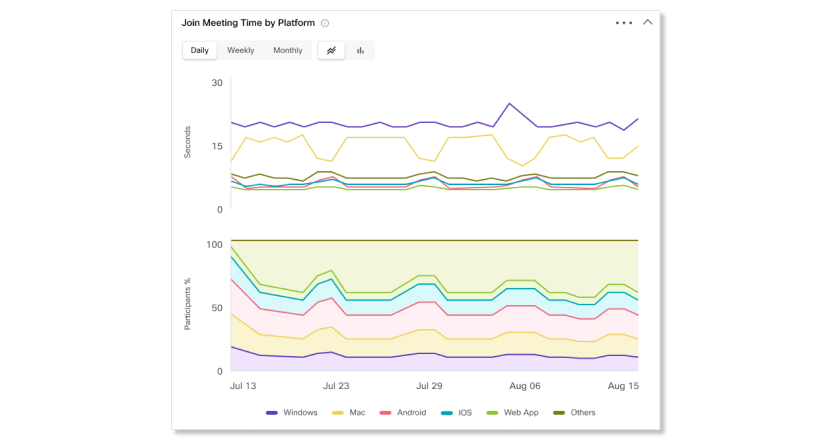
Join Meeting Time by Platform
Use this chart to determine what the average JMT is like for a specific type of platform. Seeing which platforms are having issues make it easier for you to troubleshoot if there's a network connection problem in your organization, or if it's only limited to some platforms.
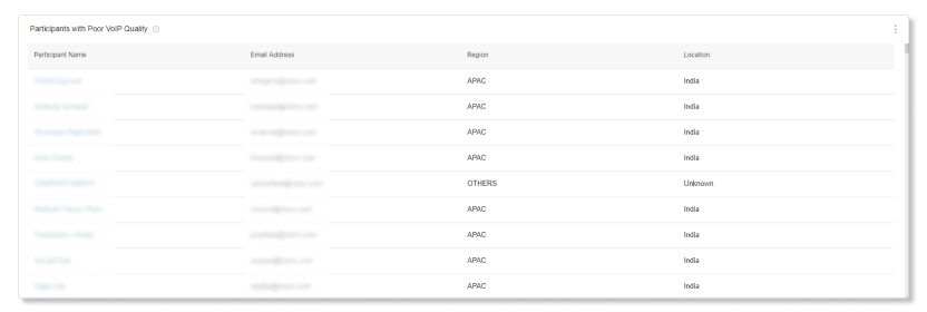
Participants with Poor Quality
For each day of the last 21 days, we capture the worst 350 participants with poor quality. Depending on the date range selected, the top 300 participants who had the poorest quality show up on the list.
For example, on the first day, 350 participants with the poorest quality are captured for that day. On the second day, an independent set of 350 participants with the poorest quality are captured for that day. The table then captures the worst 300 participants between all those days and lists them on the table.
This table only shows the worst offenders from the last 21 days.
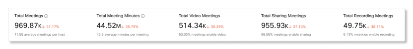
KPIs
There are five KPIs that show at the top of the Meetings Engagement tab. The range of data they measure changes as you select a new date range.
The five KPIs are:
-
Total Meetings—Use this KPI to see if users are regularly hosting Webex meetings in your organization. If this number is low, you can follow up with users to find out why they're not using their hosting capabilities.
-
Total Meeting Minutes—Use this KPI to see to get a sense of how long meetings are being held for in your organization.
-
Total Video Meetings—Use this KPI to see if users are turning on their video during meetings. If this number is low, you can check the Quality tab to look at the video quality charts to determine if there were any media quality issues.
-
Total Sharing Meetings—Use this KPI to see if users are sharing their screens during meetings.
-
Total Recording Meetings—Use this KPI to see if users are recording their meetings.
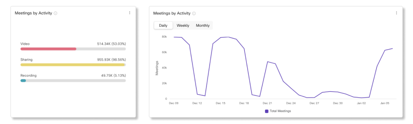
Meetings by Activity
Use these charts to see a breakdown for the number of meetings where users turned on their video, shared their screen, or started a recording. This information helps you find out if users are engaged in meetings. Click on one of the filters on the left-side chart to change the data for the trending chart on the right side and both Meeting Minutes by Activity charts.
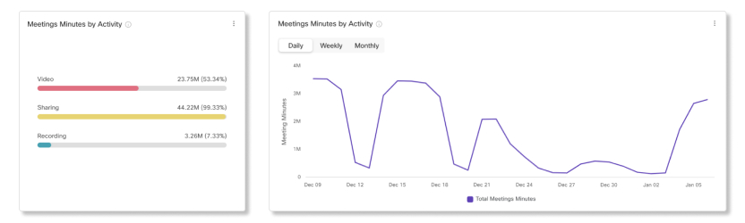
Meeting Minutes by Activity
Use these charts to see a breakdown for how long users turned on their video, shared their screen. or started a recording. If engagement isn't high for these activities, you can reach out to users and inform them of the benefits for utilizing each activity.
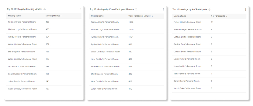
Top 10 Meetings by Meeting Minutes
This table shows the top 10 meetings that had the longest duration.
Top 10 Meetings by Video Participant Minutes
This table shows the top 10 meetings which had the longest duration for participants who turned on their video.
Top 10 Meetings by # of Participants
This table shows you which meetings had the most number of participants.
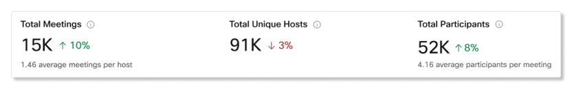
KPIs
There are three KPIs that show at the top of the Meetings Participants tab. The range of data they measure changes as you select a new date range.
The three KPIs are:
-
Total Meetings—Use this KPI to see if users are reguarly hosting Webex meetings in your organization. If this number is low, you can follow up with users to find out why they're not using their hosting capabilities.
-
Total Unique Hosts—Use this KPI to see how many users are utilizing host licenses. If this number is low, you can consider switching some users to an attendee account to free up host licenses.
-
Total Participants—Use this KPI to see the total number of joins by participants and devices.
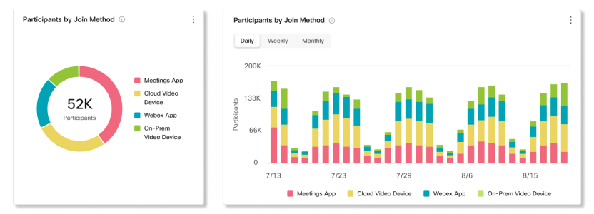
Participants by Join Method
Use these charts to see a breakdown of clients that participants used to join meetings.
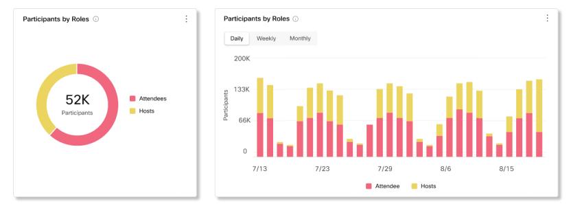
Participants by Roles
Use these charts to see a breakdown of host and attendee accounts used to join meetings. If more host accounts are joining meetings than attendee accounts, you can reassign hosts who aren't regularly hosting to attendee accounts.
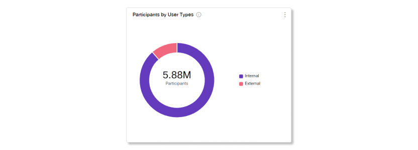
Participants by User Types
Use this chart to see a breakdown of users that joined meetings from your organization and users that joined as guests or from an external organization. This chart can help you keep track of how many external users have access to your meetings and if you want to change any security measures.
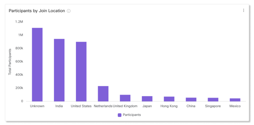
Participants by Join Location
Use these charts to see a breakdown of locations that participants joined meetings from. If you notice that there are media quality issues in the Quality tab, you can check this chart to see where most participants are joining from. You can then determine if the issue is coming from a certain location or if something else is the root cause.
The location for users who join meetings with the Webex app and video devices will show up as unknown.
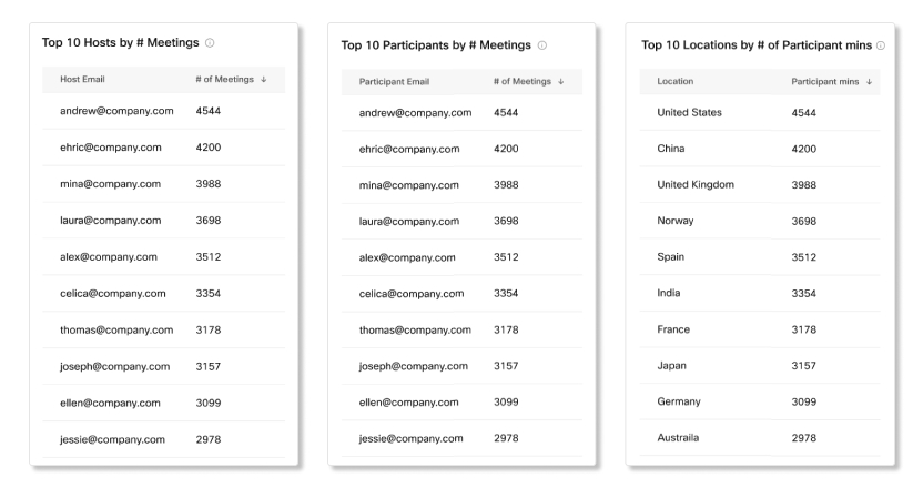
Top 10 Hosts by # Meetings
This table shows the top 10 hosts who scheduled and started the most meetings.
Top 10 Participants by # Meetings
This table shows the top 10 participants who joined the most meetings.
Top 10 Location by # of Participant Mins
This table shows the top 10 locations that had the most participant minutes.
KPIs
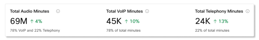
There are three KPIs that show at the top of the Meetings Audio tab. The range of data they measure changes as you select a new date range.
The three KPIs are:
-
Total Audio Minutes—Use this KPI to see the total number of VoIP and telephony minutes used during meetings in your organization.
-
Total VoIP Minutes—Use this KPI to see the total number of VoIP minutes used during meetings in your organization.
-
Total Telephony Minutes—Use this KPI to see the total number of telephony minutes used during meetings in your organization. Depending on if your organization prefers VoIP or telephony minutes, you can look at the charts below to see a breakdown of why this number is high or low.
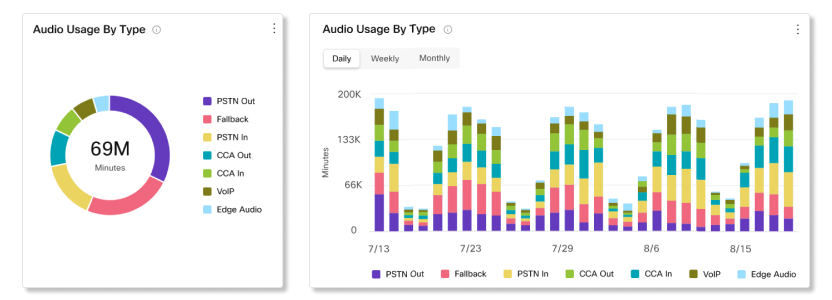
Audio Usage by Type
Use these charts to determine the types of audio that users are connecting to meetings with. You can take action if your organization has a preferred type of audio that users should be adopting. For example, if your organization has deployed Edge Audio, but the usage for it is low, you can reach out to users and find out why they aren't connecting through Edge Audio.
You have various messaging-related charts at your fingertips that can help you determine just how engaged your users are with Webex. You can find out how many people in your organization are using the app to communicate and share ideas, which of those users are most active, and which spaces are most commonly used. You can rely on your most active users to encourage others in your organization to use the app. You can also determine the number and size of the files being shared and which platforms are most popular (for example, Webex for Windows or Mac).
If you're a Pro Pack customer, you have access to historical metrics API that you can use to return daily aggregated messaging-related data automatically.
Key Performance Indicators (KPIs)
There are four KPIs that show at the top of the Messaging Analytics tab. The range of data they measure changes as you select a new date range.
The four KPIs are:
-
Highest Daily Active User—The highest number of users who had activity in the Webex app during a day within the selected date range. Activities include:
-
Sending or reading a new message.
-
Uploading a file.
-
Signing in to the app.
-
Joining a space.
-
-
Average Daily Active User—The average number of users who had an activity during the days within the selected date range.
-
Total Messages Sent—The number of messages that were sent over the selected date range. The percentage at the bottom indicates the increase or decrease in the number of messages that are sent by comparing the number of messages sent yesterday, to the number of messages sent the week before.
-
Active Spaces—The number of spaces that had activity over the selected date range. A space is considered active when someone:
-
Sends or reads a new message.
-
Uploads or downloads a file.
-
Creates, joins, or leaves a space.
-

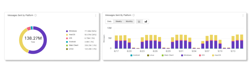
Messages Sent by Platform
You can use this chart to compare the usage of Webex in desktop or mobile. You can use this information to see if the desktop or mobile app is more popular in your organization. If adoption of one of these platforms isn’t what you expected, then consider providing more training so users know the benefits of using desktop or mobile.
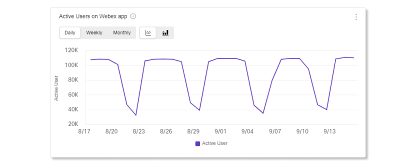
Active Users
You can use this chart to determine the number of people actively using the Webex app. An active user is someone who has sent a message, made a call, uploaded a file, or attended a meeting.
Perhaps you signed up your organization for a trial to determine whether you want to purchase some of the services that a Cisco Webex subscription has to offer. In this case, we recommend that you monitor usage. If people are actively engaged, you may want to invest in various services that make workplace collaboration more convenient. If people aren't using the app as much as expected, show them how the app can make their day-to-day work life easier.
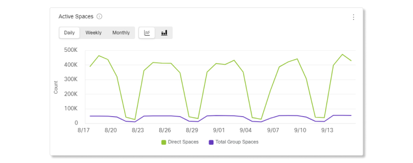
Active Spaces
You can use this chart to review the total number of spaces people participate in each day. A space is considered active when someone:
-
Sends a message.
-
Reads a new message.
-
Uploads or downloads a file.
-
Creates, joins, or leaves a space.
You can use this information to determine how well your organization is adopting the practice of using spaces to meet and collaborate. If your organization isn't using spaces as much as you expected, we recommend that you provide more training. People may make better use of their spaces if they're more familiar with the space concept. You can also make them aware of the productivity gains this feature can bring.
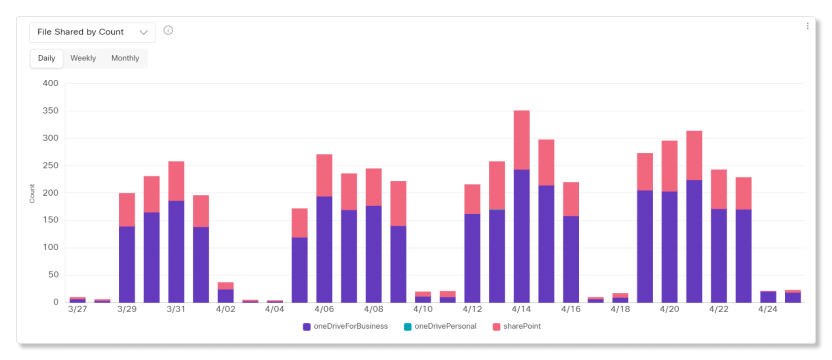
Files Shared by Count and by Total Size
You can use these charts to monitor the number and total size of files shared using an integration on the Webex app. The integrations that you can use to share files with are:
-
Dropbox
-
Box
-
Microsoft OneDrive for Business
-
Microsoft OneDrive Personal
-
Microsoft SharePoint
Use this information to determine the level of feature adoption within your organization. If the number of files shared is low compared to the number of people in your organization, you may want to investigate the reasons why. We recommend that you implement strategies to encourage people to take advantage of the file sharing feature.
Use the Analytics page in Control Hub to see data for historical calls based in the Webex app and the quality of their call media experiences. You have access to 13 months of data for calls based in the Webex app if your organization has Pro Pack. If your organization doesn't have Pro Pack, you have access to 3 months of data.
We keep historical data for calls using Call on Webex on the Webex desktop and mobile app.
The Analytics tab is a historical view that's updated daily. Call data from the previous day is uploaded at 00:00 (midnight) UTC.
How We Collect Data
At the end of each call, we collect the statistics directly from that endpoint. The data is collected over the day, and added to the display in Control Hub at midnight (UTC) the following day.
For example: Alice makes a call on June 9th, from the Webex app, to an external party. On June 10th, you'll see Alice's call detail record in Control Hub, and be able to see the media statistics reported by that endpoint.
When Alice calls Bob, who is another user in your organization, two call records will be collected; one for the media statistics reported by Alice's endpoint, and one for the statistics from Bob's endpoint. This helps you to work out which user is having the problem when they share a poor quality call.
Dashboard Tips
-
Adjust time period
You can view the Total Call Legs and Total Call Minutes graphs on Daily, Weekly or Monthly timescales, so you can track engagement over time, and look for usage trends. This offers powerful insight into the adoption and usage of the different platforms for Webex over time.
-
Filters
The dashboard contains powerful filtering tools. Click on the Filters bar to select which data you want to see. You can filter by Endpoint in the Engagement tab, and by Quality, Endpoint, or Location in the Quality tab.
You can clear individual filters by clicking the close button on the filter name.
-
Export data or charts
You can export any graph or detail view. Click the More button on the top right of the chart/list, and select the file format for your download (PDF, PNG, or CSV, depending on whether it's a graph or list).
When you combine file download with the filtering, searching, and ordering tools, you can easily generate useful reports about your Webex deployment.
Reports for Calling Engagement and Quality Data
If you want to see data for the call legs that users made or received and the quality of their calls in a CSV file format, you can download the Calling Engagement and Calling Quality reports in the Reports section of Analytics.
Known Limitations
These following types of calls do not currently appear on the dashboard in Control Hub. We are working to address these limitations.
-
Calls from IPv6 endpoints.
-
Calls which are not 'over the top' because they use a VPN termination to Webex.
-
If your organization has multiple regions, we don't currently show calls made in regions other than your organization's home region.
-
DECT phones and ATA devices aren't supported.
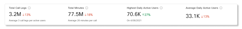
Key Performance Indicators (KPIs)
There are four KPIs that show at the top of the Calling Engagement tab. The range of data they measure changes as you select a new date range.
The four KPIs are:
-
Total Call Legs—The total number of call legs made and received by users.
-
Total Minutes—The total number of minutes for all the calls made over the selected date range. This number includes both the caller and receiver. For example, if a user calls another user for 30 minutes, then the total count is 60.
-
Highest Daily Active Users—The highest number of users that made or received call legs during a day within the selected date range.
-
Average Daily Active Users—The average number of users that made or received one call leg during the days within the selected date range.
Total Call Legs by Platform and Total Call Minutes by Platform
The Total Call Legs and Total Call Minutes graphs show how users have been making calls in your organization. The graphs show you the number of call legs and call minutes by platform type.
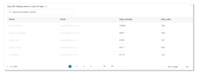
Top 300 Calling Users in Last 30 Days
This table shows the top 300 users that made or received the most call legs over the last 30 days. You can also use the data in this table to see how often users are turning on their video during their calls.
KPIs
There are two KPIs that show at the top of the Calling Engagement tab. The range of data they measure changes as you select a new date range.
The two KPIs are:
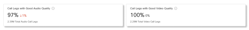
-
Audio Calls with Good Quality—The percentage of audio calls that had good quality over the selected date range. Calls are counted as having good quality if they were below 400ms latency and had less than 5% of packet loss.
-
Video Calls with Good Quality—The percentage of video calls that had good quality over the selected date range. Calls are counted as having good quality if they were below 400ms latency and had less than 5% of packet loss.
Charts and Table
Use the this view to identify users that are experiencing poor call leg quality, and to get an overall view of media quality across the organization.
We collect media quality data from each endpoint at the end of every call leg. The data is collected from desk phones and all the desktop apps, and you can see it in the Quality section of the Calling Analytics page.
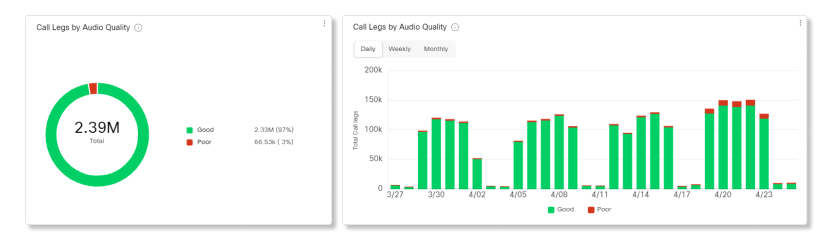
A call leg is considered to have poor media quality if it meets or exceeds any one of the following thresholds:
-
Packet loss of 5%
-
Latency of 400 ms
-
Jitter of 150 ms
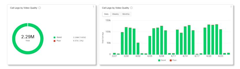
The Call Legs by Audio Quality and Call Legs by Video Quality graphs compare the proportion of calls that are within the quality threshold ("Good") against those that are "Above Threshold".
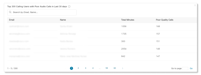
The Top 300 Calling Users with Poor Audio Quality in Last 30 Days table shows which users have experienced the most poor audio quality calls, because their quality measurements exceeded at least one threshold. Use search and ordering controls to quickly find a particular user.
If a particular user is experiencing poor media quality, you can check if all the user's endpoints are similarly affected. Common quality issues come from Android or iOS calling applications, which may be due to poor mobile internet connections. You can use the CScan tool to test a user's connection to the internet.
You can use the reports here to determine which devices are more popular with your users and which ones aren't. You can use this information when setting up places with shared devices. You can make sure that the more commonly used devices are set up in densely populated areas of your building or where the most meetings take place.
If you're a Pro Pack customer, you have access to historical metrics API that you can use to return daily aggregated devices-related data automatically.
The devices page shows usage metrics for Webex devices, including the Webex Desk Pro, Webex Room Panorama, DX80, and Webex room devices. Webex Share and other cloud-registered devices are not included in the usage metrics, but they're included in the inventory details list.
Key Performance Indicators (KPIs)
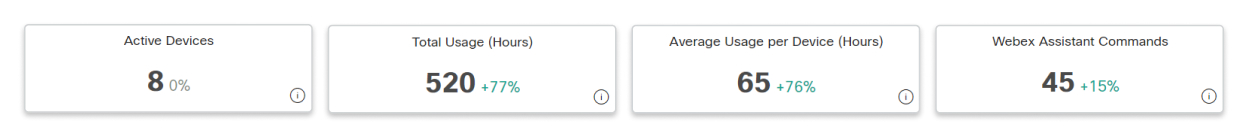
There are four KPIs that show at the top of the Devices Analytics page. They don't change as you navigate through the different tabs, but the range of data they measure changes as you select a new date range.
The four KPIs are:
-
Active Devices—Total number of active devices. Devices are counted as active when used to join calls, for local wired or wireless displays, whiteboarding, or in USB passthrough mode. The percentage change is this number compared against the number from the previous selected time period. For example, if 10 days are selected, the number is compared to the previous 10 days.
-
Total Usage (Hours)—Total number of hours that devices were used for. This usage includes when devices are used to join calls, for local wired or wireless displays, whiteboarding, in USB passthrough mode, and for digital signage.
-
Active Usage per Device (Hours)—The average number of hours that devices were used for any active or digital signage activities. The average is calculated as (number of Active Devices KPI) divided by (number of Total Usage KPI).
-
Webex Assistant Commands—Total number of voice commands from users in your organization.
The filters list corresponds with the devices you have setup throughout your organization. You can use this information to focus on a specific device. For instance, if you just deployed DX80s to all the users in your organization, then select DX80 as the filter.
Key performance indicators (KPIs)
KPIs are available at the top of the page to show you how often devices are being used within the date range that you selected. The KPIs available are:
-
Active Device—Total number of active devices. Devices are counted as active when used to join calls, for local wired or wireless displays, whiteboarding, or in USB passthrough mode. The percentage change is this number compared against the number from the previous selected time period. For example, if 10 days are selected, the number is compared to the previous 10 days.
-
Total Device Usage (Hours)—Total number of hours that devices were used for. This usage includes when devices are used to join calls, for local wired or wireless displays, whiteboarding, in USB passthrough mode, and for digital signage.
-
Active Usage per Device—The average number of hours that devices were used for any active or digital signage activities. The average is calculated as (number of Active Devices KPI) divided by (number of Total Usage KPI).

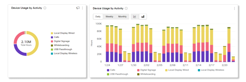
Device usage by activity
This chart shows the total usage (hours) of cloud-registered devices, including Cisco Webex Room Devices, Webex Boards, and Webex Shares. A device may be one of the following types of activities:
-
In Call—Device is used to join a meeting as a video endpoint.
-
Local Sharing Cable—Device is shared and connected locally by the user via a HDMI cable without joining any meetings or calls.
-
Local Sharing Wireless—Device is shared and connected locally by the user via WiFi without joining any meetings or calls.
-
Signage—Device is used as a multimedia display under Digital Signage mode.
-
USB Passthrough—Device is connected to a computer via a USB cable and used as a webcam.
-
Whiteboarding—Device is used as a whiteboard in a conference room without any users connected to it.
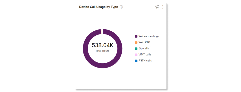
Device Call Usage by type
This chart breaks down the types of calls made from cloud-registered devices in your organization by duration.
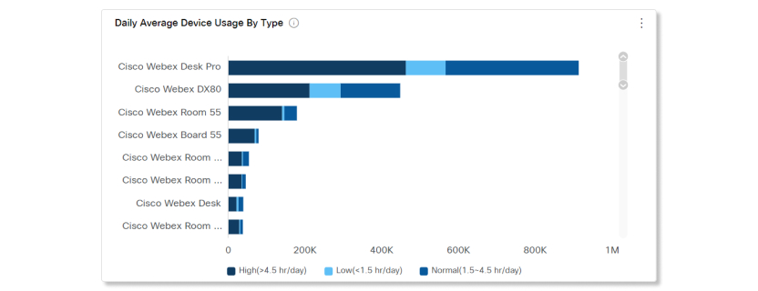
Daily Average Device Usage by Type
This chart breaks down how often specific devices are used across all activities over the selected date range. You can use this chart to see which devices are the most popular among users in your organization or to help drive engagement with devices that are in the low usage range.
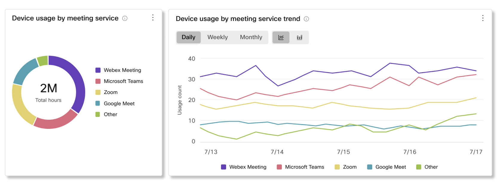
Device usage by meeting service and trend
This chart breaks down the meeting services that users in your organization are hosting and joining with Cisco devices. You can use this chart to help drive adoption with the meeting service that you want users to focus on.
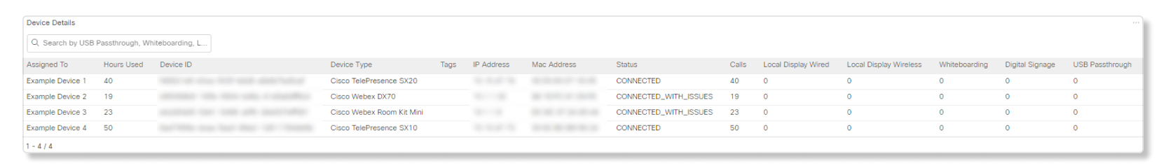
Device details
Use this table to see details of every device in your organization. Look at the Hours Used column to quickly pinpoint underutilized devices. It shows the total usage of the device over the selected time period. You can click on any of the columns to sort them.
-
Assigned To—Name of the place or user this device is assigned to. If this field is blank then the device was deleted from your organization.
-
Hours Used—Total usage over the selected time period.
-
Device ID—Unique identifier internal for administrators.
-
Device Type—Device model.
-
Tags—Shows tags assigned to the device on the Control Hub Devices page.
-
IP Address—Last known IP address of when the device was online.
-
Mac Address—Media Access Control address of the device.
-
Status—Device online status from the last 24 hours.
-
Calls—The number of hours the device was used for a call.
-
Local Display Wired—The number of hours the device was used for a wired local display.
-
Local Display Wireless—The number of hours the device was used for a wireless local display.
-
Whiteboarding—The number of hours the device was used for whiteboarding.
-
Digital Signage—The number of hours the device was used for digital signage.
-
USB Passthrough—The number of hours the device was used for USB passthrough.
Analytics for Webex Assistant for Devices are supported for:
-
Room Kit
-
Room Kit Mini
-
Room Kit Plus
-
Room Kit Pro
-
Room 55 and 55 Dual
-
Room 70 and 70 G2
-
Webex Board 55 and 55S
-
Webex Board 70 and 70S
-
Webex Board 85S
-
Desk Pro
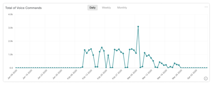
Total of Voice Commands
This chart shows you the trend for the number of voice commands that users are saying to the Webex Assistant for Devices in your organization. These numbers give you insights on how often users are utilizing Webex Assistant for Devices, and how you can help users make use of it more often.
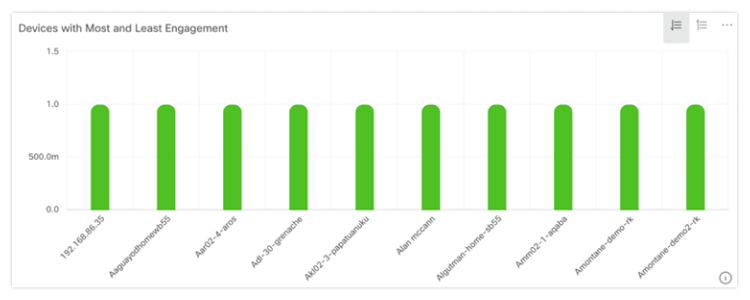
Devices with Most and Least Engagement
This chart shows you the top 10 and bottom 10 list of devices that responded to voice commands from users over the selected time period. You can use this chart to get an idea of which devices get the most use, and how you can help get more use out of the devices with the least engagement.
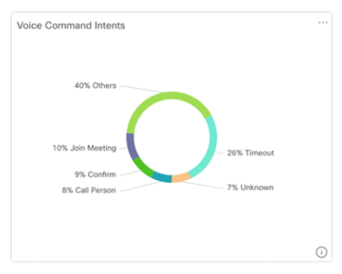
Voice Command Intents
A breakdown of voice command intents from users in your organization. You can see which intents are the most used, and see why some intents aren't used as often as others.
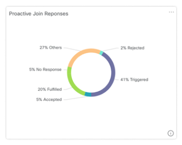
Proactive Join Responses
A breakdown of how users responded to the prompts given by the Webex Assistant on devices with Proactive Join enabled. You can use this breakdown to see if users are making use of the Proactive Join feature, or if they're not aware of it, you can help users adopt it.
With the Customer Experience Essentials offering, you have access to data that helps you gauge the productivity of call queues and agents.
To access this data in Control Hub, go to .
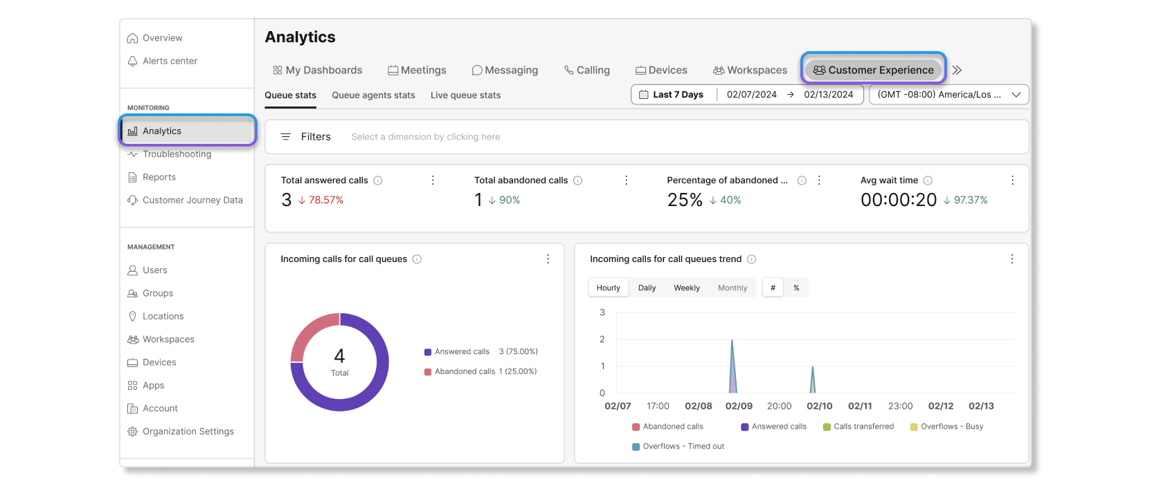
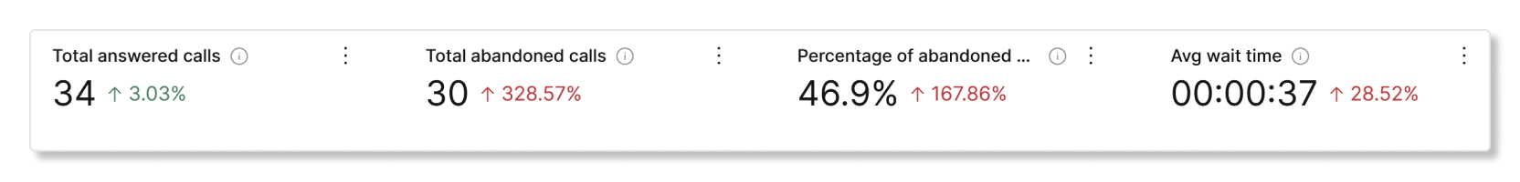
KPIs
KPIs are available at the top of the page to show you a quick high-level status of incoming calls in call queues within the date range that you selected. The KPIs available are:
- Total answered calls—Total number of calls that agents answered. The percentage shows the change in value over time by comparing it with the past data of the date range selected.
- Total abandoned calls—Total number of calls where the caller hung up or left a message before an agent became available. The percentage shows the change in value over time by comparing it with the past data of the date range selected.
- Percentage of abandoned calls—Percentage of calls where the caller hung up or left a message before an agent became available. The percentage shows the change in value over time by comparing it with the past data of the date range selected.
- Avg wait time—Average time that callers spent waiting for the next available agent to answer the call. The percentage shows the change in value over time by comparing it with the past data of the date range selected.
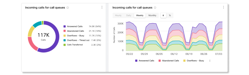
Incoming calls for call queues and trend
This chart shows a breakdown of call queue statistics by incoming calls. You can use this chart to see how call queues are handling all the incoming calls to your organization.
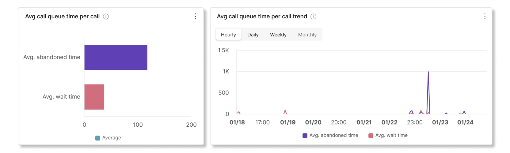
Avg call queue time per call and trend
This chart shows a breakdown between the average abandoned and average wait minutes from incoming calls. You can use this chart to see how long callers had to wait before hanging up the call or getting transferred to an agent. Average minutes are calculated as:
- Avg. abandoned time—Average call time that the callers spent waiting for an agent before hanging up or selecting the option to leave a message.
- Avg. wait time—Average time that callers spend waiting for the next available agent to answer the call.
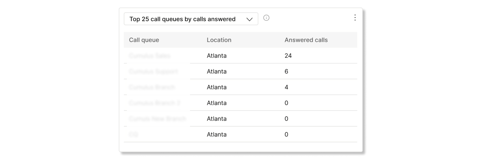
Top 25 call queues by status of calls
This table shows the top 25 call queues with the most calls by a specific status. The statuses of calls available are:
- Answered calls—Number of calls answered by agents.
- % of answered calls—Percentage of calls answered by agents.
- Abandoned calls—Number of calls where the caller hung up or left a message before an agent became available.
- % of abandoned calls—Percentage of calls where the caller hung up or left a message before an agent became available.
- Overflows - Busy—Number of calls that overflowed to a different call queue because the queue limit was met.
- Overflows - Timed out—Number of calls that overflowed to a different call queue because the wait time exceeded the maximum configured limit.
- Calls transferred—Number of calls that were transferred out of the queue.
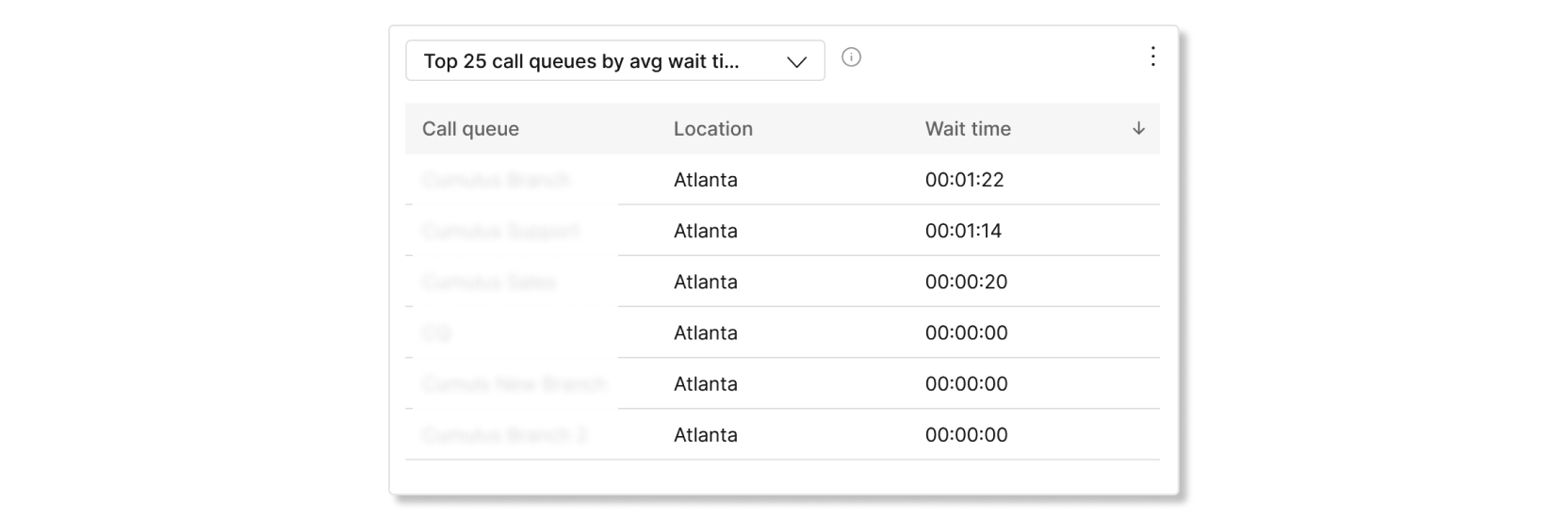
Top 25 call queues by avg wait and abandoned time
This table shows the top 25 call queues with the highest average wait and abandoned times from incoming calls. Average time are calculated as:
- Avg abandoned time—Average call time that the callers spent waiting for an agent before hanging up or selecting the option to leave a message.
- Avg wait time—Average call time that callers spend waiting for the next available agent to answer the call.
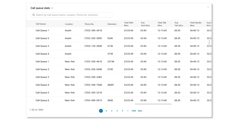
Call queue stats
This table shows details of call queues that have been set up in your organization. You can use this table to see the number of incoming calls to call queues and the status of those calls. You can also search for specific call queues, locations, phone numbers, and extensions by using the search bar in the table. The details available are:
- Call queue—Name of the call queue.
- Location—Location assigned to the call queue.
- Phone No.—Phone number assigned to the call queue.
- Extension—Extension number assigned to the call queue.
- Total hold time—Total time that calls were placed on hold by agents.
- Avg hold time—Average time that calls were placed on hold by agents.
- Total talk time—Total time that agents were actively talking on calls.
- Avg talk time—Average time that agents were actively talking on calls.
- Total handle time—Total time that agents spent handling calls. Handle time is calculated as Total talk time + Total hold time = Total handle time.
- Avg handle time—Average time that agents spent handling calls.
- Total wait time—Total time that callers spent waiting for the next available agent to answer the call.
- Avg wait time—Average time that callers spent waiting for the next available agent to answer the call.
- Calls answered—Number of calls answered by agents.
- % Answered calls—Percentage of calls answered by agents.
- Calls abandoned—Number of calls where the caller hung up or left a message before an agent became available.
- % Abandoned calls—Percentage of calls where the caller hung up or left a message before an agent became available.
- Avg abandoned time—Average time where callers hung up or left a message before an agent became available.
- Abandoned time—Time where callers hung up or left a message before an agent became available.
- Total calls—Total number of incoming calls.
- Overflow - Busy—Number of calls that overflowed because the queue limit was met.
- Overflow - Timed out—Number of calls that overflowed because the wait time exceeded the maximum limit.
- Calls transferred—Number of calls that were transferred out of the queue.
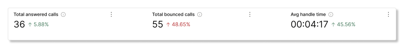
KPIs
KPIs are available at the top of the page to show you details about the calls that agents handled within the date range that you selected. The KPIs available are:
- Total answered calls—Total number of presented calls that were answered by agents. The percentage shows the change in value over time by comparing it with the past data of the date range selected.
- Total bounced calls—Total number of calls that were presented to an agent but weren't answered. The percentage shows the change in value over time by comparing it with the past data of the date range selected.
- Avg. handle time—Average time that agents spend on handling calls. The percentage shows the change in value over time by comparing it with the past data of the date range selected.
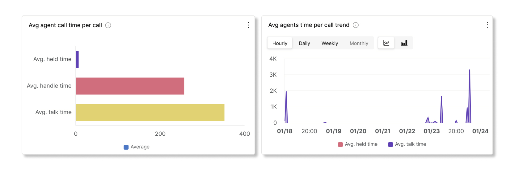
Avg agent call time per call and trend
This chart shows on average how long each call lasts by their call status. You can use this chart to see if callers are getting the help they need in a timely manner.
Incoming calls to agents by call status
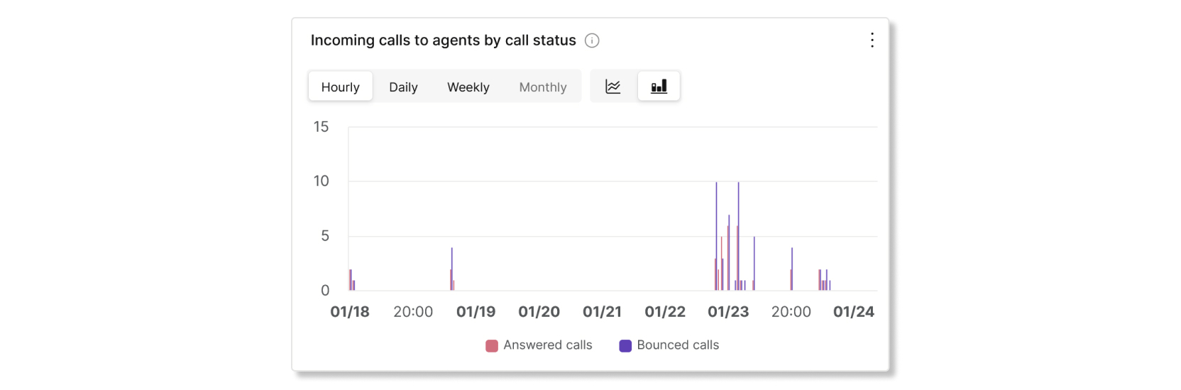
This chart shows a breakdown of incoming calls to agents based on the call status. This chart can help you see if there are more bounced calls than usual.
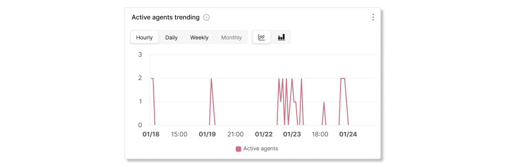
Active agents trending
This chart shows a trend of active agents during certain date ranges. You can compare the numbers of agents in this chart with another chart, such as with Incoming calls to agents by call status, to see if there are enough agents to handle the number of calls.
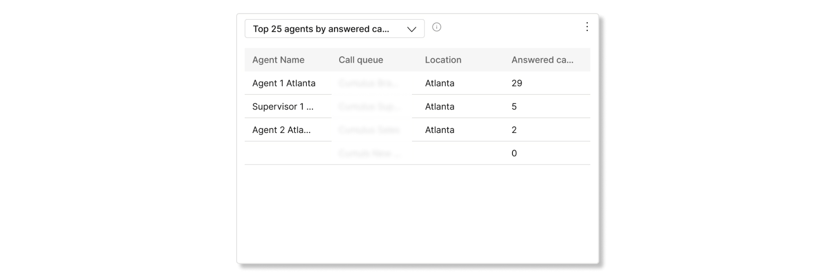
Top 25 agents by answered and bounced calls
This table shows the top 25 agents with the most answered or bounced calls.
Top 25 agents by avg talk and avg held time
This table shows the top 25 agents with the highest average talk or hold minutes.

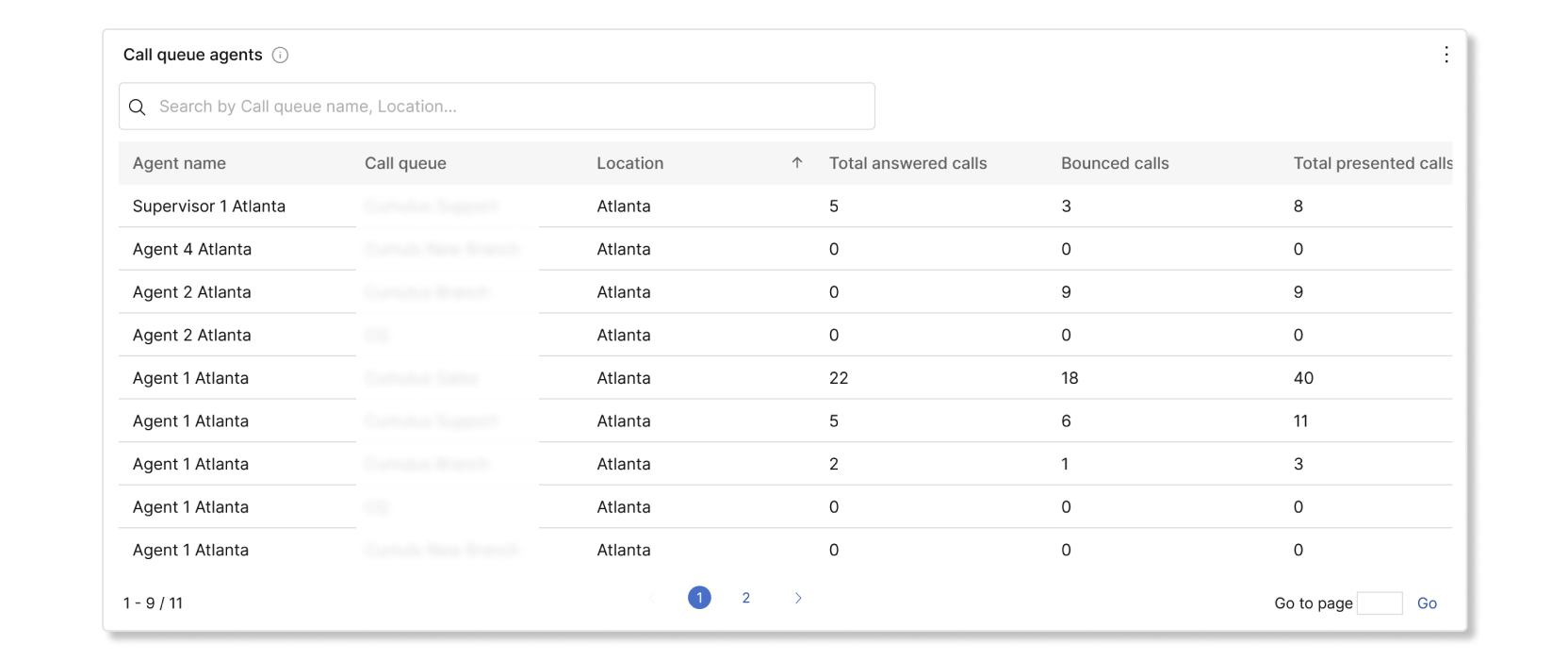
Call queue agents
This table shows details of all the agents that have been assigned to call queues in your organization. You can use this table to see which agent gets the most calls and information about their calling stats. You can also search for specific agent or workspace names, call queues, and locations by using the search bar in the table. The details available are:
- Agent name—Name of the agent or workspace.
- Call queue—Name of the call queue.
- Location—Location assigned to the call queue.
- Total answered calls—Number of calls that were presented to the agent and answered by them.
- Bounced calls—Number of calls that were presented to the agent but went unanswered.
- Total presented calls—Number of inbound calls to the agent that were distributed by the call queue.
- Total talk time—Total time that an agent spent actively talking on calls.
- Avg. talk time—Average time that an agent spent actively talking on calls.
- Total hold time—Total time that an agent put calls on hold.
- Avg. hold time—Average time that an agent put calls on hold.
- Total handle time—Total time that an agent spent handling calls. Handle minutes are calculated as Total talk time + Total hold time = Total handle time.
- Avg. handle time—Average time that an agent spent handling calls.
KPIs
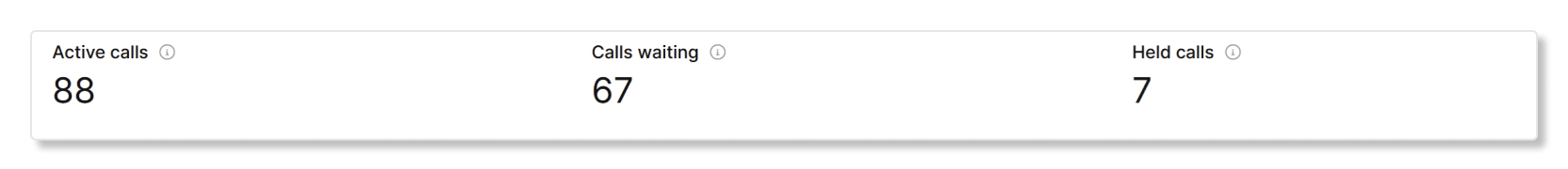
KPIs are available at the top of the page to show you all the current incoming calls and what their statuses are to help you monitor call queues in real time. The KPIs available are:
- Active calls—Shows the number of calls where agents are talking to callers.
- Calls waiting—Shows the number of calls that are waiting for the next available agent to answer.
- Held calls—Shows the number of calls that agents placed on hold.
Live call queue stats
This table shows details of all the call queues that have been set up in your organization. You can use this table to see which call queue gets the most calls and adjust the number of agents as needed. You can also search for specific call queues, locations, phone numbers, and extensions by using the search bar in the table. The details available are:
- Call queue—The name of the call queue.
- Location—The location assigned to the call queue.
- Phone no.—The phone number assigned to the call queue.
- Extension—The extension assigned to the call queue.
- Active calls—The number of calls where agents are talking to callers.
- Held calls—The number of calls that agents have placed on hold.
- Calls waiting—The number of calls that are waiting for the next available agent.
Supervisor desktop
As a supervisor in Customer Experience Essentials, you have access to the following charts in Webex App.
KPIs
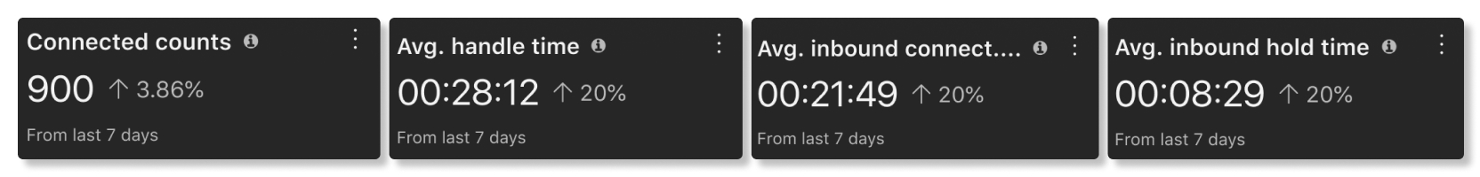
KPIs are available at the top of the page to show you details about how agents are handling calls. The KPIS available are:
- Connected counts—Number of connected calls answered by agents over the selected date range.
- Avg. handle time—Average amount of time that agents spent handling calls over the selected date range.
- Avg. inbound connected time—Average amount of time that agents spent connected with calls over the selected date range.
- Avg. inbound hold time—Average amount of time that agents put an inbound call on hold over the selected date range.
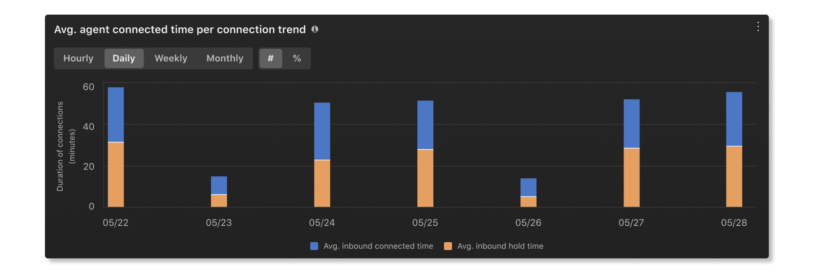
Avg. agent connected time per connection trend
This chart shows a trend of inbound status times of agents per connection over the selected date range. This chart helps you see if hold times are increasing over time because there aren't enough agents or if calls are getting answered in a timely manner.
Avg. inbound connected time by agents
This chart shows the agents with the longest average inbound connected times in ascending or descending order over the selected date range. You can use this chart to see if there are any outliers in how long calls can take.

Avg. inbound hold time by agents
This chart shows the agents with the longest average inbound hold times in ascending or descending order over the selected date range. You can use this chart to see if more agents are needed in a specific call queue if calls are getting put on hold for longer than average.

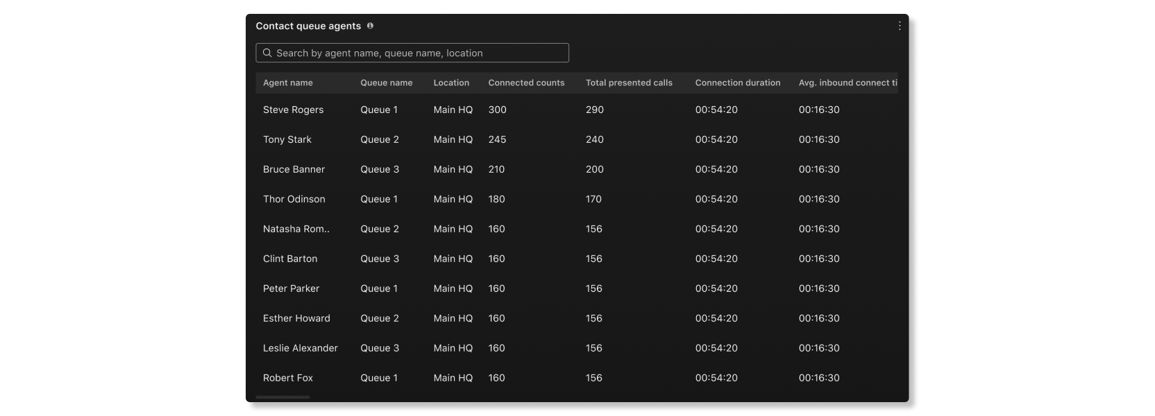
Contact queue agents
This table shows details of the agents that have been assigned to call queues in your organization. You can use this table to see which agent gets the most calls and information about their calling stats. The details available are:
- Agent name—Name of the agent.
- Queue name—Name of the call queue.
- Location—Location assigned to the call queue.
- Connected count—Number of calls that the agent answered.
- Total presented calls—Number of inbound calls to the agent that were distributed by the call queue.
- Connection duration—Amount of time that the agent spent on connected calls.
- Avg. inbound connect time—Average amount of time that the agent spent connected with calls.
- Hold duration—Amount of time that callers were put on hold.
- Avg. inbound hold time—Average amount of time that the agent put calls on hold.
- Total handle time—Total time that an agent spent handling calls. Handle time is calculated as Hold duration + Connected duration = Total handle time.
- Avg. handle time—Average time that an agent spent handling calls.
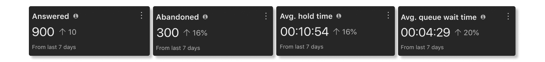
KPIs
KPIs are available at the top of the page to show you the high-level status of call queues. The KPIs available are:
- Answered—Number of calls that agents answered over the selected date range.
- Abandoned—Number of calls where the caller hung up or left a message before an agent became available over the selected date range.
- Avg. hold time—Average time that agents put callers on hold over the selected date rage.
- Avg. queue wait time—Average time that callers spent waiting for the next available agent to answer the call over the selected date range.
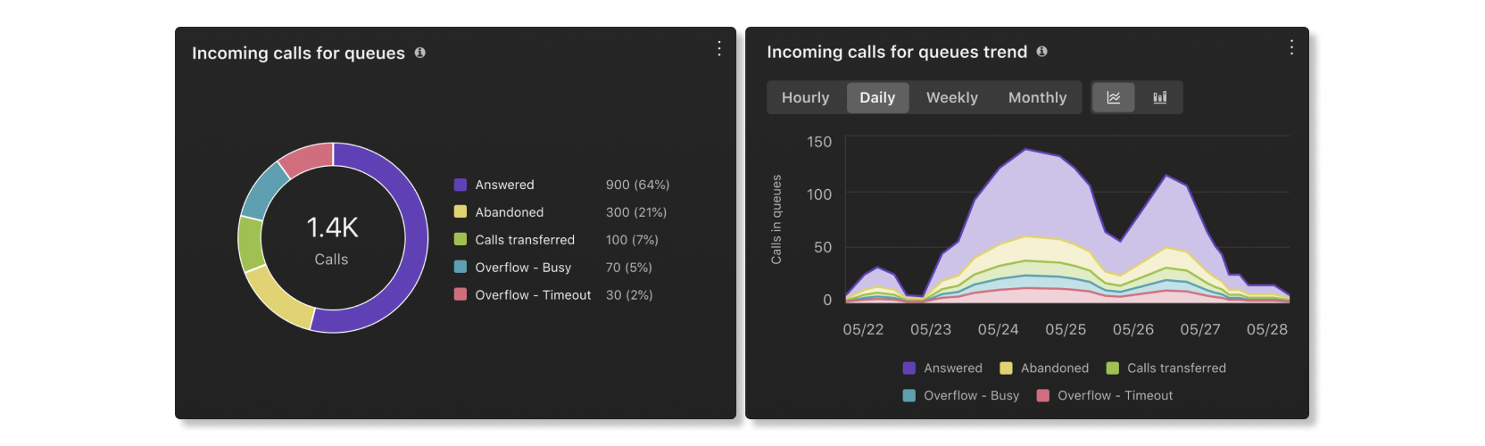
Incoming calls for queues and trend
These charts categorize incoming calls based on their statues. You can use this chart to get a general overview of how call queues are performing.
Avg. queue wait time per call
This chart shows the call queue with the longest average wait time per call by ascending or descending order over the selected date range. You can use this chart to see which call queue needs more agents assigned to it to help reduce the wait time.

Avg. queue hold time per call
This chart shows the call queue with the longest average hold time per call by ascending or descending order over the selected date range. You can use this chart to see when callers were put on hold for longer than average.

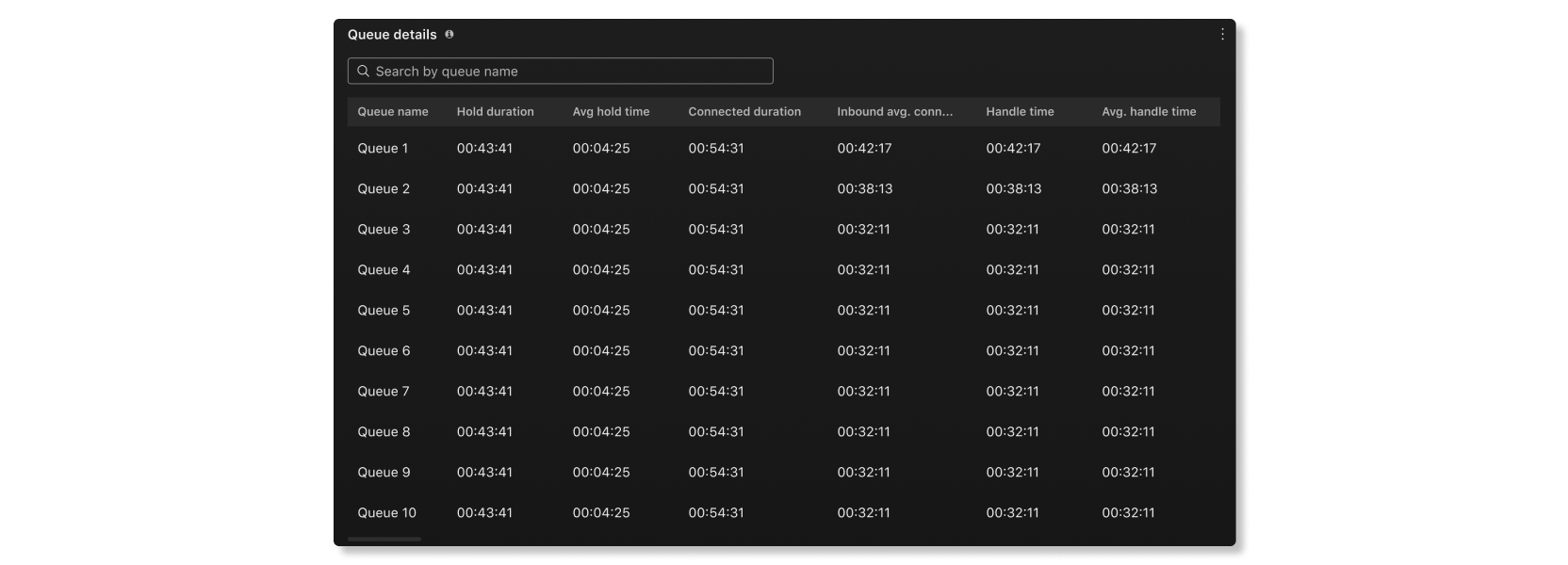
Queue details
This table shows details about call queues that have been set up in your organization. You can use this chart to see how agents in each call queue are performing. The details available are:
- Queue name—Name of the call queue.
- Hold duration—Amount of time that callers were put on hold.
- Avg hold time—Average amount of time per call that callers were put on hold.
- Connected duration—Amount of time that callers talked to agents.
- Inbound avg. connected duration—Average amount of time per call that callers talked to agents.
- Handle time—Amount of time that agents spend handling calls. Handle time is calculated as Hold duration + Connected duration = Handle time.
- Avg. handle time—Average amount of time that agents spent handling calls.
- Queue time—Amount of time that callers spent waiting for the next available agent to answer the call.
- Avg. queue wait time—Average time that callers spent waiting for the next available agent to answer the call.
- Answered—Number of calls answered by agents.
- Abandoned—Number of calls where callers hung up or left a message before an agent became available.
- Total calls—Total number of incoming calls.
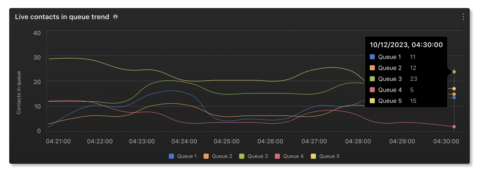
Live contacts in queue trend
This chart shows how many callers are currently waiting in a queue. You can use this chart to see when the peak calling times are so that you can adjust call queues or reassign agents as needed.
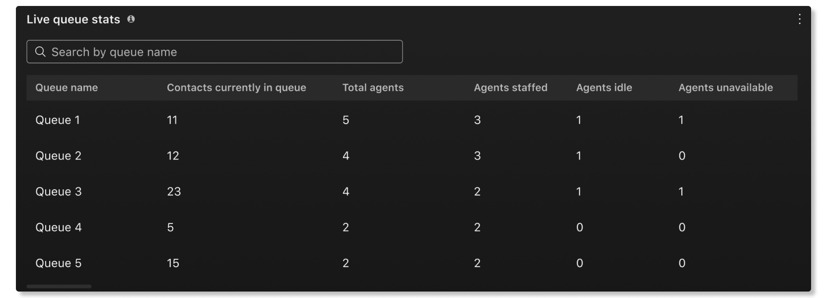
Live queue stats
This table shows details of agent statuses and the number of contacts waiting in queues. You can use this table to see if you need to adjust the number of agents in certain queues. The details available are:
- Queue name—Name assigned to the call queue.
- Contacts currently in queue—Number of callers that are waiting for an agent to be available.
- Total agents—Number of agents assigned to the call queue.
- Agents staffed—Number of agents that are currently working in the call queue.
- Agents idle—Number of agents that aren't on a call.
- Agents unavailable—Number of agents that are on a call.
Agent desktop
Live contacts in queue trend
This chart shows how many callers are currently waiting in a queue. You can use this chart to see when the peak calling times are so that you can adjust call queues or reassign agents as needed.
Live queue stats
This table shows details of agent statuses and the number of contacts waiting in queues. You can use this table to see if you need to adjust the number of agents in certain queues. The details available are:
- Queue name—Name assigned to the call queue.
- Contacts currently in queue—Number of callers that are waiting for an agent to be available.
- Total agents—Number of agents assigned to the call queue.
- Agents staffed—Number of agents that are currently working in the call queue.
- Agents idle—Number of agents that aren't on a call.
- Agents unavailable—Number of agents that are on a call.
Reports now have its own section under Monitoring in the left navigation of Control Hub, along with a separate article for it.


