
Thanks for your feedback.
Analytics for Your Cloud Collaboration Portfolio
 Feedback?
If you have Pro Pack, you can currently select a date range of up to 13 months in Analytics and Reports. Starting January 27, 2026, the maximum date range that you can select will be 3 months at a time. You'll still have access to 13 months of historical data, but you’ll need to run multiple reports if you want to review longer time periods. This update improves performance and helps reports generate faster.
For example, if you want to view the last 6 months of data starting from November, you’ll need to run two date ranges: one from June through August, and another from September through November.
As a full administrator, read-only administrator, or support administrator of an organization, you have access to various charts in Control Hub, depending on your deployment. You can use this information to evaluate how Webex services and devices are being used in your organization and how often. For example, you can use analytics to track and measure services in your cloud collaboration portfolio.
Analytics data is for your general use and shouldn't be used for billing purposes. Analytics data isn't available for Webex Online customers (sites that have the *.my.webex.com format)
If you've linked your Site Administration account to Control Hub, then you can access the Analytics page through Site Administration.
Historical charts are standard in Control Hub. Most charts are available in daily, weekly, and monthly format. The amount of data you have access to depends on the type of customer you are. If you're a standard customer, you have access to 3 months of data. If you're a Pro Pack customer, you have access to 13 months of data.
Dashboard tips
Global filters
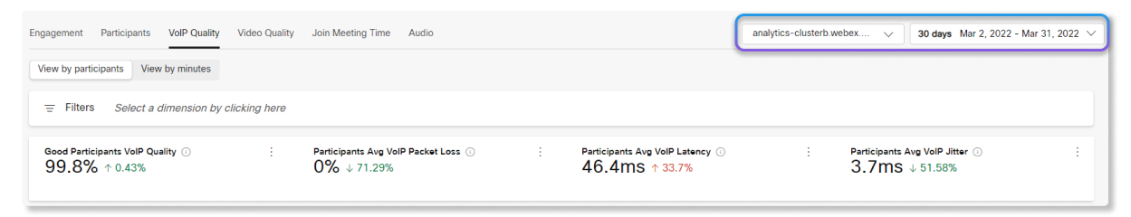
Dashboards contain powerful filtering tools. Click on the Filters bar to select which data you want to see. The filters that you select will automatically apply to all of the charts.
Select all functionality
The Analytics filter now supports Select all functionality. After choosing a filter category, you can search by keyword and select results in bulk. You can apply up to 200 results as a filter within each category. If a category contains more than 200 results, you can narrow the list by typing additional keywords to refine your search.
View Analytics
Analytics data, except for Meetings, is batch processed each day. Data is made available within 24 hours and metrics are available by 1:00PM GMT the next day. Meetings data is updated every 10 minutes.
Apart from Video Mesh, all reports are in Greenwich Mean Time (GMT).
| 1 |
Sign in to Control Hub, go to Analytics, and then select which data to look at. If you manage your Webex site in Control Hub, then you also have access to Site Admin Classic Reports. |
| 2 |
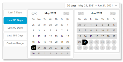
Select which date range you want to view the data for with the calendar date selector.
|
| 3 |
Change the date range for the chart: Daily, Weekly, or Monthly. If your charts don't load, enable third-party cookies in your browser. If you prefer to control which third-party cookies your browser accepts, you can add *.webex.com to the list of exceptions. If third-party cookies are already enabled, try clearing your browser cache. |
| 4 |
To save an individual chart, choose a chart, click the more If you choose CSV, you'll export all of the data for the selected report. If you select PNG or PDF, you get a copy of the data shown on the screen only.
|
 button, and then choose a file type.
Meetings Analytics provides you with details and descriptions about who's using Webex meetings, regardless of whether it's a Personal Room Meeting or a standard Webex meeting. You can also find out how many minutes people are spending in meetings, the quality of those meetings, and what type of audio people are using.
Use the Webex site selector and calendar date selector at the top-right corner of the page to select the metrics you want to view.
Global filters
The dashboard contains powerful filtering tools. Click on the Filters bar to select which data you want to see. The filters that you select will automatically apply to all of the charts.
KPIs
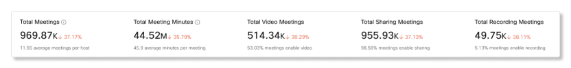
There are five KPIs that show at the top of the Meetings Engagement tab. The range of data they measure changes as you select a new date range.
The five KPIs are:
-
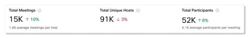
Total Meetings—Use this KPI to see if users are regularly hosting Webex meetings in your organization. If this number is low, you can follow up with users to find out why they're not using their hosting capabilities.
-
Total Meeting Minutes—Use this KPI to see to get a sense of how long meetings are being held for in your organization.
-
Total Video Meetings—Use this KPI to see if users are turning on their video during meetings. If this number is low, you can check the Quality tab to look at the video quality charts to determine if there were any media quality issues.
-
Total Sharing Meetings—Use this KPI to see if users are sharing their screens during meetings.
-
Total Recording Meetings—Use this KPI to see if users are recording their meetings.
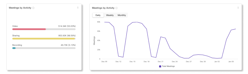
Meetings by Activity
Use these charts to see a breakdown for the number of meetings where users turned on their video, shared their screen, or started a recording. This information helps you find out if users are engaged in meetings. Click on one of the filters on the left-side chart to change the data for the trending chart on the right side and both Meeting Minutes by Activity charts.
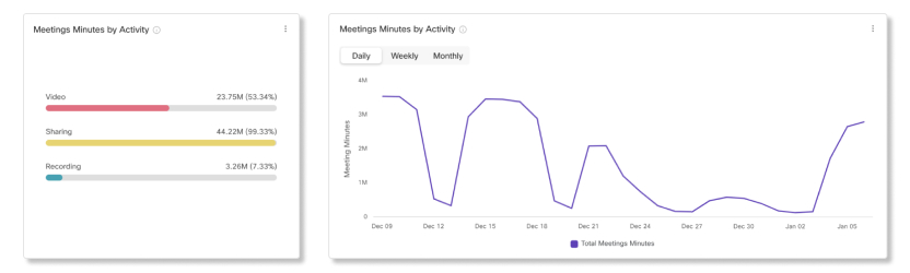
Meeting Minutes by Activity
Use these charts to see a breakdown for how long users turned on their video, shared their screen. or started a recording. If engagement isn't high for these activities, you can reach out to users and inform them of the benefits for utilizing each activity.
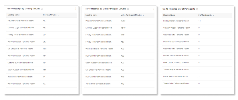
Top 10 Meetings by Meeting Minutes
This table shows the top 10 meetings that had the longest duration.
Top 10 Meetings by Video Participant Minutes
This table shows the top 10 meetings which had the longest duration for participants who turned on their video.
Top 10 Meetings by # of Participants
This table shows you which meetings had the most number of participants.
KPIs
There are three KPIs that show at the top of the Meetings Participants tab. The range of data they measure changes as you select a new date range.
The three KPIs are:
-
Total Meetings—Use this KPI to see if users are reguarly hosting Webex meetings in your organization. If this number is low, you can follow up with users to find out why they're not using their hosting capabilities.
-
Total Unique Hosts—Use this KPI to see how many users are utilizing host licenses. If this number is low, you can consider switching some users to an attendee account to free up host licenses.
-
Total Participants—Use this KPI to see the total number of joins by participants and devices.
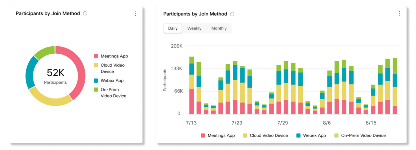
Participants by Join Method
Use these charts to see a breakdown of clients that participants used to join meetings.
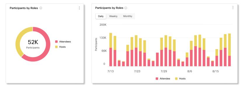
Participants by Roles
Use these charts to see a breakdown of host and attendee accounts used to join meetings. If more host accounts are joining meetings than attendee accounts, you can reassign hosts who aren't regularly hosting to attendee accounts.
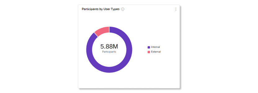
Participants by User Types
Use this chart to see a breakdown of users that joined meetings from your organization and users that joined as guests or from an external organization. This chart can help you keep track of how many external users have access to your meetings and if you want to change any security measures.
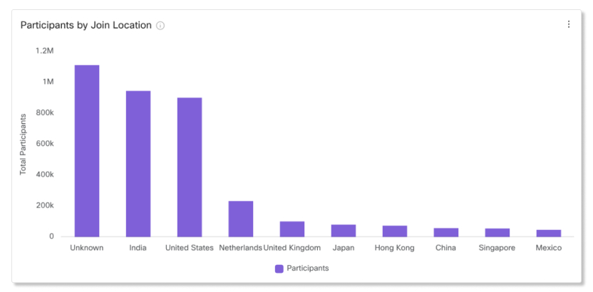
Participants by Join Location
Use these charts to see a breakdown of locations that participants joined meetings from. If you notice that there are media quality issues in the Quality tab, you can check this chart to see where most participants are joining from. You can then determine if the issue is coming from a certain location or if something else is the root cause.
The location for users who join meetings with the Webex app and video devices will show up as unknown.
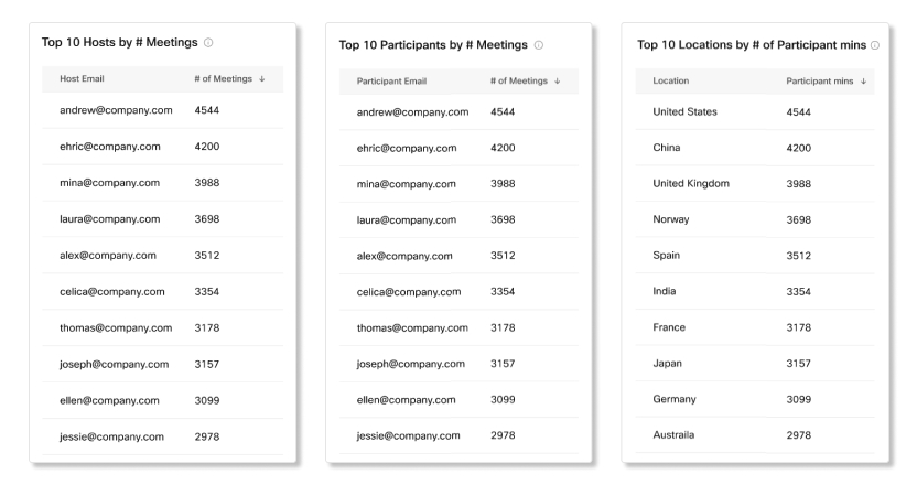
Top 10 Hosts by # Meetings
This table shows the top 10 hosts who scheduled and started the most meetings.
Top 10 Participants by # Meetings
This table shows the top 10 participants who joined the most meetings.
Top 10 Location by # of Participant Mins
This table shows the top 10 locations that had the most participant minutes.
KPIs
There are three KPIs that show at the top of the Meetings Audio tab. The range of data they measure changes as you select a new date range.
The three KPIs are:
-
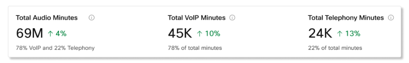
Total Audio Minutes—Use this KPI to see the total number of VoIP and telephony minutes used during meetings in your organization.
-
Total VoIP Minutes—Use this KPI to see the total number of VoIP minutes used during meetings in your organization.
-
Total Telephony Minutes—Use this KPI to see the total number of telephony minutes used during meetings in your organization. Depending on if your organization prefers VoIP or telephony minutes, you can look at the charts below to see a breakdown of why this number is high or low.
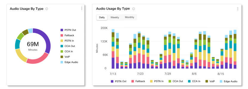
Audio Usage by Type
Use these charts to determine the types of audio that users are connecting to meetings with. You can take action if your organization has a preferred type of audio that users should be adopting. For example, if your organization has deployed Edge Audio, but the usage for it is low, you can reach out to users and find out why they aren't connecting through Edge Audio.
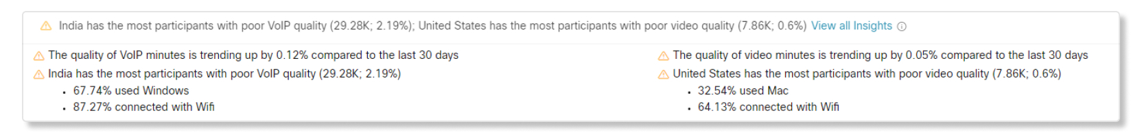
Insights
These insights provide you with a quick glance of where participants experienced the most poor media quality during meetings. You can use this information to get a sense of what filters and charts to look at so you can help diagnose and mitigate the problem.
Key Performance Indicators (KPIs)
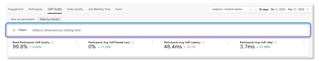
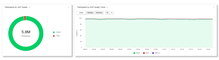
KPIs are available at the top of the page to show you what the VoIP/video quality was like for participants or minutes within the date range that you selected. You can use these KPIs as measurable data to see if participants are having VoIP/video quality issues during meetings in your organization. The KPIs available are:
-
Good Participants or Minutes VoIP/Video Quality—Shows the percentage of participants or minutes that were above the good VoIP/video quality threshold. VoIP/video quality is counted as good if packet loss was less than or equal to 5% and latency was less than or equal to 400ms.
-
Participants or Minutes Avg VoIP/Video Packet Loss—Shows the average VoIP/video packet loss of participants or minutes over the selected date range.
-
Participants or Minutes Avg VoIP/Video Latency—Shows the average VoIP/video latency of participants or minutes over the selected date range.
-
Participants or Minutes Avg VoIP/Video Jitter—Shows the average VoIP/video jitter of participants or minutes over the selected date range.

Participants or Minutes by VoIP/Video Quality and Trend
This chart shows a breakdown between good and poor VoIP/video quality for participants or minutes in your organization. If there's a sudden spike of participants or minutes with poor VoIP/video quality, you can view the metrics for that specific date range and compare the metrics between all the other charts available to you and see if there are any common anomalies.
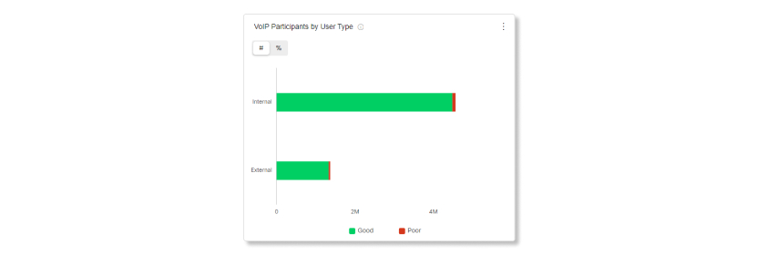
VoIP/Video Participants or Minutes by User Type
This chart shows you a breakdown of VoIP/video participants or minutes by internal or external. Internal are users in your organization. External are users who join meetings hosted in your organization as guests. You can use this chart to help determine if VoIP/video quality issues are affecting participants inside your organization, or if it's a problem coming from outside your organization.
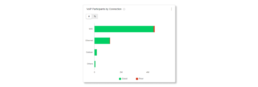
VoIP/Video Participants or Minutes by Connection
This chart shows you a breakdown of VoIP/video participants or minutes by connection type. You can use this chart to help determine if VoIP/video quality issues are affecting all participants in your organization, or if it's limited to specific connection types.
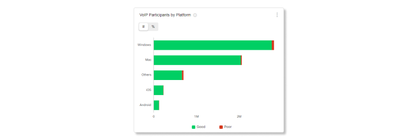
VoIP/Video Participants or Minutes by Platform
This chart shows you a breakdown of VoIP/video participants or minutes by platforms. You can use this chart to help determine if VoIP/video quality issues are affecting all participants in your organization, or if it's limited to specific platforms.
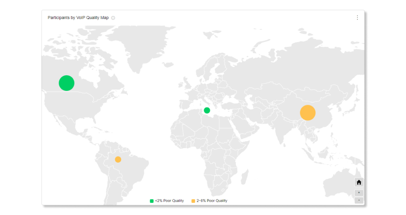
Participants or Minutes by VoIP/Video Quality Map
This map shows the overall geographic distribution of VoIP/video participants or minutes. It also shows a breakdown by VoIP/video quality over the selected date range. This visualization helps you glance quickly at which locations are having VoIP/video quality issues.
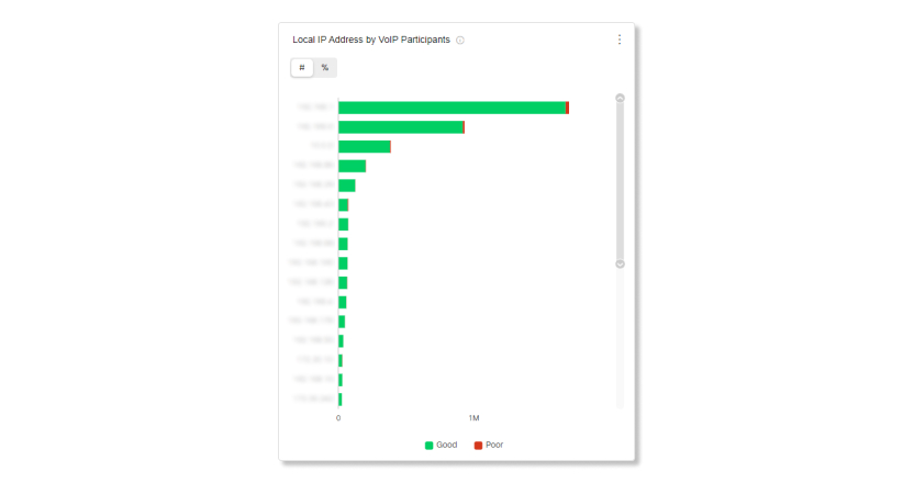
Local IP Address by VoIP/Video Participants or Minutes
This chart shows you a breakdown of local IP addresses that participants are connected to. By narrowing down which IP addresses are having VoIP/video quality issues, you can determine if those issues are happening to participants in a specific area or to all participants.
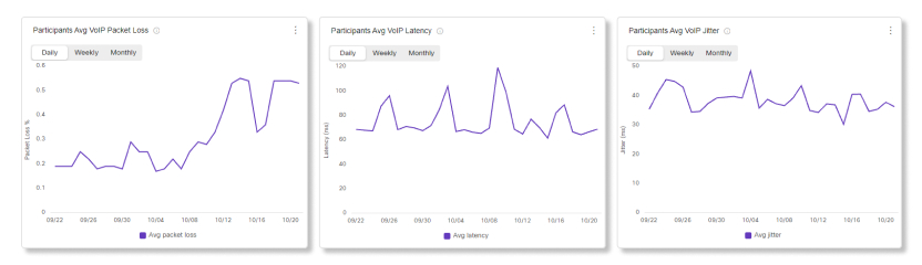
Participants or Minutes Avg VoIP/Video Packet Loss, Latency, and Jitter
These charts show you a trend of what the average VoIP/video packet loss, latency, and jitter were like over the selected date range. You can use these charts to see if any of the average are trending upward to determine if issues are happening from a specific media quality, or all.
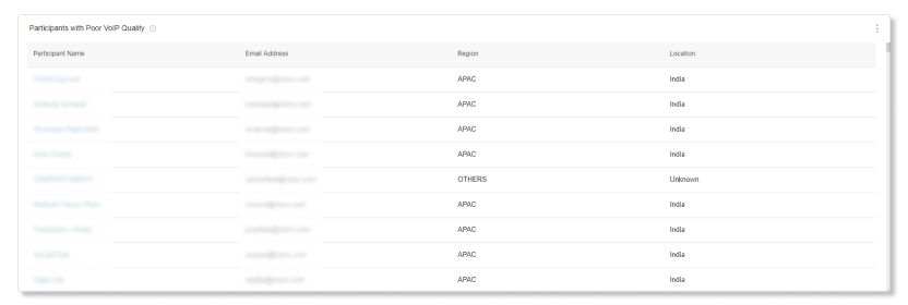
Participants with Poor VoIP/Video Quality
For each day of the last 21 days, we capture the worst 350 participants with poor quality. Depending on the date range selected, the top 300 participants who had the poorest quality show up on the list.
For example, on the first day, 350 participants with the poorest quality are captured for that day. On the second day, an independent set of 350 participants with the poorest quality are captured for that day. The table then captures the worst 300 participants between all those days and lists them on the table.
This table only shows the worst offenders from the last 21 days.
Key Performance Indicators (KPIs)
KPIs are available at the top of the page to show you what the join meeting times were like for participants within the date range that you selected. You can use these KPIs as measurable data to see if participants are having JMT issues during meetings in your organization. The KPIs available are:
-
Avg Join Meeting Time—Shows the average join meeting times of participants over the selected date range.
-
Avg Join Meeting Time of Returning Users—Shows the average join meeting times of participants who joined meetings for the second time and on after updating to a new version of the Webex App.
-
Avg Join Meeting Time of Updated/New Users—Shows the average join meeting time of participants who joined a meeting for the first time after updating the Webex App and participants who joined a meeting for the first time with the Webex App.

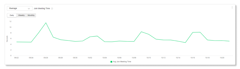
Join Meeting Time
This chart shows a trend of the average, 75th percentile, or 95th percentile join meeting times of all participants in your organization. If there's a sudden spike of participants with high join meeting times, you can view the metrics for that specific date range and compare the metrics between all the other charts available to you. For example, you can check the Join Meeting Time Count by Location chart to see if high join meeting times are only happening at a specific location.
Join Meeting Time by User Type
This chart shows a breakdown between the join meeting times of internal and external participants. Internal are users in your organization. External are users who join meetings hosted in your organization as guests. You can use this chart to help determine if join meeting time issues are affecting participants inside your organization, or if it's a problem coming from outside your organization.

Join Meeting Time by User Status
This chart shows a breakdown of join meeting times for specific types of users. New users might take longer than returning users to join a meeting since they have to download the software. Updated users might take longer to join a meeting since they waited to update the app right before joining a meeting. By seeing how long each type of users takes to join a meeting, you can take proactive steps on how to mitigate these issues, like sending out information on what changed before a new update rolls out, or sending out instructions to new users on how to join a Webex meeting.

Join Meeting Time by Platform
This chart shows a breakdown of join meeting times by platforms. This data can help you see if any issues with joining meetings are affecting your whole organization, or if it's limited to specific platforms.

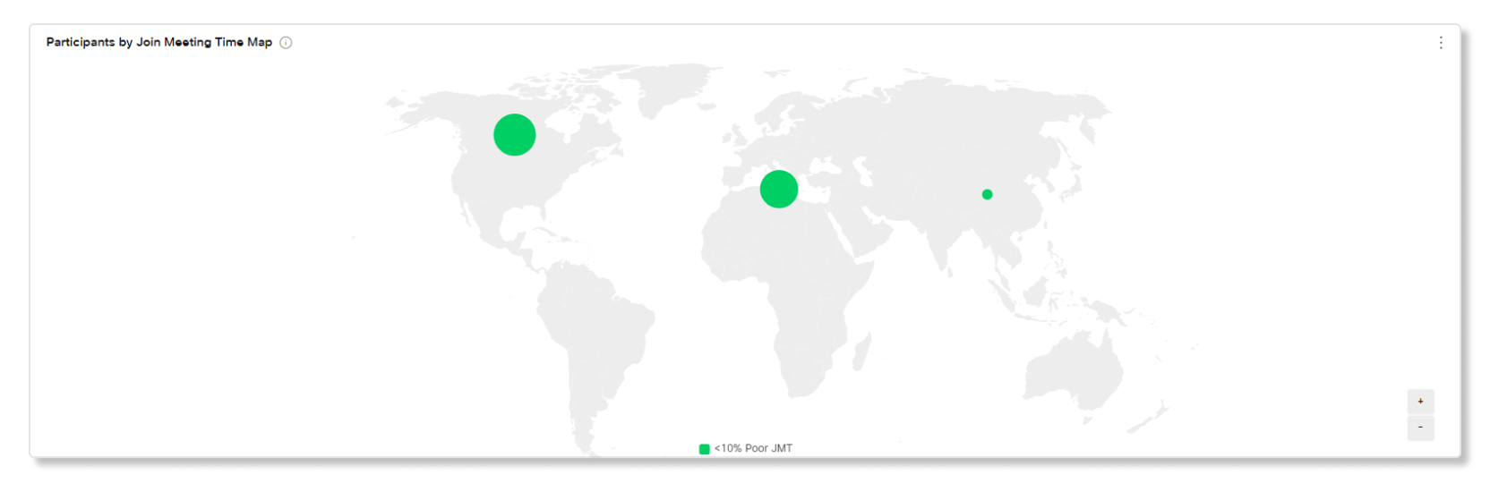
Participants by Join Meeting Time Map
This map shows the overall geographic distribution of join meeting times. You can use this map to determine if a specific location has a higher than average join meeting time. This could indicate that a connection problem is limited to a certain area.
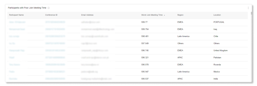
Participants with Poor Join Meeting Time
For each day of the last 21 days, we capture the worst 350 participants with poor join meeting times. Depending on the date range selected, the top 300 participants who had the poorest join meeting times show up on the list.
For example, on the first day, 350 participants with the poorest join meeting times are captured for that day. On the second day, an independent set of 350 participants with the poorest join meeting times are captured for that day. The table then captures the worst 300 participants between all those days and lists them on the table.
This table only shows the worst offenders from the last 21 days.
You have various messaging-related charts at your fingertips that can help you determine just how engaged your users are with Webex App. You can find out how many people in your organization are using the app to communicate and share ideas, which of those users are most active, and which spaces are most commonly used. You can rely on your most active users to encourage others in your organization to use the app. You can also determine the number and size of the files being shared and which platforms are most popular (for example, Webex App for Windows or Mac).
If you're a Pro Pack customer, you have access to historical metrics API that you can use to return daily aggregated messaging-related data automatically.
Key Performance Indicators (KPIs)
There are four KPIs that show at the top of the Messaging Analytics tab. The range of data they measure changes as you select a new date range.
The KPIs available are:
-
Highest Daily Active Users on Webex App—The highest number of users who had activity on the Webex App during a day within the selected date range. Activities include:
-
Sending a message.
-
Uploading a file.
-
Making a phone call with Call on Webex.
-
Joining a meeting from a space.
-
-
Average Daily Active Users on Webex App—The average number of users who had an activity during the days within the selected date range.
-
Total Messages Sent—The number of messages that were sent over the selected date range. The percentage at the bottom indicates the increase or decrease in the number of messages that are sent by comparing the number of messages sent yesterday, to the number of messages sent the week before.
-
Active Spaces—The number of spaces that had activity over the selected date range. A space is considered active when someone:
-
Sends or reads a new message.
-
Uploads or downloads a file.
-
Creates, joins, or leaves a space.
-

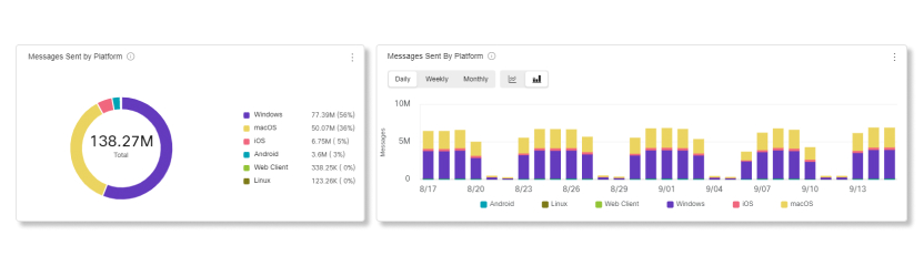
Messages Sent by Platform
You can use this chart to compare the usage of Webex in desktop or mobile. You can use this information to see if the desktop or mobile app is more popular in your organization. If adoption of one of these platforms isn’t what you expected, then consider providing more training so users know the benefits of using desktop or mobile.
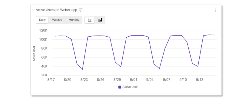
Active Users on Webex app
You can use this chart to determine the number of people actively using the Webex App. An active user is someone who has sent a message, made a call, uploaded a file, or attended a meeting.
Perhaps you signed up your organization for a trial to determine whether you want to purchase some of the services that a Cisco Webex subscription has to offer. In this case, we recommend that you monitor usage. If people are actively engaged, you may want to invest in various services that make workplace collaboration more convenient. If people aren't using the app as much as expected, show them how the app can make their day-to-day work life easier.
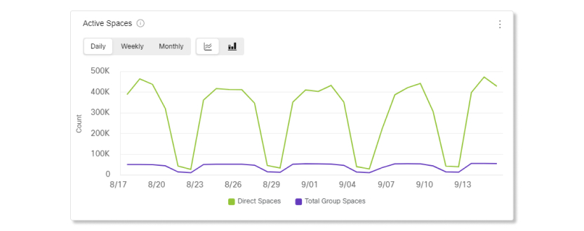
Active Spaces
You can use this chart to review the total number of spaces people participate in each day. A space is considered active when someone:
-
Sends a message.
-
Reads a new message.
-
Uploads or downloads a file.
-
Creates, joins, or leaves a space.
You can use this information to determine how well your organization is adopting the practice of using spaces to meet and collaborate. If your organization isn't using spaces as much as you expected, we recommend that you provide more training. People may make better use of their spaces if they're more familiar with the space concept. You can also make them aware of the productivity gains this feature can bring.
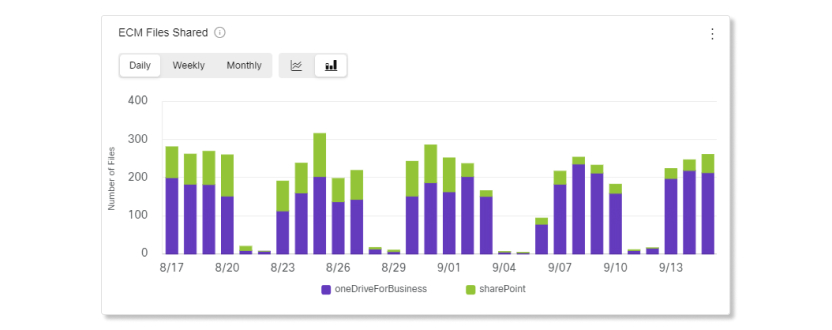
ECM Files Shared
You can use these charts to monitor the number of files shared using an integration on the Webex App. The integrations that you can use to share files with are:
-
Dropbox
-
Box
-
Microsoft OneDrive for Business
-
Microsoft OneDrive Personal
-
Microsoft SharePoint
Use this information to determine the level of feature adoption within your organization. If the number of files shared is low compared to the number of people in your organization, you may want to investigate the reasons why. We recommend that you implement strategies to encourage people to take advantage of the file sharing feature.
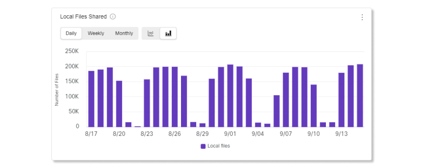
Local Files Shared
This chart helps you see how many shared files came from users' devices. You can use the data from this chart to compare with the data from the ECM Files Shared chart to see if users are adopting the integrations that your organization uses, and to see how often users are collaborating with each other in Webex.
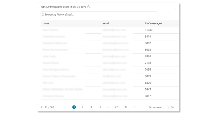
Top 300 messaging users in last 30 days
You can use this chart to compare the number of messages sent by the most active users in your organization.
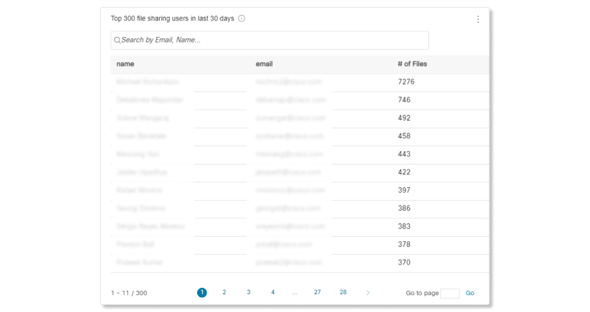
Top 300 file sharing users in last 30 days
You can use this chart to compare which users have shared the most files in your organization.
Use the Analytics page in Control Hub to see historical Webex Calling data. You have access to 13 months of data for calls based in Webex App if your organization has Pro Pack. If your organization doesn't have Pro Pack, you have access to 3 months of data for calls based in Webex App.
We keep historical data for calls involving Webex Calling desk phones, desktop and mobile version of Webex App, the Webex Calling App (desktop and mobile), and Cisco Room Series devices.
Data isn't captured for calls based in Cisco Unified Communications Manager (CUCM), Cisco Dedicated Instance, and Cisco Webex Cloud-Connected UC.
The Calling Media Quality dashboard in Control Hub makes it easy to manage Webex Calling and Call on Webex call quality across your organization. High level key performance indicators (KPIs) give administrators a quick view of global call quality. Our charts provide detailed views of this data by location, IP address, media type, connection type, codec, endpoint type, and IP phone model.
Limitations
Media quality metrics aren’t available for the following devices:
-
Analog phones
-
IPv6 endpoints
Dashboard Tips
Choose between Webex Calling or Call on Webex
You can view analytics data specific to either Webex Calling or Call on Webex by selecting the corresponding tab. When you select the Webex Calling tab or the Call on Webex tab, the KPIs and charts automatically update to display data relevant to your selection.
Global Filters
The dashboard contains powerful filtering tools. Click on the Filters bar to select which data you want to see. You can filter by the following dimensions:
-
Media sessions quality
-
Location and local IP address
-
Media, connection, endpoint, and device types
-
Audio and video codecs
-
Time distribution
The location filter is only applicable to call-level quality KPIs.
Filter by user name or email address
You can now filter all charts by user names or email addresses.

Contextual Filters
You can also click on a category in the charts to filter the data. For example, let's say you notice that there are a lot of poor quality media sessions made through Wi-Fi in the Media sessions by connection type chart. You can click on Wifi to quickly apply the filter to all the charts so you can determine what the problem could be.
Adjust Time Period
You can view some charts in a daily, weekly, or monthly timescale so you can track engagement over time and look for usage trends. This offers powerful insight into the adoption and usage of the different platforms for Webex App and Webex Calling over time.
Export Data or Charts
You can export any graph to save a snapshot of the view. Click the More button on the top right of the chart/list, and select the file format to download. The formats available are PDF, PNG, or CSV, depending on whether it's a graph or list.
KPIs
KPIs are available at the top of the page to show you what the media quality was like for media sessions within the date range that you selected. You can use these KPIs as measurable data to see if callers had issues during calls in your organization.
For Webex Calling calls, we have separated these top KPIs into two categories: KPIs for overall calls and KPIs for media sessions.
Call-level quality KPIs
These KPIs indicates the media quality for a full Webex Calling call, and aren't available for Call on Webex calls.
- Total calls—Total number of Webex Calling calls, including calls with and without media, within the organization for a selected date range. A single Webex Calling call can have multiple call legs based on the participants involved within each call. Each of these call legs can have one or more or no media sessions.
- Calls with media—Total number of Webex Calling calls that had one or more media sessions where media quality stats were captured.
- Good quality calls with media—Total Webex Calling calls with media where all the media sessions within the call were categorized as good quality sessions. Media sessions are counted as good if both video and audio stream had max jitter below 150ms, latency below 400ms, and packet loss below 5%.
Media session-level KPIs
These KPIs indicate the media quality for the media sessions within a call where the media quality stats were captured. There can be one, more than one, or no media sessions within a call. These KPIs are applicable for both Webex Calling and Call on Webex.
-
Media sessions—Total number of media sessions established within the total calls where media quality was captured. A media session here represents a single segment of a call where audio or video is actively transmitted, and media quality is captured.
-
Good quality media sessions—Shows the percentage of media sessions that were categorized as good quality. Media sessions are categorized as good if both video and audio stream had max jitter below 150ms, latency below 400ms, and packet loss below 5%.
-
Avg audio jitter—Shows the average value of maximum jitter that is experienced by each media sessions. For example, if one media session experienced 50ms, 75ms, and 100ms of jitter, and the second media sessions experienced 150ms and 200ms of jitter, only the value of 100ms for the first media session and 200ms for the second media session are calculated and then averaged.
-
Avg audio packet loss—Shows the average value of packet loss experienced by each media session.
-
Avg audio latency—Shows the average value of latency experienced by each media session.
Media sessions by type and trend
This chart shows a breakdown of media session within Webex Calling calls by the type of user. You can use this chart to see how media sessions are distributed across type of user in your organization. The user types available are:
- User
- Workspace
- Virtual lines
These charts are only applicable to Webex Calling calls.
Media sessions by quality and trend
This chart shows a breakdown between good and poor media quality for media sessions in your organization. Media sessions are categorized as good if both video and audio stream had jitter below 150ms, latency below 400ms, and packet loss below 5%. If there's a sudden spike of media sessions with poor quality, you can view the metrics for that specific date range and compare the metrics between all the other charts available to you and see if there are any common anomalies.
Media sessions by country
This chart shows the quality of media sessions based on the country that users are assigned to in Control Hub over the selected date range. You can use this chart to help determine if media quality issues are limited to a country or the devices set up in that country. You can filter the entire page by selecting a category on the chart.
This chart categorizes Call on Webex data separately as those media sessions aren't tied to a specific location.
Media sessions by location
This chart shows you a breakdown of media sessions by the locations set up in the Calling section of Control Hub. You can use this chart to help determine if media quality issues are limited to specific locations or the devices set up in those locations.
Media sessions by media type
This chart shows a breakdown of media sessions that were audio only or had video enabled. You can use this chart to see if there are any media quality issues if video was enabled or not.
If a media session has both audio and video stream, then it’s categorized once under video.
Media sessions by connection type
This chart shows you a breakdown of media sessions by the connections used. You can use this chart to help determine if media quality issues are affecting all media sessions in your organization, or if those issues are limited to specific connection types.
Media sessions by ISP
This chart shows you a breakdown of media sessions by internet service providers (ISP) used. You can use this chart to help determine if media quality issues are coming from specific ISPs.
Media sessions by local IP address
This chart shows you a breakdown of local IP addresses that media sessions connected to. IP addresses are limited to only the first three segments to preserve the personal identity of users.
By narrowing down which IP addresses are having media quality issues, you can determine if those issues are happening to media sessions in a specific area, or to all media sessions.
Media sessions by endpoint type
This chart shows you a breakdown of media sessions by the endpoints used. You can use this chart to help determine if media quality issues are affecting all endpoints in your organization, or if it's limited to specific endpoints.
Media sessions by device type
This chart shows you a breakdown of media sessions by the Cisco IP Phones and Webex Board, Room, and Desk devices used. You can use this chart to narrow down what devices are being affected by media quality issues.
Media sessions by path optimization
These charts show you the quality of media sessions based on the type of path optimization used over the selected date range.
The available path optimization types are:
- Interactive Connectivity Establishment (ICE): It is used to enable devices to send media directly to one another, which reduces latency and bandwidth usage.
- Private Network Connect (PNC): It is used to enable Webex Calling customers to extend their private network to the cloud over a dedicated VPN.
- No Optimization: When neither ICE nor PNC path optimization is used.
You can filter the entire page by selecting a category on the chart.
Media sessions by audio jitter, packet loss, and latency
These charts show you a trend of what the audio packet loss, latency, and jitter of media sessions were like.
Audio jitter is derived from the delay between successive audio requests over a number of packets. Call quality improves as jitter decreases. Only the maximum value of jitter is recorded. For example, if one media session experienced 50ms, 75ms, and 100ms of jitter, and the second media session experienced 150ms and 200ms of jitter, only the value of 100ms for the first media session and 200ms for the second media session are calculated and then averaged.
Packet loss is the time distortion that you experience when you record or playback an audio signal. Call quality improves as packet loss decreases.
Latency is the time that it takes for your voice (or data packet) to reach the recipient plus the time it takes for its acknowledgment to come back. Call quality improves as latency decreases.
The 90th percentile shows the max audio jitter, packet loss, or latency value that 10% of media sessions experienced over the selected date range.
You can use these charts to see if any of the media quality metrics are trending upward to help narrow down where the issues could be coming from.
Media sessions by audio and video codecs
These charts show you a breakdown of media sessions by the types of audio and video codecs used. You can use these charts to determine if a specific codec is affecting the media quality of media sessions. Video codecs are only applicable to calls that have video stream.
Media sessions distribution by time
These charts show you a breakdown of media sessions based on hourly distribution of the day over the selected date range. The distribution is according to the UTC time zone. You can filter the entire page by selecting a category on the chart. You can use these charts to determine if the media quality of media sessions is affected during a specific time of the day.
Users with worst calling experience
This table shows you see the top 50 users in your organization who experienced the most poor quality media sessions. You can use this table to help you quickly see which users to focus on and find out why they might be having poor quality media sessions as opposed to other users.
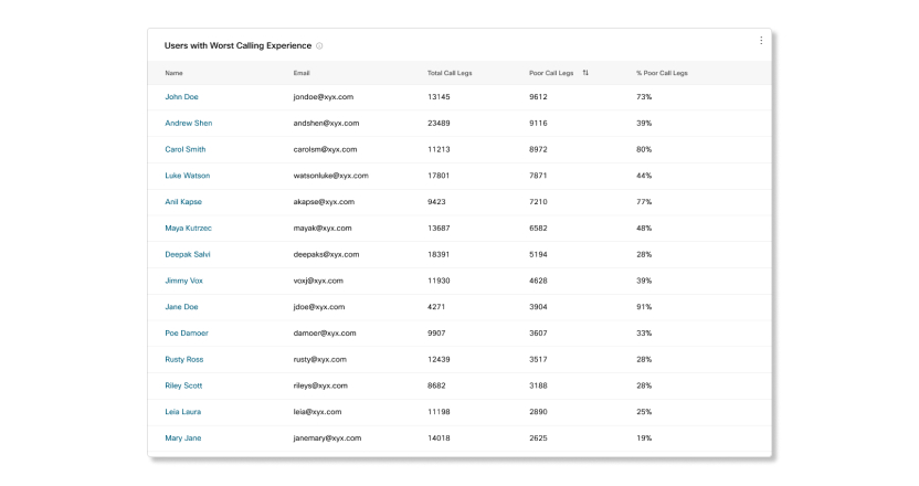
Cross launch into Troubleshooting from Analytics
When you click on a name in the Users with worst calling experience table, a new tab opens up to Troubleshooting that shows you all the media sessions that the user made within the date range that you selected, up to 21 days.
Known limitations
Data for Call on Webex calls may take up to 30 minutes after the call ends to reflect on the charts.
Dashboard tips
Adjust time period
You can view some charts in a hourly, daily, weekly, or monthly timescale so you can track engagement over time and look for usage trends. This offers powerful insight into how incoming calls are being handled in call queues.
The date picker doesn't apply to data in the live queue stats section. Data for the live queue stats section is collected every 30 seconds.
Global filters
The dashboard contains powerful filtering tools. Click on the Filters bar to select which data you want to see. The filters that you select will automatically apply to all of the charts. You can filter by specific call queues, locations, and Supervisors.
The Supervisors filter is applicable only to Call Queue Agent Stats.
Export data or charts
You can export any graph or detail view. Click the More button on the top right of the chart/list, and select the file format for your download (PDF, PNG, or CSV, depending on whether it's a graph or list).
When you combine file download with the filters available, you can easily generate useful reports about call queues in your organization.
Reports for call queues and call queue agents stats
If you want to see data for call queues and call queue agents in a CSV file format, you can download the Call Queue Stats and Call Queue Agent Stats reports in the Reports section.
KPIs
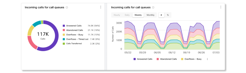
KPIs are available at the top of the page to show you a quick high-level status of incoming calls in call queues within the date range that you selected. The KPIs available are:
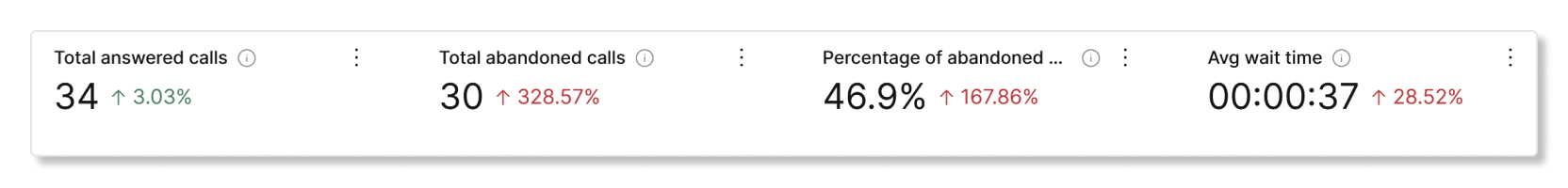
- Total answered calls—Total number of calls that agents answered. The percentage shows the change in value over time by comparing it with the past data of the date range selected.
- Total abandoned calls—Total number of calls where the caller hung up or left a message before an agent became available. The percentage shows the change in value over time by comparing it with the past data of the date range selected.
- Percentage of abandoned calls—Percentage of calls where the caller hung up or left a message before an agent became available. The percentage shows the change in value over time by comparing it with the past data of the date range selected.
- Avg wait time—Average time that callers spent waiting for the next available agent to answer the call. The percentage shows the change in value over time by comparing it with the past data of the date range selected.
Incoming calls for call queues and trend
This chart shows a breakdown of call queue statistics by incoming calls. You can use this chart to see how call queues are handling all the incoming calls to your organization.
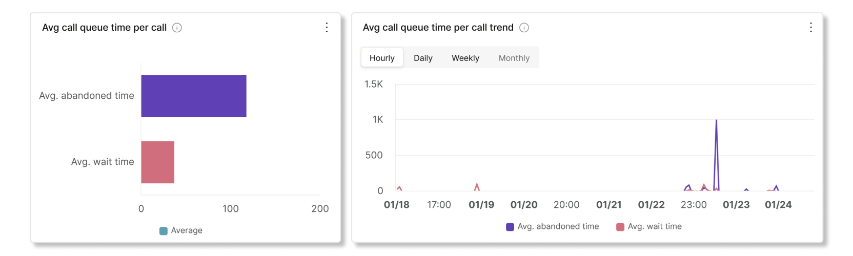
Avg call queue time per call and trend
This chart shows a breakdown between the average abandoned and average wait minutes from incoming calls. You can use this chart to see how long callers had to wait before hanging up the call or getting transferred to an agent. Average minutes are calculated as:
- Avg. abandoned time—Average call time that the callers spent waiting for an agent before hanging up or selecting the option to leave a message.
- Avg. wait time—Average time that callers spend waiting for the next available agent to answer the call.
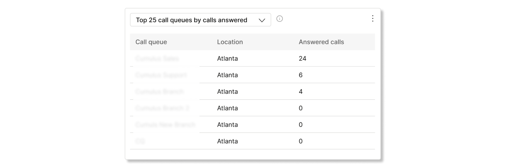
Top 25 call queues by status of calls
This table shows the top 25 call queues with the most calls by a specific status. The statuses of calls available are:
- Answered calls—Number of calls answered by agents.
- % of answered calls—Percentage of calls answered by agents.
- Abandoned calls—Number of calls where the caller hung up or left a message before an agent became available.
- % of abandoned calls—Percentage of calls where the caller hung up or left a message before an agent became available.
- Overflows - Busy—Number of calls that overflowed to a different call queue because the queue limit was met.
- Overflows - Timed out—Number of calls that overflowed to a different call queue because the wait time exceeded the maximum configured limit.
- Calls transferred—Number of calls that were transferred out of the queue.
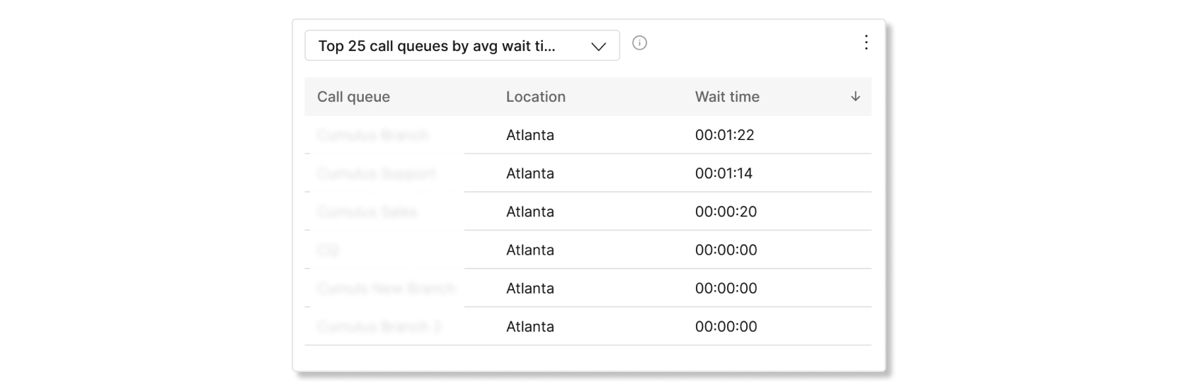
Top 25 call queues by avg wait and abandoned time
This table shows the top 25 call queues with the highest average wait and abandoned times from incoming calls. Average time are calculated as:
- Avg abandoned time—Average call time that the callers spent waiting for an agent before hanging up or selecting the option to leave a message.
- Avg wait time—Average call time that callers spend waiting for the next available agent to answer the call.
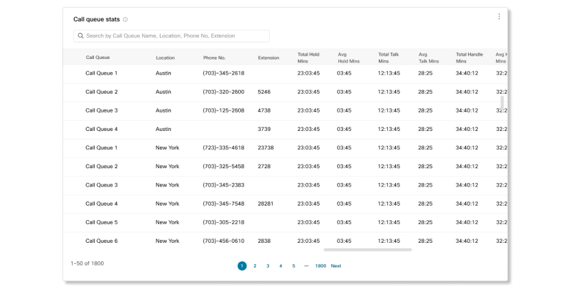
Call queue stats
This table shows details of call queues that have been set up in your organization. You can use this table to see the number of incoming calls to call queues and the status of those calls. You can also search for specific call queues, locations, phone numbers, and extensions by using the search bar in the table. The details available are:
- Call queue—Name of the call queue.
- Location—Location assigned to the call queue.
- Phone No.—Phone number assigned to the call queue.
- Extension—Extension number assigned to the call queue.
- Total hold time—Total time that calls were placed on hold by agents.
- Avg hold time—Average time that calls were placed on hold by agents.
- Total talk time—Total time that agents were actively talking on calls.
- Avg talk time—Average time that agents were actively talking on calls.
- Total handle time—Total time an agent spends on a call from a queue. This is recorded when the agent ends or transfers the call. Handle time includes talk time, hold time, and ring time.
- Avg handle time—Average time that agents spent handling calls. Handle time includes talk time, hold time, and ring time.
- Total wait time—Total time that callers spent waiting for the next available agent to answer the call.
- Avg wait time—Average time that callers spent waiting for the next available agent to answer the call.
- Calls answered—Number of calls answered by agents.
- % Answered calls—Percentage of calls answered by agents.
- Calls abandoned—Number of calls where the caller hung up or left a message before an agent became available.
- % Abandoned calls—Percentage of calls where the caller hung up or left a message before an agent became available.
- Avg abandoned time—Average time where callers hung up or left a message before an agent became available.
- Abandoned time—Time where callers hung up or left a message before an agent became available.
- Total calls—Total number of incoming calls.
- Overflow - Busy—Number of calls that overflowed because the queue limit was met.
- Overflow - Timed out—Number of calls that overflowed because the wait time exceeded the maximum limit.
- Calls transferred—Number of calls that were transferred out of the queue.
- Avg. no. of agents assigned—Average number of agents assigned to call queues.
- Avg. no. of agents handling calls—Average number of agents that actively handled calls.
Call queues with no data won't show in this table.
KPIs
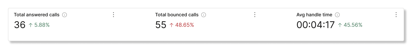
KPIs are available at the top of the page to show you details about the calls that agents handled within the date range that you selected. The KPIs available are:
- Total answered calls—Total number of presented calls that were answered by agents. The percentage shows the change in value over time by comparing it with the past data of the date range selected.
-
Total bounced calls—Total number of calls that were presented to an
agent but weren't answered. The percentage shows the change in value over time by
comparing it with the past data of the date range selected.
Calls that were declined by an agent aren't counted as bounced calls.
- Avg. handle time—Average time that agents spend on handling calls. The percentage shows the change in value over time by comparing it with the past data of the date range selected.
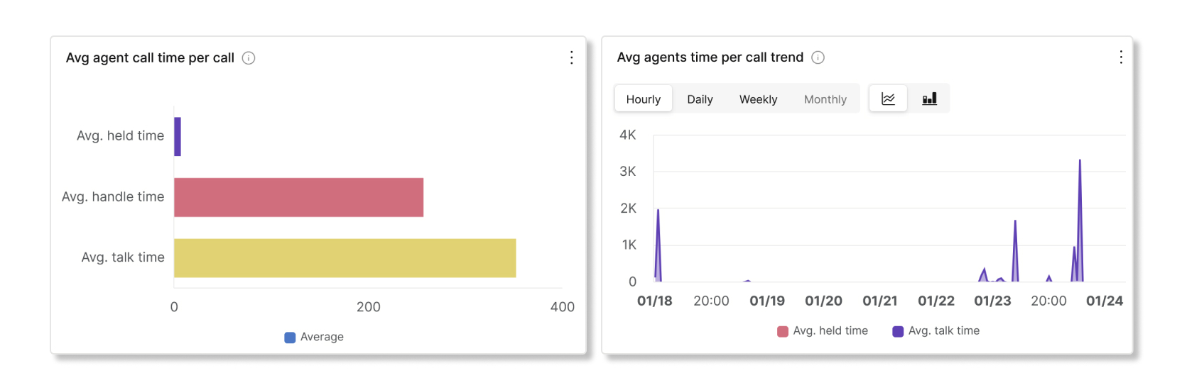
Avg agent call time per call and trend
This chart shows on average how long each call lasts by their call status. You can use this chart to see if callers are getting the help they need in a timely manner.
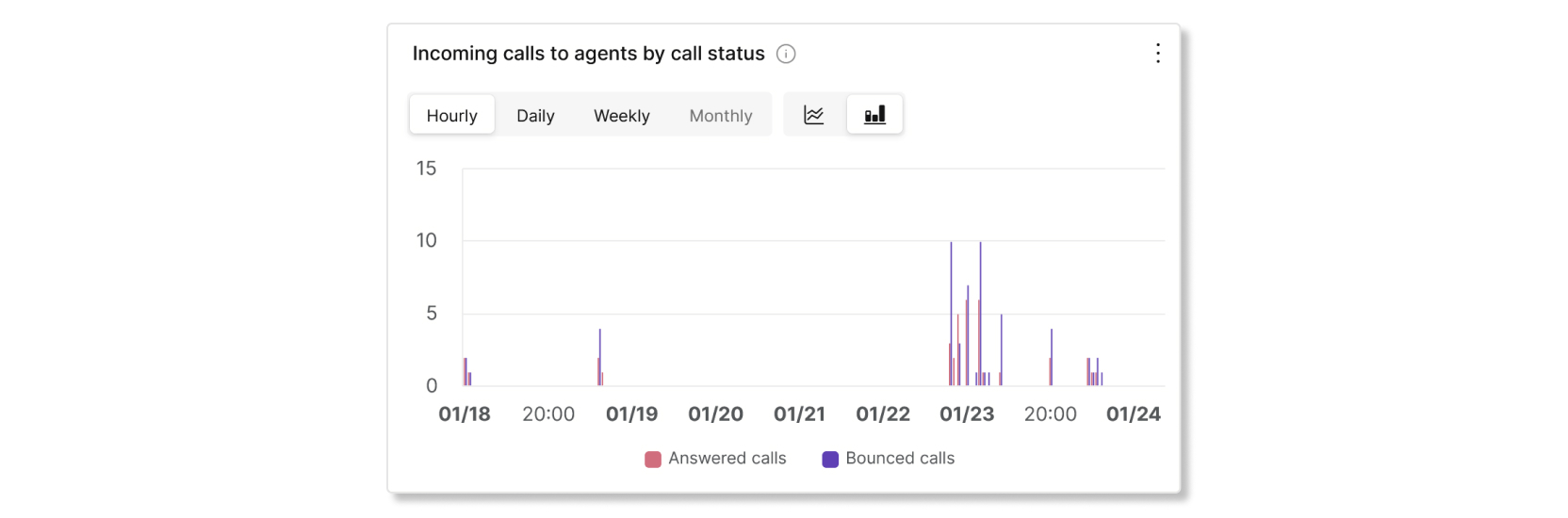
Incoming calls to agents by call status
This chart shows a breakdown of incoming calls to agents based on the call status. This chart can help you see if there are more bounced calls than usual.
Agents handling calls vs agents assigned
This chart shows a trend of the average number of agents handling calls against the average number of assigned agents to call queues. You can use this chart to see if there are enough agents to handle calls and adjust as needed.

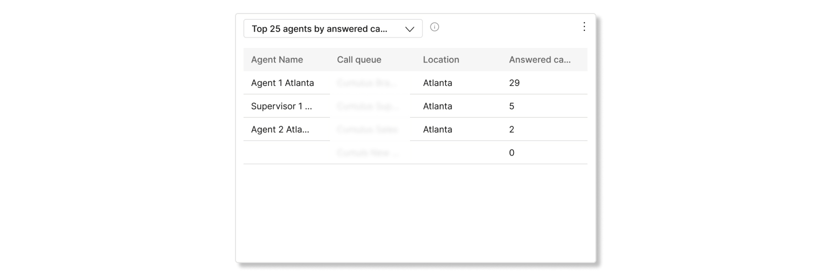
Top 25 agents by answered and bounced calls
This table shows the top 25 agents with the most answered or bounced calls.
Calls that were declined by an agent aren't counted as bounced calls.
Top 25 agents by avg talk and avg held time
This table shows the top 25 agents with the highest average talk or hold minutes.

Call queue agents
This table shows details of all the agents that have been assigned to call queues in your organization. You can use this table to see which agent gets the most calls and information about their calling stats. You can also search for specific agent or workspace names, call queues, and locations by using the search bar in the table. The details available are:
- Agent name—Name of the agent or workspace.
- Call queue—Name of the call queue.
- Location—Location assigned to the call queue.
- Total answered calls—Number of calls that were presented to the agent and answered by them.
-
Bounced calls—Number of calls that were presented to the agent but went
unanswered.
Calls that were declined by an agent aren't counted as bounced calls.
- Total presented calls—Number of inbound calls to the agent that were distributed by the call queue.
- Total talk time—Total time that an agent spent actively talking on calls.
- Avg. talk time—Average time that an agent spent actively talking on calls.
- Total hold time—Total time that an agent put calls on hold.
- Avg. hold time—Average time that an agent put calls on hold.
- Total handle time—Total time that an agent spent handling calls. Handle minutes are calculated as Total talk time + Total hold time = Total handle time.
- Avg. handle time—Average time that an agent spent handling calls.
KPIs
KPIs are available at the top of the page to show you all the current incoming calls and what their statuses are to help you monitor call queues in real time. The KPIs available are:
- Active calls—Shows the number of calls where agents are talking to callers.
- Calls waiting—Shows the number of calls that are waiting for the next available agent to answer.
- Held calls—Shows the number of calls that agents placed on hold.
Live call queue stats
This table shows details of all the call queues that have been set up in your organization. You can use this table to see which call queue gets the most calls and adjust the number of agents as needed. You can also search for specific call queues, locations, phone numbers, and extensions by using the search bar in the table. The details available are:
- Call queue—The name of the call queue.
- Location—The location assigned to the call queue.
- Phone no.—The phone number assigned to the call queue.
- Extension—The extension assigned to the call queue.
- Active calls—The number of calls where agents are talking to callers.
- Held calls—The number of calls that agents have placed on hold.
- Calls waiting—The number of calls that are waiting for the next available agent.
See these videos for more details:
Detailed Call History reporting
Webex Calling detailed call history reporting provides the necessary details about the calling records data for your organization from the cloud.
One can easily troubleshoot and analyze calls, allowing one to better understand the Webex Calling experience and identify employee performance concerns.
The detailed call history tab doesn't include the Call on Webex option.
The detailed call history tab provides the following features.
Global filters
The dashboard contains powerful filtering tools. Click on the Filters bar to select which data you want to see. You can filter by the following dimensions:
-
Answered
-
Call Classification (Internal / External)
-
Call Type
-
Direction
-
Location
-
User Name
-
Email
-
Endpoint Type
-
Device Type
You can use the Direction filter only when the Call classification is set to External.
Time Zone
The time zone is set according to your profile at the top right corner; you can change your preferred time zone anytime from the drop-down menu.
For example, if you are looking for a call that took place in a different time zone, you can switch to that time zone by searching so that you don’t have to do the time conversion. Analytics data are populated only based on the time zone that's chosen.
Key Performance Indicators (KPIs)
There are five KPIs that show at the top of the Detailed Call History tab. The range of data they measure changes as you select filters and a date range.
KPIs are generated on a per call basis. For example, if Alice calls Bob, that counts as a single call for KPI calculations. There are five KPIs that show at the top of the Detailed Call History tab. The range of data they measure changes as you select filters and a date range.
The KPIs are:
-
Total Calls—The total number of Webex Calling calls for the selected filters and date range. A single call may have several legs. For example, an internal call between two users has two call legs, but is counted as a single call for the purposes of this dashboard. The footer line shows the total number of calls made or received by the users during the busiest hour when applying the selected filters and date range.
The busiest hour has the maximum number of calls in for these filters, within the selected date range.
-
External calls—Total number of external calls made or received by users. An external call is a call made to or received from outside of the organization. Internal calls are calls made between Webex Calling users within the organization. Internal calls in the footer are calls made between Webex Calling users within the organization.
CDRs with unknown call type are accounted as external calls.
-
Answered Calls—Percentage of answered calls made or received by users within the selected filters and date range. For example, if a call arrives on a hunt group, and it is not answered by the first 9 agents, but is answered by the 10th, the call is considered as answered. Calls that are answered by voicemail are also considered answered.
-
Calls in Busiest Location—Total number of calls made or received by users in the busiest location within the selected filters and date range.
-
Webex Calling Active Users—The total number of unique active users who made or received calls within the selected filters and date range. An active user includes any Webex Calling user—such as individual users, workspace users, or virtual line users who has made or received any type of call during the selected time period.

External calls by Type
The External calls by Type graph shows a breakdown of external calls that are made or received from outside of the organization. It lists calls based on supported types that match the selected filters and are within the date range. The call types that can show in this graph are:
-
Mobile/Cell
-
National
-
International
-
Emergency
-
Operator Services
-
Short Numbers
-
Premium Rate
-
SIP URI
-
Inbound
-
Unknown
-
Zero Touch Meeting
-
Integrated Audio (On Net Webex Meeting)
-
Don't correlate the count of External calls with the breakup of External calls reported in this widget. This is because a call can be both Inbound & National.
Total Calls by Location
The Total Calls by Location graph shows a breakdown of the calls made or received at different locations within the selected filters and date range. Data is oriented around individual call legs rather than one single entry. It lists both answered and unanswered calls.
For example:
-
For a P2P call between Alice & Bob, both are at Location A, then Loation A shows 2 entries.
-
If Alice is on Location A and Bob is at Location B, then 1 entry is shown on both Location A and B.
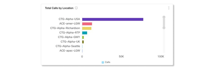
The report counts a call that had Consultative Transfer, Call Park or Call Retrieve as an additional Internal Call because these calls have a different correlation id for their CDR records.
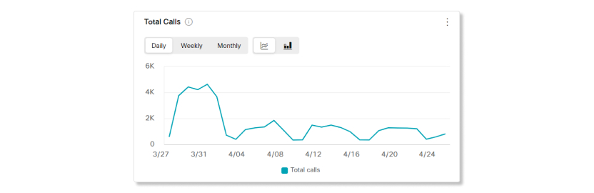
Total Calls
This chart shows the number of calls made or received across the selected date range. It can show you how your organizations usage of Webex Calling is trending over time.
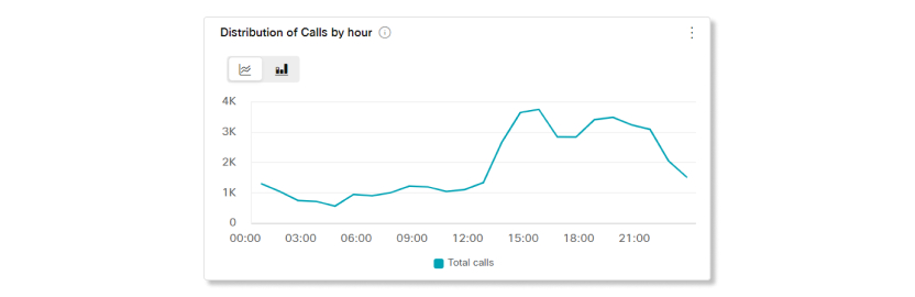
Distribution of Calls by hour
This chart shows the number of calls made or received, summed up on an hourly basis across the selected date range. It can show you when during the day your Webex Calling users are busiest and using the service the most.
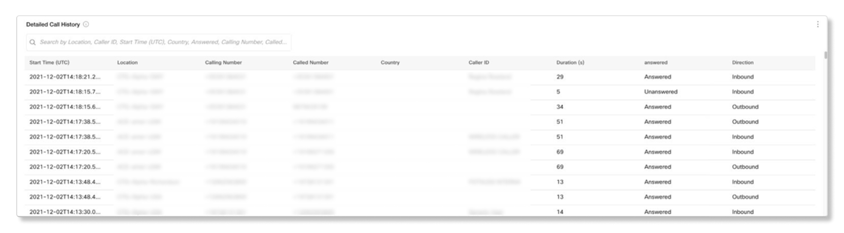
Detailed Call History
The Detailed Call History table shows all the calls, made or received, by the users within the selected filters and date range.
The table entries is for individual call legs and each call in Webex Calling is comprised of two records
- An Originating record and
- A Terminating record
For example, If Alice calls Bob, and Alice and Bob are registered Webex Calling users, Webex Calling shows two call records in the Detailed call history table
- One Originating record from Alice’s point of view and
- One Terminating record from Bob’s point of view
If Alice is a PSTN user, then Webex Calling, logs only one record that is, terminating entry for Bob.
The Detailed Call History table shows a list of calls along with the following details:
-
Start Time—This is the start time of the call, the answer time may be slightly after this.
-
Location—Location of the call.
-
Calling Number—For incoming calls, it’s the telephone number of the calling party. For outgoing calls, it’s the telephone number of the user.
-
Called Number—For incoming calls, it is the telephone number of the user. For outgoing calls, it’s the telephone number of the called party.
-
Country—This field populates for international calls. It shows the country code of the caller ID number.
We're currently experiencing an issue where the Country field may appear empty for some admins. We're actively working to resolve this.
-
Caller ID—The caller ID of the user who placed or received the call, if applicable.
-
Duration—The length of the call in seconds.
-
Answered—Answered if this call leg was answered, Unanswered otherwise.
The report lists a call answered by the voicemail service as answered.
-
Direction—Inbound or Outbound.
KPIs
KPIs are available at the top of the page to show you a quick high-level status of calls handled by auto-attendants within the date range that you selected. The KPIs available are:
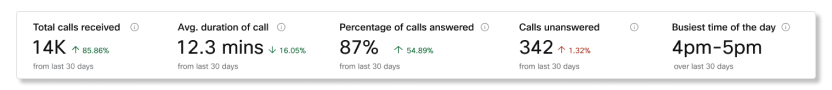
- Total calls received—Total number of incoming calls routed to an auto-attendant over the selected date range. This includes all calls that successfully reached an auto-attendant and forced forward calls. The percentage shows the change in value over time by comparing it with the past data of the date range selected.
- Avg. duration of call—Average number of minutes that callers were on the line with auto-attendants over the selected date range. The percentage shows the change in value over time by comparing it with the past data of the date range selected.
- Percentage of calls answered—Percentage of calls answered by agents, users through call forwarding, or voicemails over the selected date range. Calls transferred to call services are counted as answered calls. The percentage shows the change in value over time by comparing it with the past data of the date range selected.
- Calls unanswered—Number of calls that were routed to agents or users through call forwarding but weren’t answered over the selected date range. The percentage shows the change in value over time by comparing it with the past data of the date range selected.
- Busiest time of the day—Time of day with the most calls to auto-attendants over the selected date range. The percentage shows the change in value over time by comparing it with the past data of the date range selected.
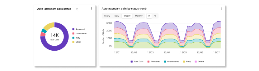
Auto-attendant calls status and trend
This chart shows a breakdown of auto-attendant call stauses by incoming calls. You can use this chart to see how auto attendants are handling all the incoming calls to your organization over the selected date range.
Auto-attendant calls by location
This chart categorizes auto-attendant calls based on the location of where auto attendants were provisioned over the selected date range.

Calls by auto-attendants
This chart categorizes calls based on which auto-attendant the calls were routed to over the selected date range.

Call distribution by time of day
This chart categorizes calls based on the time of day that auto-attendants received those calls over the selected date range.

Auto-attendant calls by key menu and key pressed
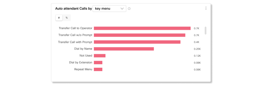
This chart categorizes auto-attendant calls based on the key menu options that callers chose or the key options pressed by callers on the keypad over the selected date range. You can use this chart to see which options users are calling about the most.
Calls by received hours
This chart categorizes calls based on if they were received during business hours, after hours, and not available over the selected date range.
Not available means that users weren't shown key menu options when certain features are used, like call forwarding, call intercept, and call screening services.

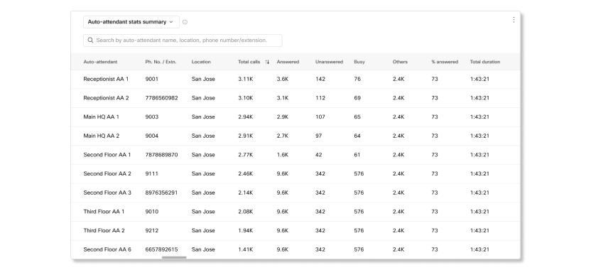
Auto-attendant stats summary, business hour key details, and after hour key details
This table shows details of auto-attendants that have been set up in your organization. You can use this table to see the number of incoming calls to auto-attendants and the status of those calls. Calls that are "Not Available" will count in the charts, but won't count in the data tables. Because of this calculation, the number of total calls will differ between the charts and tables.
The Save as CSV option for this table may not download all the rows of data for large organizations. To get a complete list of all the rows of data for this table, download the auto-attendant reports in the Reports section.
The details available for auto-attendant stats summary are:
- Auto-attendant—Name of the auto-attendant, as provisioned.
- Ph. No. / Extn.—Extension assigned to the auto-attendant.
- Location—Location of the auto-attendant, as provisioned.
- Total calls—Total number of incoming calls dialed and routed to the auto-attendant. This includes all calls that successfully reach the auto-attendant and forced forward calls.
- Answered—Number of calls answered by agents, users through call forwarding, or voicemails. Calls transferred to call services are counted as answered calls.
- Unanswered—Number of calls that were routed to agents or users through call forwarding but weren’t answered.
- Busy—Number of calls where callers reached a busy tone.
-
Others—Number of calls that had a status other than answered, unanswered, or busy.
For example:
- Caller didn't make a key selection and abandoned the call before it gets redirected.
- Caller didn't make a key selection and call disconnected or timed out (without getting redirected to another user or service).
- Caller pressed an exit key.
- % answered—Percentage of calls answered by agents.
- Total duration—Total time that callers were on the line with the auto-attendant when first answered until the call is routed or terminated.
- Total AA talktime—Total time that the auto-attendant was engaged with the caller.
The details available for auto-attendant business hour key details and after hour key details are:
- Auto-attendant—Name of the auto-attendant, as provisioned.
- Key pressed—The key option pressed by callers on the keypad.
- Ph. No. / Extn.—Phone number and extension assigned to the auto-attendant.
- Location—Location of the auto-attendant, as provisioned.
- Total calls—Total number of incoming calls dialed and routed to the auto-attendant. This includes all calls that successfully reach the auto-attendant and forced forward calls.
- Answered—Number of calls answered by agents, users through call forwarding, or voicemails. Calls transferred to call services are counted as answered calls.
- Unanswered—Number of calls that were routed to agents or users through call forwarding but weren’t answered.
- Busy—Number of calls where callers reached a busy tone.
-
Others—Number of calls that had a status other than answered, unanswered, or busy.
For example:
- Caller didn't make a key selection and abandoned the call before it gets redirected.
- Caller didn't make a key selection and call disconnected or timed out (without getting redirected to another user or service).
- Caller pressed an exit key.
- % answered—Percentage of calls answered by agents.
- Duration—Length of time that callers were on the line with the auto-attendant.
- Destination—The phone number of the terminating call detail record.
- Key menu—The key menu option assigned to the key pressed on the keypad.
- Key description—The description for the key option pressed by callers on the keypad.
- Auto Attendant Talktime—Total time that the auto-attendant was engaged with the caller for a given key pressed.
The hunt group usage analytics tab allows admins to monitor how hunt groups within their organizations are being used by providing critical telemetry for each hunt group, such as a breakdown of incoming calls for each hunt group and the statuses of those calls.
Below are details around specific telemetry and charts available within these dashboards.
KPIs
KPIs are available at the top of the page to show you a quick high-level status of calls handled by hunt groups within the date range that you selected. The KPIs available are:
- Total hunt group calls—Total number of incoming calls routed to hunt groups over the selected date range. Calls include answered, unanswered, and abandoned.
- Hunt group answered calls—Total number of incoming calls routed to hunt groups that were answered directly or after redirection by agents.
- Hunt group unanswered calls—Total number of incoming calls routed to hunt groups that went unanswered by agents.
- Hunt group abandoned calls—Total number of incoming calls where the caller hung up before an agent became available.
HG calls by status and trend
These charts show a breakdown of incoming calls to hunt groups by their status. You can use these charts to see if calls are getting answered at a good rate or if you need to investigate why unanswered and abandoned calls are trending at a high rate.
Top 10 HGs by calls received
This chart shows which hunt group received the most calls over the selected date range. You can use this chart to help see which hunt group has the most activity and if more agents should be assigned to that hunt group to help reduce wait time.
Top 10 locations by calls received
This chart shows which assigned location of hunt groups received the most calls, which can help you see if other agents need to be reassigned to a more popular location to help reduce unanswered and abandoned call times.
Total calls received trend
This chart shows you a trend of calls received across all hunt groups over the selected date range. You can use this chart to help visualize which days your organization received the most calls and if hunt groups performed well on those days.
HG answered calls by endpoint type and trend
These charts show a breakdown of calls by which endpoint type was used to answer the call. This chart can help you see which endpoint type agents prefer to use in your organization.
The hunt group performance tab allows admins to monitor call behaviors once calls land on hunt groups, such as how many times calls were redirected, the reasons why calls were redirected, and call routing patterns.
90th percentile values are compared with the values from all hunt groups in your organization for the selected date range.
Below are details around specific telemetry and charts available within these dashboards.
KPIs
KPIs are available at the top of the page to show you a quick high-level status of how hunt groups performed within the date range that you selected. The KPIs available are:
- 90%ile HG call handle time—The 90th percentile value of the talk and wait time of calls. Call handle time is calculated as Call wait time + Call talk time.
- 90%ile HG wait time—The 90th percentile value of time that callers had to wait before an agent answered.
- 90%ile call talk time—The 90th percentile value of time spent talking on a call.
- 90%ile HG abandoned call time—The 90th percentile value of time before the caller hunt up or left a message before an agent answered the call.
- HG redirected calls—The total number of calls forwarded or transferred to a different agent.
HG answered calls by redirection
This chart shows you a breakdown calls that were handled successfully by the first agent or if the call had to be redirected to another agent. You can use this chart to see if callers are getting the help they need from agents in a timely manner or figure out the reason why there's an unusual amount of redirected calls by comparing the data with other charts.
Possible values are:
- Directly Handled—The first agent that the hunt group assigned the call to answered and ended the call.
- Redirected—The first agent that the hunt group assigned the call to redirected the call to another agent.
Hunt group redirected calls by reason
This chart shows you a breakdown for the different reasons on why a call gets redirected. You can use this chart to help determine if calls are getting redirected because there aren't enough agents to help out or because of other reasons.
Possible values are:
- Forward after set rings—Forwards an incoming call to another hunt group after a set number of rings.
- Divert when agents unreachable—Diverts an incoming call to another hunt group if no agents are available.
- Divert when agents busy—Diverts an incoming call to another hunt group if all agents are busy.
- Blind transfer—Transfers the call to the first available agent.
- Consultative transfer—Transfers the call to a specific agent.
- Always forward—Always forward incoming calls to another hunt group.
- Selectively forward—Always forward incoming calls from a specific hunt group to another hunt group.
- Forward calls by modes—Forward calls based on scheduling.
HGs by call routing patterns
This chart shows you a breakdown for the patterns used by hunt groups to route calls. This chart helps you see how hunt groups are configured to route calls and if you need to modify those configurations.
Possible values are:
- Simultaneous
- Circular
- Top down
- Longest idle
- Weighted
HG calls redirected by reason trend
This chart shows you a trend of the different reasons for why a call gets redirected. You can use this chart to see if there's a pattern with specific reasons over the selected date range to determine if there are issues with hunt groups in your organization or if they're working as intended.
Possible values are:
- Forward after set rings—Forwards an incoming call to another hunt group after a set number of rings.
- Divert when agents unreachable—Diverts an incoming call to another hunt group if no agents are available.
- Divert when agents busy—Diverts an incoming call to another hunt group if all agents are busy.
- Blind transfer—Transfers the call to the first available agent.
- Consultative transfer—Transfers the call to a specific agent.
- Always forward—Always forward incoming calls to another hunt group.
- Selectively forward—Always forward incoming calls from a specific hunt group to another hunt group.
- Forward calls by modes—Forward calls based on scheduling.
Top 10 HGs by redirected calls
This chart shows you the top 10 hunt groups with the most redirected calls. This chart helps you see which hunt groups are the cause of a higher number of redirected calls.
HG redirected calls by call routing patterns
This chart shows you a breakdown for the patterns used by hunt groups to route redirected calls. This chart helps you see how hunt groups are configured to route redirected calls and if you need to modify those configurations.
Possible values are:
- Simultaneous
- Circular
- Top down
- Longest idle
- Weighted
Top 10 HGs by 90%ile call handle time
This chart shows the top 10 hunt groups by their 90th percentile value of call handle time. This chart helps you see which hunt group needs to have their call handle times improved so that callers can get the help they need in a timely manner.
90%ile HG call handle time by call routing patterns
This chart compares the 90th percentile values of hunt group call handle times by call routing patterns. This chart helps you see which call routing pattern works the best and which pattern needs to be improved.
Top 10 HGs by 90%ile wait time
This chart shows the top 10 hunt groups by their 90th percentile value of call wait time. This chart helps you see which hunt group needs to have their call wait times improved so that callers can get the help they need in a timely manner.
90%ile HG wait time by call routing patterns
This chart compares the 90th percentile values of hunt group wait times by call routing patterns. This chart helps you see which call routing pattern works the best and which pattern needs to be improved.
Top 10 HGs by 90%ile abandoned time
This chart shows the top 10 hunt groups by their 90th percentile value of call abandoned time. This chart helps you see which hunt group needs to have their call abandoned times improved so that callers aren't hanging up before an agent can help them.
90%ile HG abandoned time by call routing patterns
This chart compares the 90th percentile values of hunt group abandoned times by call routing patterns. This chart helps you see which call routing pattern works the best and which pattern needs to be improved.
You can use the data here to determine which devices are more popular with your users and which ones aren't. You can use this information when setting up places with shared devices. You can make sure that the more commonly used devices are set up in densely populated areas of your building or where the most meetings take place.
If you're a Pro Pack customer, you have access to historical metrics API that you can use to return daily aggregated devices-related data automatically.
Supported devices
The devices page shows usage metrics for Cisco cloud-registered devices from the SX/DX series up to our current device offering. Webex Share and other cloud-registered devices aren't included in the usage metrics, but they're included in the inventory details list. Cisco devices before the SX/DX series won't have any usage metrics collected from them.
Analytics for Microsoft Teams Video Integration
If you deployed the Webex video integration for Microsoft Teams for your organization, then usage metrics for participants who joined Microsoft Teams meeting with Cisco video devices are counted in the key performance indicators and charts.
The filters list corresponds with the devices you have setup throughout your organization. You can use this information to focus on a specific device. For instance, if you just deployed DX80s to all the users in your organization, then select DX80 as the filter.
Key performance indicators (KPIs)
KPIs are available at the top of the page to show you how often devices are being used within the date range that you selected. The KPIs available are:
-
Active Device—Total number of active devices. Devices are counted as active when used to join calls, for local wired or wireless displays, whiteboarding, or in USB passthrough mode. The percentage change is this number compared against the number from the previous selected time period. For example, if 10 days are selected, the number is compared to the previous 10 days.
-
Total Device Usage (Hours)—Total number of hours that devices were used for. This usage includes when devices are used to join calls, for local wired or wireless displays, whiteboarding, in USB passthrough mode, and for digital signage.
-
Active Usage per Device—The average number of hours that devices were used for any active or digital signage activities. The average is calculated as (number of Active Devices KPI) divided by (number of Total Usage KPI).

Device usage by activity
This chart shows the total usage (hours) of cloud-registered devices, including Cisco Webex Room Devices, Webex Boards, and Webex Shares. A device may be one of the following types of activities:
-
In Call—Device is used to join a meeting as a video endpoint.
-
Local Sharing Cable—Device is shared and connected locally by the user via a HDMI cable without joining any meetings or calls.
-
Local Sharing Wireless—Device is shared and connected locally by the user via WiFi without joining any meetings or calls.
-
Signage—Device is used as a multimedia display under Digital Signage mode.
-
USB Passthrough—Device is connected to a computer via a USB cable and used as a webcam.
-
Whiteboarding—Device is used as a whiteboard in a conference room without any users connected to it.
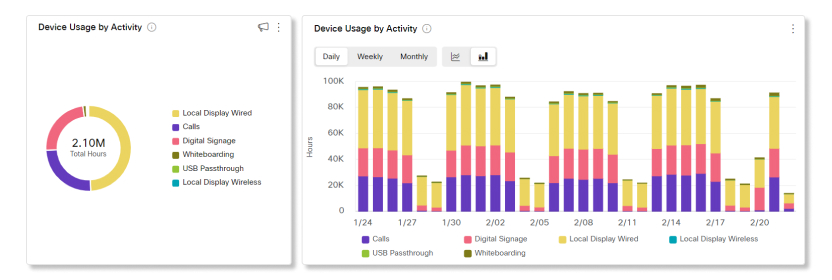
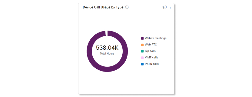
Device Call Usage by type
This chart breaks down the types of calls made from cloud-registered devices in your organization by duration.
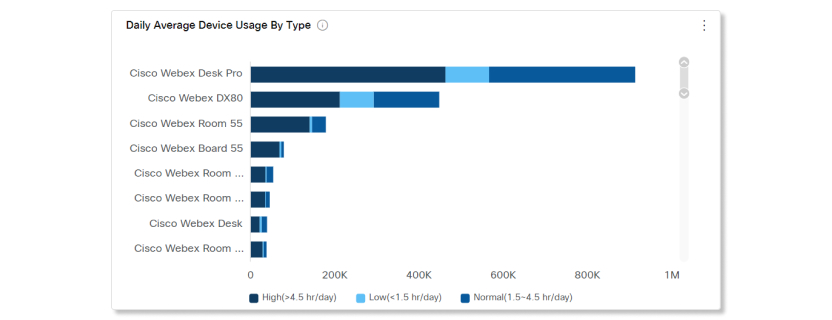
Daily Average Device Usage by Type
This chart breaks down how often specific devices are used across all activities over the selected date range. You can use this chart to see which devices are the most popular among users in your organization or to help drive engagement with devices that are in the low usage range.
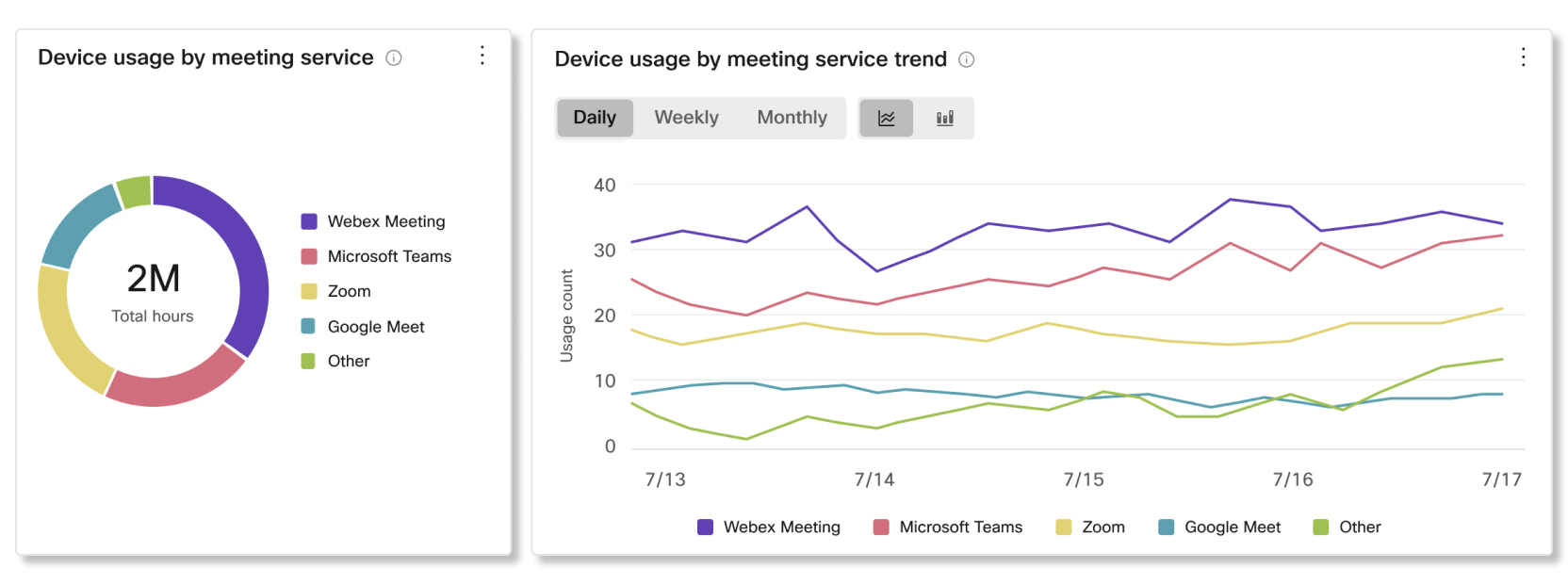
Device usage by meeting service and trend
This chart breaks down the meeting services that users in your organization are hosting and joining with Cisco devices. You can use this chart to help drive adoption with the meeting service that you want users to focus on.
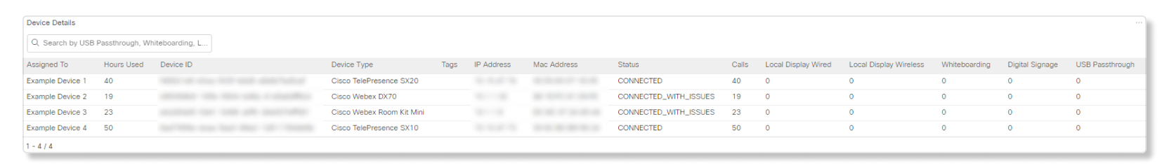
Device details
Currently, the Calls and Whiteboarding fields are reporting numbers that may be inaccurate for all devices. We're addressing this discrepancy to make sure that the data is accurate. We plan to have a solution to fix this issue by May 2025.
Use this table to see details of every device in your organization. Look at the Hours Used column to quickly pinpoint underutilized devices. It shows the total usage of the device over the selected time period. You can click on any of the columns to sort them.
-
Assigned To—Name of the place or user this device is assigned to. If this field is blank then the device was deleted from your organization.
-
Hours Used—Total usage over the selected time period.
-
Device ID—Unique identifier internal for administrators.
-
Device Type—Device model.
-
Tags—Shows tags assigned to the device on the Control Hub Devices page.
-
IP Address—Last known IP address of when the device was online.
-
Mac Address—Media Access Control address of the device.
-
Status—Device online status from the last 24 hours.
-
Calls—The number of hours the device was used for a call.
-
Local Display Wired—The number of hours the device was used for a wired local display.
-
Local Display Wireless—The number of hours the device was used for a wireless local display.
-
Whiteboarding—The number of hours the device was used for whiteboarding.
-
Digital Signage—The number of hours the device was used for digital signage.
-
USB Passthrough—The number of hours the device was used for USB passthrough.
Analytics for Webex Assistant for Devices are supported for:
-
Room Kit
-
Room Kit Mini
-
Room Kit Plus
-
Room Kit Pro
-
Room 55 and 55 Dual
-
Room 70 and 70 G2
-
Webex Board 55 and 55S
-
Webex Board 70 and 70S
-
Webex Board 85S
-
Desk Pro
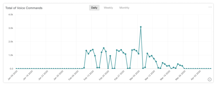
Total of Voice Commands
This chart shows you the trend for the number of voice commands that users are saying to the Webex Assistant for Devices in your organization. These numbers give you insights on how often users are utilizing Webex Assistant for Devices, and how you can help users make use of it more often.
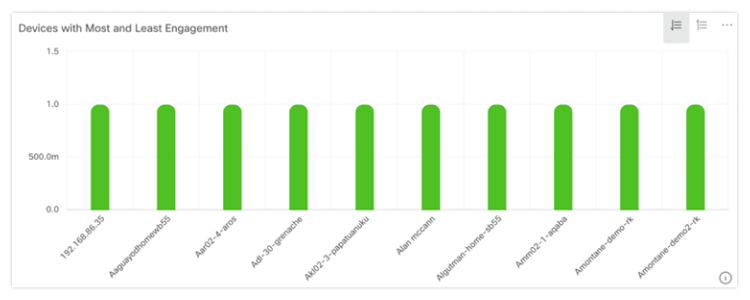
Devices with Most and Least Engagement
This chart shows you the top 10 and bottom 10 list of devices that responded to voice commands from users over the selected time period. You can use this chart to get an idea of which devices get the most use, and how you can help get more use out of the devices with the least engagement.
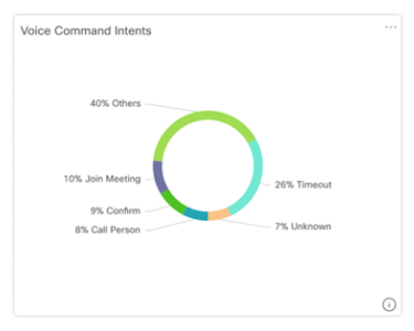
Voice Command Intents
A breakdown of voice command intents from users in your organization. You can see which intents are the most used, and see why some intents aren't used as often as others.
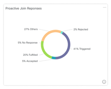
Proactive Join Responses
A breakdown of how users responded to the prompts given by the Webex Assistant on devices with Proactive Join enabled. You can use this breakdown to see if users are making use of the Proactive Join feature, or if they're not aware of it, you can help users adopt it.
You can track how often Cisco Headsets are used in your organization during meetings in the Webex app. Analytics for Cisco Headsets are supported for:
-
Cisco Headset 500 Series
-
Cisco Headset 730
Data is only available for Cisco Headsets that are connected to the Webex app on version 41.8 and later.
Key Performance Indicators (KPIs)
The KPIs available for Headsets Analytics are:
-
Total Headsets—The total number of Cisco Headsets that have connected to the Webex app and used at least once.
-
Total Active Headsets—The total number of Cisco Headsets that were used once with the Webex app over the selected date range.
-
Total Calls—The total number of calls and meetings joined in the Webex app with Cisco Headsets over the selected date range.
-
Total Call Minutes—The total number of minutes that Cisco Headsets were used in calls and meetings with the Webex app over the selected date range.
-
Average Call Minutes—The average number of minutes that Cisco Headsets were used in calls and meetings with the Webex app over the selected date range.

Usage by Connection Type
This chart breaks down headset inventory by the type of connection. You can use this information to see if users in your organization prefer a certain connection type.
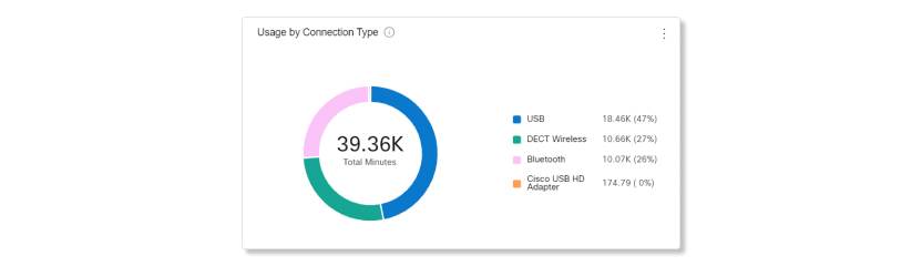
Usage by Endpoint
This chart breaks down the endpoints that users connected their headsets to. You can use this information to help with headset engagement on other endpoints.

Headsets by Status
This chart shows the trend in headset status over time. You can use this information to see how often headsets are getting used in the Webex app compared to the total amount.
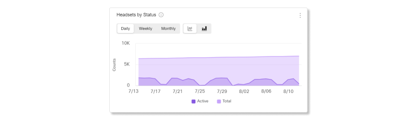
In-Call Usage
This chart shows how many hours headsets were used during calls. In-call usage refers to calls and meetings joined in the Webex app.
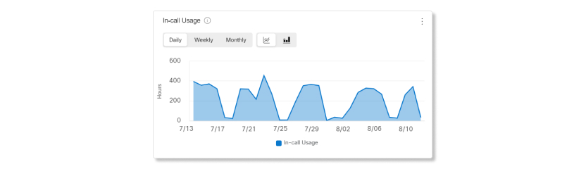
Headsets by Model
This chart breaks down your total Cisco Headset inventory by model. You can sort by total number of headsets and by percentage of headset inventory. The chart also breaks down your inventory by active and inactive headsets.
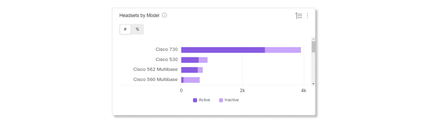
Daily Average Usage by Model
This chart shows the daily average headset use over the selected date range by headset model. You can use this information to see if a certain model has more usage than the others to help with future headset purchases.
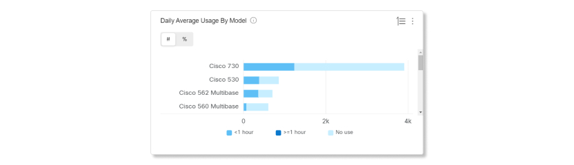
Headsets by Country
This chart shows the total distribution of your Cisco Headset inventory by country. The chart also breaks down your inventory by active and inactive headsets. You can compare this chart with the Daily Average Usage by Country chart to determine if low engagement in other countries is due to a lower headset inventory count or because of a higher number of inactive headsets.
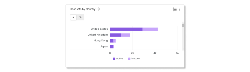
Daily Average Usage by Country
This chart shows the daily average headset use over the selected date range by country. You can use this information to help see headset engagement between different countries.
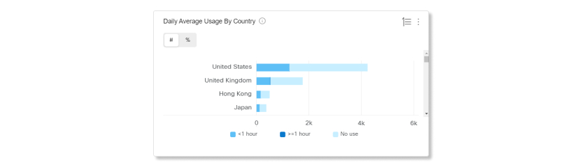
Daily Average Usage and Inventory Map
This map shows the overall geographic distribution of your Cisco Headset inventory. It also breaks down the average daily headset utilization over the selected time span. This visualization helps you glance quickly at which locations have the most headset inventory and usage.
Headset utilization is sorted into three categories:
-
Unused headsets.
-
Headset usage averages less than an hour per day.
-
Headset usage averages more than an hour per day.
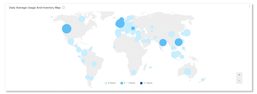
Quality data is only available for Cisco devices when used during Webex activities. Devices must be on version CE 9.15.9.3 and RoomOS 10.9.0.29 or higher for data to show.
Key performance indicators (KPIs)
KPIs are available at the top of the page to show you what the audio and video quality minutes were like for Cisco Room and Desk series devices within the date range that you selected. You can use these KPIs as measurable data to see if devices are having audio or video quality issues during meetings in your organization. The KPIs available are:
- Webex call mins of devices—The total number of minutes that Cisco devices were used for calls and meetings with Webex over the selected date range.
- Good Webex video call mins of devices—The percentage of video minutes during calls and meetings on Cisco devices that had good quality over the selected date range. Video minutes are counted as having good quality if they were below 400ms latency and had less than 5% of packet loss.
- Good Webex audio call mins of devices—The percentage of audio minutes during calls and meetings on Cisco devices that had good quality over the selected date range. Audio minutes are counted as having good quality if they were below 400ms latency and had less than 5% of packet loss.

Webex video call quality of devices and trend
This chart shows a breakdown between good and poor video quality during calls and meetings using Webex for Cisco devices in your organization. If there's a sudden spike of Cisco devices with poor video quality, you can view the metrics for that specific date range and compare the metrics between all the other charts available to you and see if there are any common anomalies.
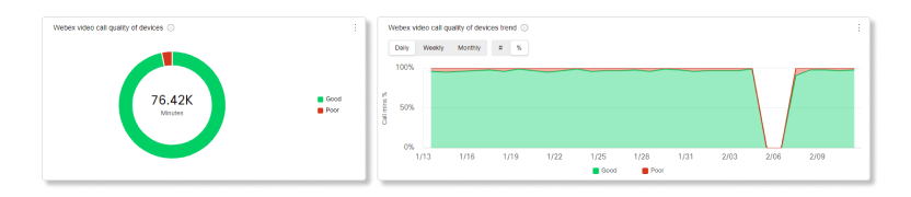
Webex audio call quality of devices and trend
This chart shows a breakdown between good and poor audio quality during calls and meetings using Webex for Cisco devices in your organization. If there's a sudden spike of Cisco devices with poor audio quality, you can view the metrics for that specific date range and compare the metrics between all the other charts available to you and see if there are any common anomalies.
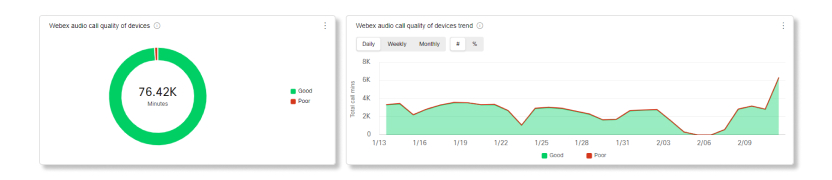
Issue mins of devices in Webex Calls
This chart breaks down audio and video minutes of Cisco devices that had packet loss and latency issues. Minutes are counted as issues if they were above 400ms latency or had more than 5% of packet loss during meetings and calls using Webex.
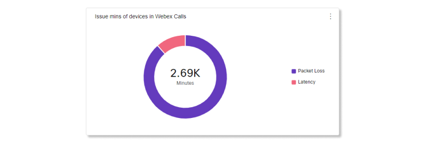
Top 20 devices by poor Webex call mins
This chart shows the top 20 Cisco devices that had the most poor quality video and audio minutes during calls and meetings using Webex over the selected date range. You can use this chart to figure out if Cisco devices are having issues in a location, or if issues are limited to certain devices.
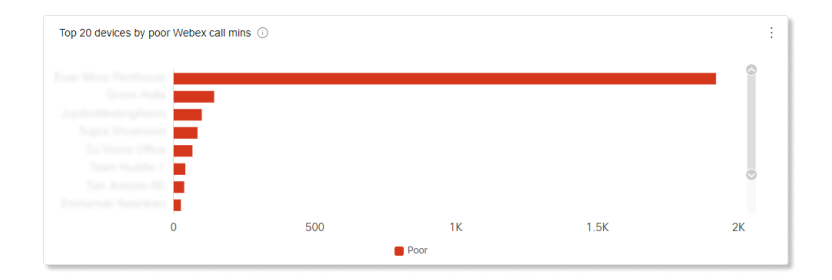
Top 300 devices with poor Webex call quality mins
This table shows the top 300 Cisco devices with the most poor audio and video minutes over the selected date range. You can use this table to view the meetings that the devices were in with troubleshooting and see if other participants also experienced poor media quality issues.
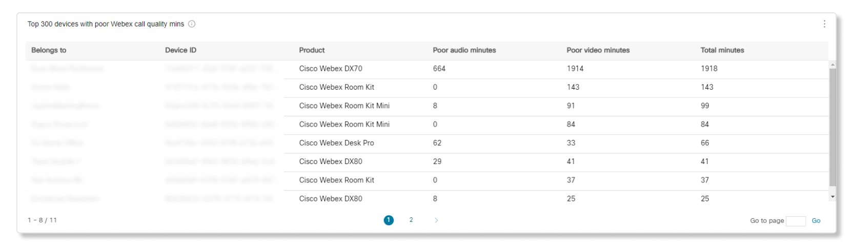
Key Performance Indicators (KPIs)
KPIs are available at the top of the page to show you how workspaces are being utilized in your organization. You can use these KPIs as measurable data to see if any workspaces aren't being used often and what the popular timeslots are. The KPIs available are:
- Total workspaces—The number of workspaces that have been set up over the selected date range.
- Occupied workspaces—The number of unique workspaces that were used by people over the selected date range. Unique workspaces are only counted once. For example, if the same workspace was occupied three different times in a week, it’s still counted as one. You can use this KPI to determine if more or less workspaces are needed for your organization.
- Booked & occupied workspaces—The number of unique workspaces that have been scheduled for use on the calendar and were occupied during that scheduled time over the selected date range. You can use this KPI to determine if users are actually utilizing the workspaces available.
- Peak occupancy hour—The most common hour that workspaces were occupied over the selected date range. This data is aggregated based on the number of days selected. For example, if you select 30 days, then the data is divided into one hour time slots for every working hour. The one-hour time slot with the most occupied workspaces during that date range will show as the peak occupancy hour.
- Ghosted meeting—The percentage of workspaces that were scheduled for use on the calendar, but weren’t occupied over the selected date range. You can use this KPI to get a sense of how often users are reserving workspaces and not occupying them.
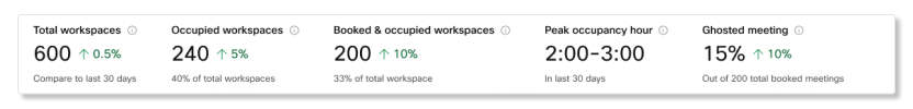
Workspaces usage by type
This chart categorizes workspaces based on the types assigned to them over the selected date range.

Workspace Occupancy hours by location
This chart shows which location had the most occupancy hours over the selected date range.
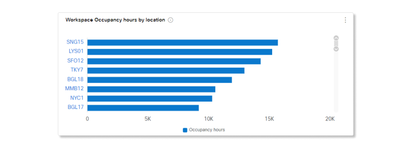
Workspaces usage trend by type
This chart shows the trend of workspace usages by each category over the selected date range.
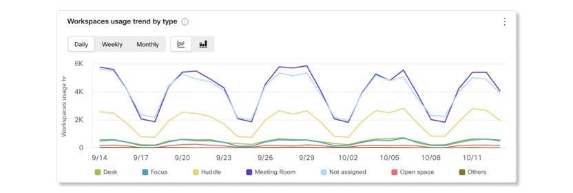
Booked workspaces meeting occupancy trend
This chart shows a trend of how many booked meetings were occupied and how many booked meetings were ghost meetings.
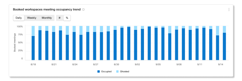
Workspaces details
This table shows a list of all workspaces set up in your organization. The details included are:
- Workspace name—The name entered for the workspace.
- Location name—The location that was assigned to the workspace.
- City—The city entered for the workspace.
- Country—The country entered for the workspace.
- Type—The type assigned to the workspace.
- Capacity—The maximum number of people the workspace is for.
- Occupancy hours—The number of hours the workspace was occupied for over the selected date range.
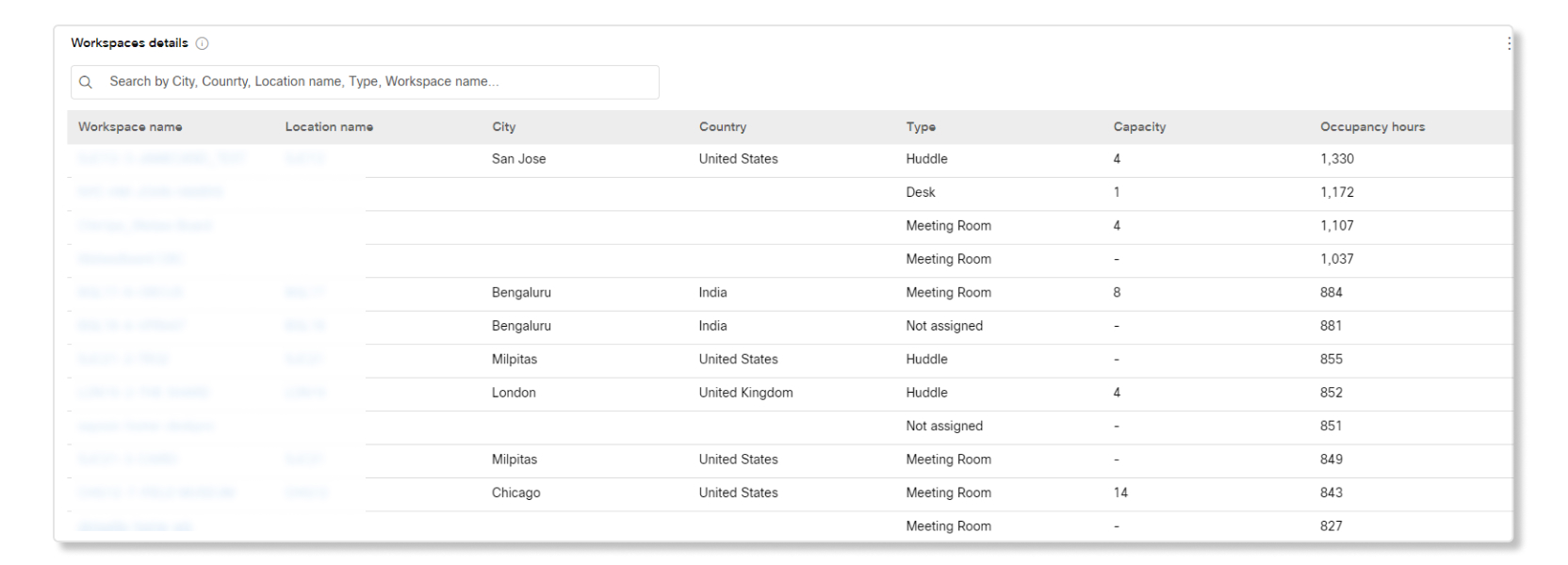
Charts and graphs for individual workspace locations
The following charts and graphs are available when you click on a location.
Total workspaces, utilization rate, and occupied workspaces KPIs
The KPIs available for individual workspace locations are:
- Total workspaces—The number of workspaces that have been set up in Control Hub over the selected date range. The percentage shows the change in value over time by comparing it with the past data of the date range selected.
- Utilization rate—The percentage of all workspaces in a location being occupied reguarly.
- Occupied workspaces—The number of workspaces that were used by people over the selected date range. The percentage shows the change in value over time by comparing it with the past data of the date range selected.
- Peak occupancy hour—The most common hour that workspaces were occupied over the selected date range. This data is aggregated based on the number of days selected. For example, if you select 30 days, then the data is divided into one hour time slots for every working hour. The one-hour time slot with the most occupied workspaces during that date range will show as the peak occupancy hour.
- Ghosted meeting—The percentage of workspaces that were scheduled for use on the calendar, but weren’t occupied over the selected date range. You can use this KPI to get a sense of how often users are reserving workspaces and not occupying them.

Distribution of occupied workspace by hour
This chart shows how many workspaces were occupied during an hour.
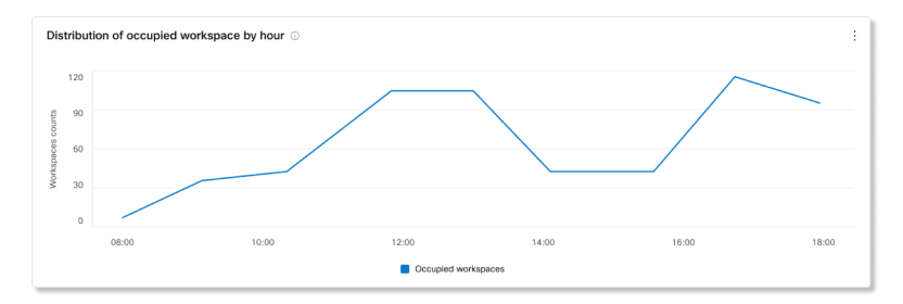
Workspace utilization rate trends by workspace type
This chart shows a trend of how often workspaces are being occupied by each type. Utilization rate is calculated as:
The number of workspaces that were booked and partially occupied + the number of workspaces that weren’t booked but occupied / the total number of workspaces.
Occupied workspaces by type trend
This chart shows a trend of occupied workspaces by their assigned types. Data is captured every 10 minutes, and the number of workspaces that were occupied during those times are then aggregated in an hourly pivot.
Booked workspaces meeting occupancy trend
This chart shows a trend of how many booked meetings were occupied and how many booked meetings were ghost meetings.
Workspace types by occupancy hr
This chart shows a breakdown of workspace types by how often they're occupied.
Top 10 occupied workspaces by occupancy hr
This chart shows the top 10 workspaces with the most occupied hours. Seeing a list of top occupied workspaces can help identify which workspaces are being underutilized.
Workspaces details
This table shows a list of workspaces that are assigned to the selected location. The details included are:
- Workspace name—The name entered for the workspace.
- City—The city entered for the workspace.
- Country—The country entered for the workspace.
- Type—The type assigned to the workspace.
- Capacity—The maximum number of people the workspace is for.
- Occupancy hours—The number of hours the workspace was occupied for over the selected date range.
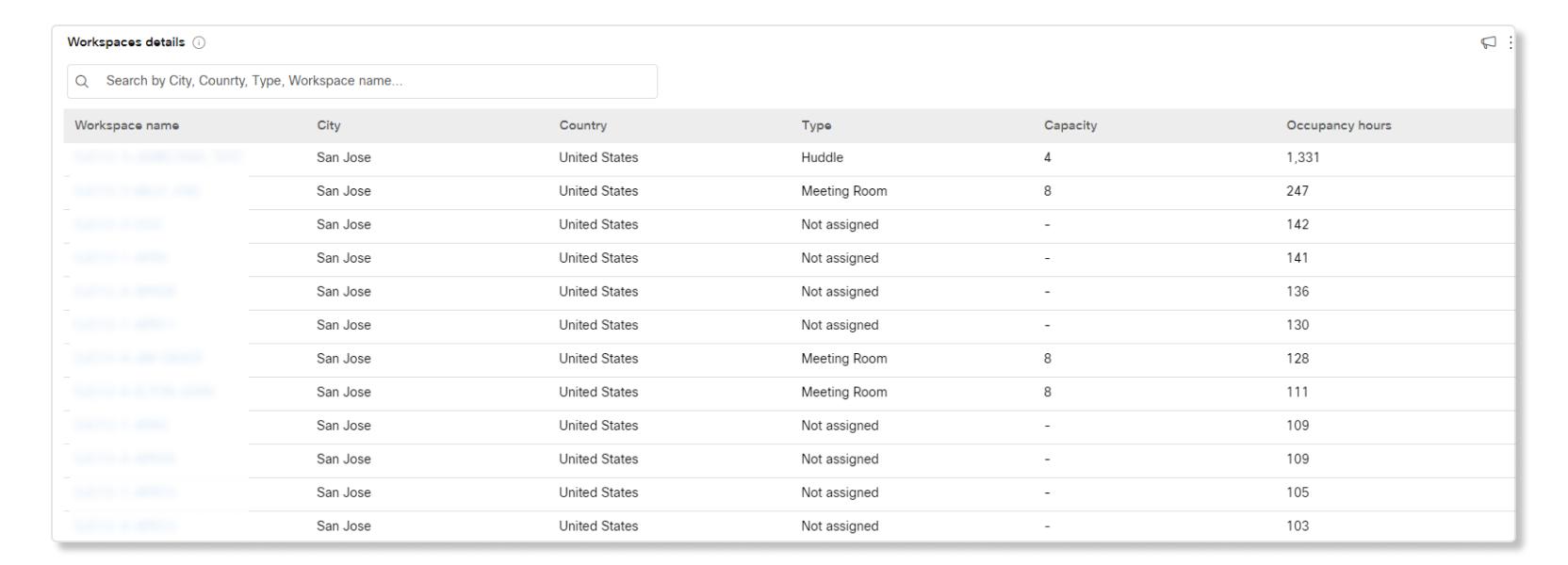
With the Customer Assist Essentials offering, you have access to data that helps you gauge the productivity of call queues and agents.
To access this data in Control Hub, go to .
To optimize performance and resource usage, there's a 15-minute delay before recent data is shown in historical dashboards. This delay applies to both Control Hub and Supervisor in Webex App.
Want to see how it's done? Watch this video demonstration for an overview of Customer Assist queue analytics.
KPIs
KPIs are available at the top of the page to show you a quick high-level status of incoming calls in call queues within the date range that you selected. The KPIs available are:
- Total answered calls—Total number of calls that agents answered. The percentage shows the change in value over time by comparing it with the past data of the date range selected.
- Total abandoned calls—Total number of calls where the caller hung up or left a message before an agent became available. The percentage shows the change in value over time by comparing it with the past data of the date range selected.
- Percentage of abandoned calls—Percentage of calls where the caller hung up or left a message before an agent became available. The percentage shows the change in value over time by comparing it with the past data of the date range selected.
- Avg wait time—Average time that callers spent waiting for the next available agent to answer the call. The percentage shows the change in value over time by comparing it with the past data of the date range selected.
Incoming calls for call queues and trend
This chart shows a breakdown of call queue statistics by incoming calls. You can use this chart to see how call queues are handling all the incoming calls to your organization.
Avg call queue time per call and trend
This chart shows a breakdown between the average abandoned and average wait minutes from incoming calls. You can use this chart to see how long callers had to wait before hanging up the call or getting transferred to an agent. Average minutes are calculated as:
- Avg. abandoned time—Average call time that the callers spent waiting for an agent before hanging up or selecting the option to leave a message.
- Avg. wait time—Average time that callers spend waiting for the next available agent to answer the call.
Top 25 call queues by status of calls
This table shows the top 25 call queues with the most calls by a specific status. The statuses of calls available are:
- Answered calls—Number of calls answered by agents.
- % of answered calls—Percentage of calls answered by agents.
- Abandoned calls—Number of calls where the caller hung up or left a message before an agent became available.
- % of abandoned calls—Percentage of calls where the caller hung up or left a message before an agent became available.
- Overflows - Busy—Number of calls that overflowed to a different call queue because the queue limit was met.
- Overflows - Timed out—Number of calls that overflowed to a different call queue because the wait time exceeded the maximum configured limit.
- Calls transferred—Number of calls that were transferred out of the queue.
Top 25 call queues by avg wait and abandoned time
This table shows the top 25 call queues with the highest average wait and abandoned times from incoming calls. Average time are calculated as:
- Avg abandoned time—Average call time that the callers spent waiting for an agent before hanging up or selecting the option to leave a message.
- Avg wait time—Average call time that callers spend waiting for the next available agent to answer the call.
Call queue stats
This table shows details of call queues that have been set up in your organization. You can use this table to see the number of incoming calls to call queues and the status of those calls. You can also search for specific call queues, locations, phone numbers, and extensions by using the search bar in the table. The details available are:
- Call queue—Name of the call queue.
- Location—Location assigned to the call queue.
- Phone No.—Phone number assigned to the call queue.
- Extension—Extension number assigned to the call queue.
- Total hold time—Total time that calls were placed on hold by agents.
- Avg hold time—Average time that calls were placed on hold by agents.
- Total talk time—Total time that agents were actively talking on calls.
- Avg talk time—Average time that agents were actively talking on calls.
- Total handle time—Total time that agents spent handling calls. Handle time is calculated as Total talk time + Total hold time = Total handle time.
- Avg handle time—Average time that agents spent handling calls.
- Total wait time—Total time that callers spent waiting for the next available agent to answer the call.
- Avg wait time—Average time that callers spent waiting for the next available agent to answer the call.
- Calls answered—Number of calls answered by agents.
- % Answered calls—Percentage of calls answered by agents.
- Calls abandoned—Number of calls where the caller hung up or left a message before an agent became available.
- % Abandoned calls—Percentage of calls where the caller hung up or left a message before an agent became available.
- Avg abandoned time—Average time where callers hung up or left a message before an agent became available.
- Abandoned time—Time where callers hung up or left a message before an agent became available.
- Total calls—Total number of incoming calls.
- Overflow - Busy—Number of calls that overflowed because the queue limit was met.
- Overflow - Timed out—Number of calls that overflowed because the wait time exceeded the maximum limit.
- Calls transferred—Number of calls that were transferred out of the queue.
KPIs
KPIs are available at the top of the page to show you details about the calls that agents handled within the date range that you selected. The KPIs available are:
- Total answered calls—Total number of presented calls that were answered by agents. The percentage shows the change in value over time by comparing it with the past data of the date range selected.
-
Total bounced calls—Total number of calls that were presented to an
agent but weren't answered. The percentage shows the change in value over time by
comparing it with the past data of the date range selected.
Calls that were declined by an agent aren't counted as bounced calls.
- Avg. handle time—Average time that agents spend on handling calls. Handle time includes talk time, hold time, and ring time. The percentage shows the change in value over time by comparing it with the past data of the date range selected.
Avg agent call time per call and trend
This chart shows on average how long each call lasts by their call status. You can use this chart to see if callers are getting the help they need in a timely manner.
Incoming calls to agents by call status
This chart shows a breakdown of incoming calls to agents based on the call status. This chart can help you see if there are more bounced calls than usual.
Active agents trending
This chart shows a trend of active agents during certain date ranges. You can compare the numbers of agents in this chart with another chart, such as with Incoming calls to agents by call status, to see if there are enough agents to handle the number of calls.
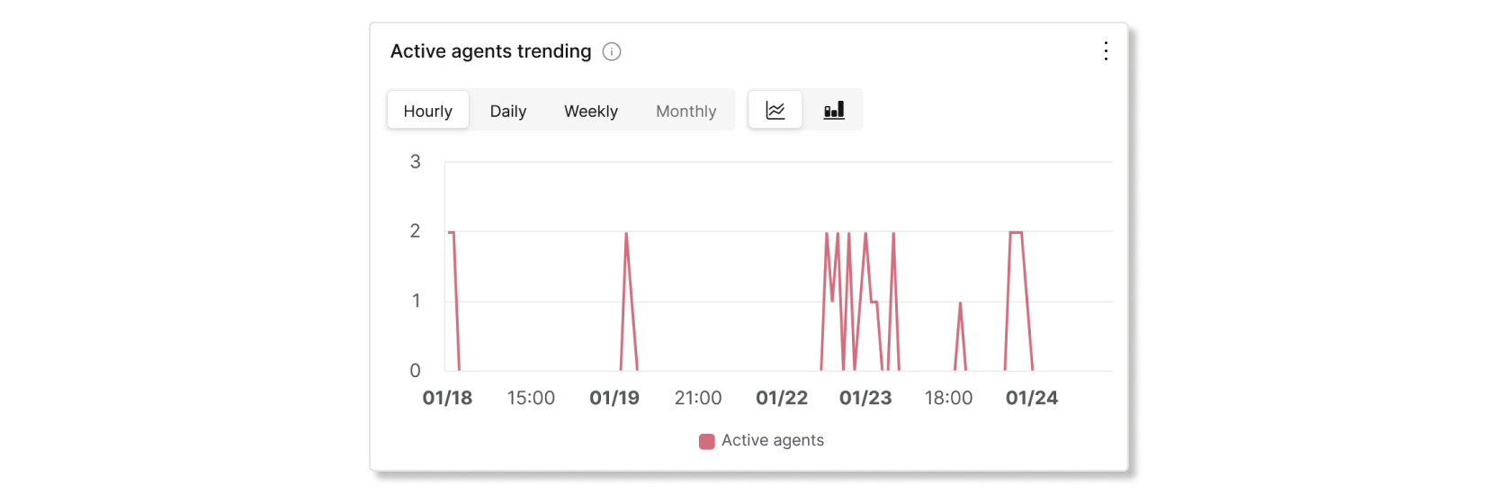
Top 25 agents by answered and bounced calls
This table shows the top 25 agents with the most answered or bounced calls.
Calls that were declined by an agent aren't counted as bounced calls.
Top 25 agents by avg talk and avg held time
This table shows the top 25 agents with the highest average talk or hold minutes.
Call queue agents
This table shows details of all the agents that have been assigned to call queues in your organization. You can use this table to see which agent gets the most calls and information about their calling stats. You can also search for specific agent or workspace names, call queues, and locations by using the search bar in the table. The details available are:
- Agent name—Name of the agent or workspace.
- Call queue—Name of the call queue.
- Location—Location assigned to the call queue.
- Total answered calls—Number of calls that were presented to the agent and answered by them.
-
Bounced calls—Number of calls that were presented to the agent but went
unanswered.
Calls that were declined by an agent aren't counted as bounced calls.
- Total presented calls—Number of inbound calls to the agent that were distributed by the call queue.
- Total talk time—Total time that an agent spent actively talking on calls.
- Avg. talk time—Average time that an agent spent actively talking on calls.
- Total hold time—Total time that an agent put calls on hold.
- Avg. hold time—Average time that an agent put calls on hold.
- Total handle time—Total time an agent spends on a call from a queue. This is recorded when the agent ends or transfers the call. Handle time includes talk time, hold time, and ring time.
- Avg. handle time—Average time that an agent spent handling calls. Handle time includes talk time, hold time, and ring time.
KPIs
KPIs are available at the top of the page to show you all the current incoming calls and what their statuses are to help you monitor call queues in real time. The KPIs available are:
- Active calls—Shows the number of calls where agents are talking to callers.
- Calls waiting—Shows the number of calls that are waiting for the next available agent to answer.
- Held calls—Shows the number of calls that agents placed on hold.
Live call queue stats
This table shows details of all the call queues that have been set up in your organization. You can use this table to see which call queue gets the most calls and adjust the number of agents as needed. You can also search for specific call queues, locations, phone numbers, and extensions by using the search bar in the table. The details available are:
- Call queue—The name of the call queue.
- Location—The location assigned to the call queue.
- Phone no.—The phone number assigned to the call queue.
- Extension—The extension assigned to the call queue.
- Active calls—The number of calls where agents are talking to callers.
- Held calls—The number of calls that agents have placed on hold.
- Calls waiting—The number of calls that are waiting for the next available agent.
Supervisor desktop
As a supervisor in Customer Assist, you have access to the following charts in Webex App.
KPIs
KPIs are available at the top of the page to show you details about how agents are handling calls. The KPIS available are:
- Connected counts—Number of connected calls answered by agents over the selected date range.
- Avg. handle time—Average amount of time that agents spent handling calls over the selected date range. Handle time includes talk time, hold time, and ring time.
- Avg. inbound connected time—Average amount of time that agents spent connected with calls over the selected date range.
- Avg. inbound hold time—Average amount of time that agents put an inbound call on hold over the selected date range.
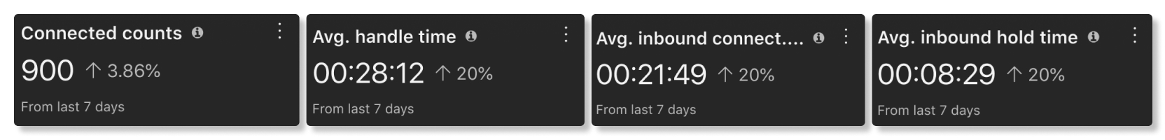
Avg. agent connected time per connection trend
This chart shows a trend of inbound status times of agents per connection over the selected date range. This chart helps you see if hold times are increasing over time because there aren't enough agents or if calls are getting answered in a timely manner.
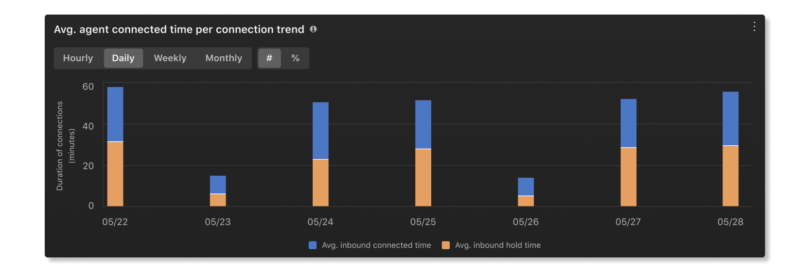
Avg. inbound connected time by agents
This chart shows the agents with the longest average inbound connected times in ascending or descending order over the selected date range. You can use this chart to see if there are any outliers in how long calls can take.

Avg. inbound hold time by agents
This chart shows the agents with the longest average inbound hold times in ascending or descending order over the selected date range. You can use this chart to see if more agents are needed in a specific call queue if calls are getting put on hold for longer than average.

Queue agents
This table shows details of the agents that have been assigned to call queues in your organization. You can use this table to see which agent gets the most calls and information about their calling stats. The details available are:
- Agent name—Name of the agent.
- Queue name—Name of the call queue.
- Location—Location assigned to the call queue.
- Answered calls—Number of calls that the agent answered.
- Bounced calls—Number of calls that are presented to the agent but went unanswered.
- Abandoned calls—Number of calls where callers hung up or left a message before an agent became available.
- Other unanswered calls—Number of calls that had a status other than unanswered. For example, instances where the caller didn't make a key selection.
- Presented calls—Number of inbound calls to the agent that were distributed by the call queue.
- Total talk time—Total time that an agent spent actively talking on calls.
- Avg. inbound talk time—Average time that an agent spent actively talking on calls.
- Total hold time—Total time that an agent put calls on hold.
- Avg. inbound hold time—Average time that an agent put calls on hold.
- Total handle time—Total time an agent spends on a call from a queue. This is recorded when the agent ends or transfers the call. Handle time includes talk time, hold time, and ring time.
- Avg. handle time—Average time that an agent spent handling calls. Handle time includes talk time, hold time, and ring time.
- agentId—Unique identifier of the agent answering the call offered from the queue.
KPIs
KPIs are available at the top of the page to show you the high-level status of call queues. The KPIs available are:
- Answered—Number of calls that agents answered over the selected date range.
- Abandoned—Number of calls where the caller hung up or left a message before an agent became available over the selected date range.
- Avg. hold time—Average time that agents put callers on hold over the selected date rage.
- Avg. queue wait time—Average time that callers spent waiting for the next available agent to answer the call over the selected date range.
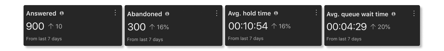
Incoming calls for queues and trend
These charts categorize incoming calls based on their statues. You can use this chart to get a general overview of how call queues are performing.
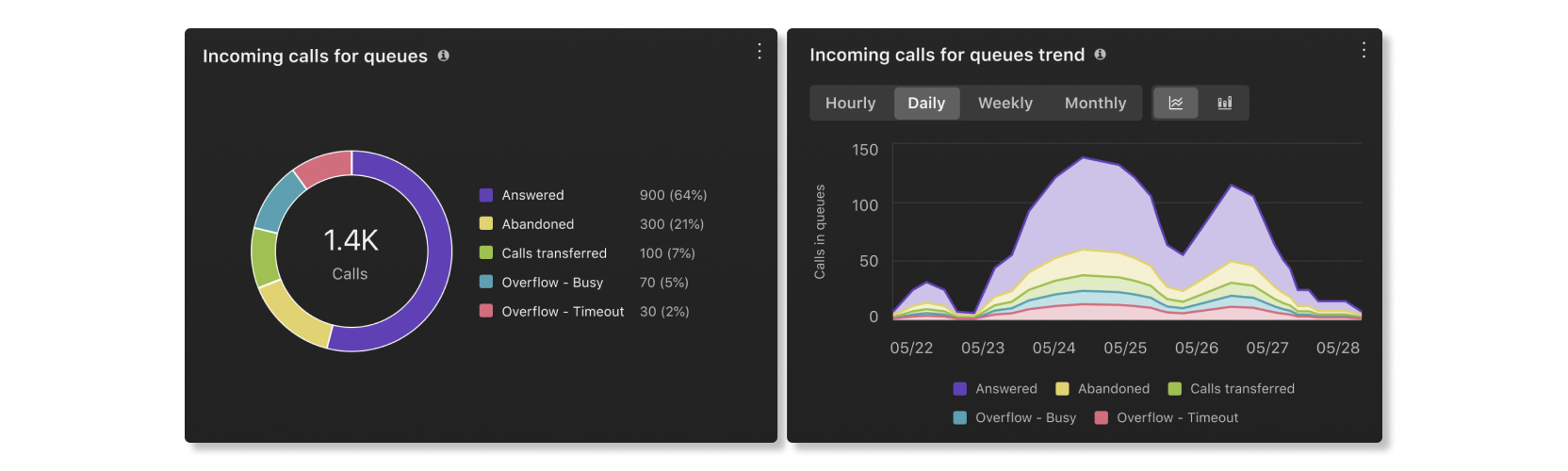
Avg. queue wait time per call
This chart shows the call queue with the longest average wait time per call by ascending or descending order over the selected date range. You can use this chart to see which call queue needs more agents assigned to it to help reduce the wait time.

Avg. queue hold time per call
This chart shows the call queue with the longest average hold time per call by ascending or descending order over the selected date range. You can use this chart to see when callers were put on hold for longer than average.

Queue details
This table shows details about call queues that have been set up in your organization. You can use this chart to see how agents in each call queue are performing. The details available are:
- Queue name—Name of the call queue.
- Hold duration—Amount of time that callers were put on hold.
- Avg hold time—Average amount of time per call that callers were put on hold.
- Connected duration—Amount of time that callers talked to agents.
- Inbound avg. connected duration—Average amount of time per call that callers talked to agents.
- Handle time—Amount of time that agents spent on a call from a queue. This is recorded when agents end or transfer the call. Handle time includes talk time, hold time, and ring time.
- Avg. handle time—Average amount of time that agents spent handling calls over the selected date range. Handle time includes talk time, hold time, and ring time.
- Queue time—Amount of time that callers spent waiting for the next available agent to answer the call.
- Avg. queue wait time—Average time that callers spent waiting for the next available agent to answer the call.
- Answered—Number of calls answered by agents.
- Abandoned—Number of calls where callers hung up or left a message before an agent became available.
- Total calls—Total number of incoming calls.
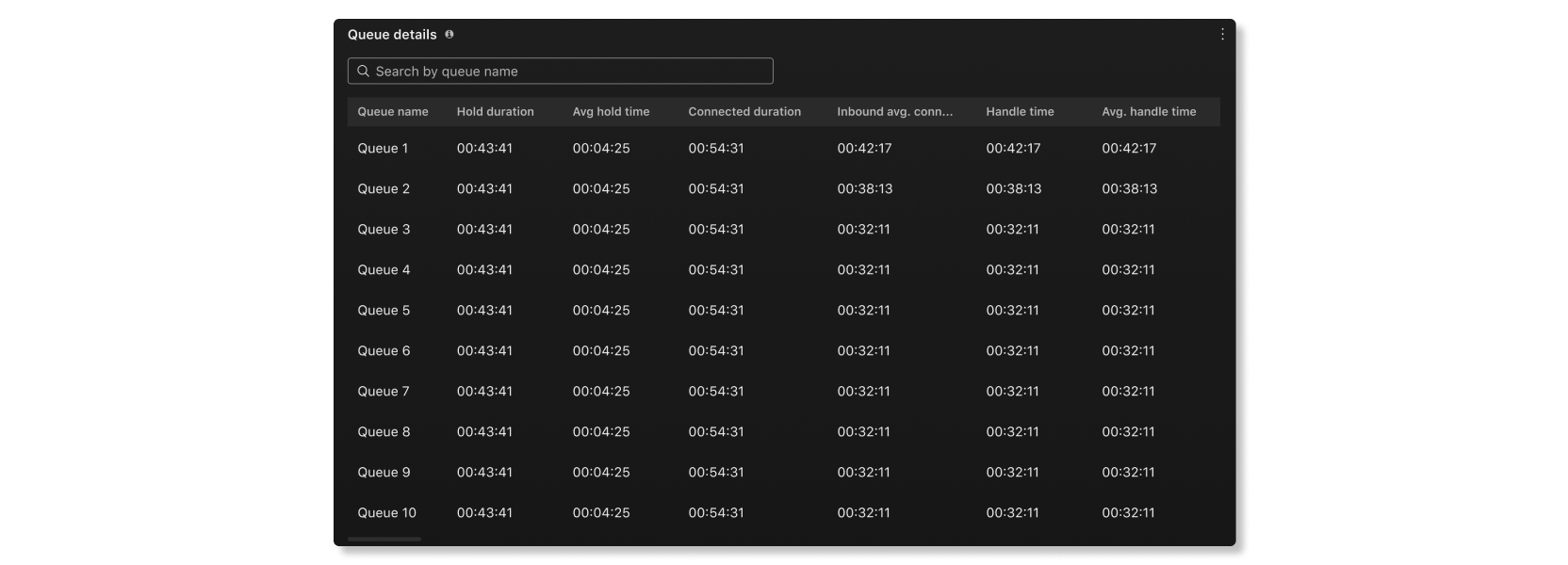
Live contacts in queue trend
This chart shows how many callers are currently waiting in a queue. You can use this chart to see when the peak calling times are so that you can adjust call queues or reassign agents as needed.
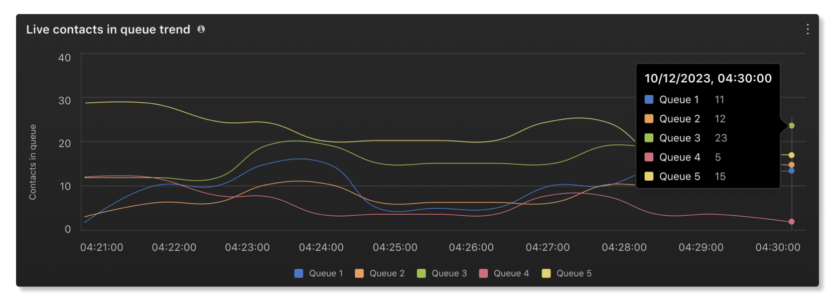
Live queue stats
This table shows details of agent statuses and the number of contacts waiting in queues. You can use this table to see if you need to adjust the number of agents in certain queues. The details available are:
- Queue name—Name assigned to the call queue.
- Contacts currently in queue—Number of callers that are waiting for an agent to be available.
- Total agents—Number of agents assigned to the queue.
- Agents staffed—Number of agents that have joined the queue.
- Agents idle—Number of agents that are available but not on a call.
- Agents unavailable—Number of agents that have set their status as "Unavailable" and aren't receiving calls.
KPIs
KPIs are available at the top of the page to show you statistics on how agents wrap up their calls. The KPIs available are:
- Avg wrap up duration—The average wrap up duration across all agents in the organization.
- Highest avg wrap up duration queue—The queue with agents who had the highest average wrap up duration over the date range selected.
- Lowest avg wrap up duration queue—The queue with agents who had the lowest average wrap up duration over the date range selected.
Avg wrap up duration trend
This chart shows the trend of average wrap up duration across all queues over the selected date range. You can use this information to see which days have a higher than average wrap up durations, and investigate those days to find out the reason why the average durations were higher.
Top/Bottom wrap up reasons used
This table shows the top or bottom wrap up reasons used and their corresponding average wrap up duration over the selected date range. You can use this information to see which wrap up reasons were the most used in your organization and if the duration is expected for your organization's service-level agreement.
Top queues by highest/lowest avg wrap up duration
This table shows the top queues with the highest or lowest average wrap up duration and their corresponding wrap ups completed over the selected date range. You can use this information to gain insights on why certain queues take longer to complete their wrap ups than others.
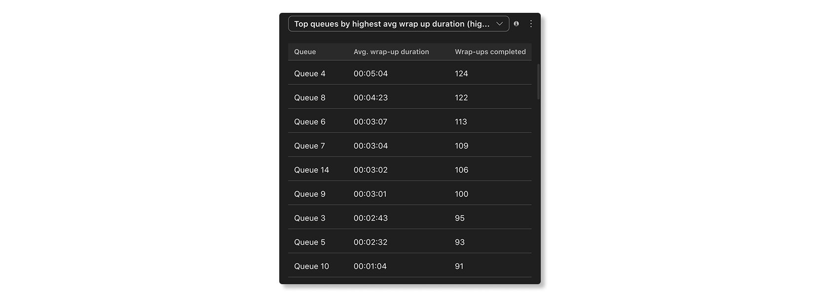
Top agents by highest/lowest number of wrap ups completed
This table shows the top agents by number of wrap ups completed over the selected date range. and their corresponding average wrap up duration over the selected date range. You can use this information to see how well agents are performing in your organization.

Top agents by highest/lowest avg wrap up duration
This table shows the top agents with the highest or lowest wrap up duration and their corresponding wrap ups completed over the selected date range. You can use this information to help agents improve their wrap up times to provide a consistent customer service experience.

Agent desktop
As an agent in Customer Assist, you have access to the following charts in Webex App.
Live contacts in queue trend
This chart shows how many callers are currently waiting in a queue. You can use this chart to see when the peak calling times are so that you can adjust call queues or reassign agents as needed.
Live queue stats
This table shows details of agent statuses and the number of contacts waiting in queues. You can use this table to see if you need to adjust the number of agents in certain queues. The details available are:
- Queue name—Name assigned to the call queue.
- Contacts currently in queue—Number of callers that are waiting for an agent to be available.
- Total agents—Number of agents assigned to the queue.
- Agents staffed—Number of agents that have joined the queue.
- Agents idle—Number of agents that are available but not on a call.
- Agents unavailable—Number of agents that have set their status as "Unavailable" and aren't receiving calls.
Sustainability analytics models the estimated energy that current measurable devices and phones in your organization are consuming over a selected date range and the estimated greenhouse gas emissions (measured in CO2e) associated with their energy consumption.
Sustainability analytics currently includes energy consumption metrics for the following product list of measurable devices and phones in your organization:
-
Desk Portfolio (excluding DX 70)
-
Board Portfolio (excluding Spark Board 55 and 70)
-
Board Pro 55 G2 and Board Pro 75 G2
-
Room Kit and Room Kit Mini
-
Room Bar and Room Bar Pro
-
Quad Cam
-
Codec Plus, Codec Pro, Codec EQ
-
Room55S
-
Desk Phone 9800
Time zone selector
The time zone is set according to your selection at the top-right corner. You can change your preferred time zone anytime from the drop-down menu.
Device energy consumption
You can set your own carbon emission factor by going to and then clicking Edit. The default value is based on the US EPA's eGRID if your organization is based in the US.
You can learn more about different measurements of energy consumption for Cisco Video Collaboration devices here.
KPIs
The following KPIs related to current measurable devices and phones in your organization are available at the top of the page:
- Total device energy consumption—Total number of kilowatts hours consumed over the selected date range.
- Estimated carbon emissions—An estimate of the carbon emissions released from the energy consumption over the selected date range.
- Current measurable devices—Total number of devices and phones that can be measured for energy consumption and are currently online.
-
Potential savings in a year—An estimate of how much energy your organization is
saving, assuming that each measurable device and phone is set to be online for ten hours
during a typical week of five business days and zero hours during the weekend.
Potential savings in kWh for devices and phones online in the past 52 weeks is calculated as:
- Devices—52 weeks * [14 hours * 5 (working days)] + [24 hours *2 (weekend)] * [power in Halfwake mode – energy consumption in Networked Standby mode]
- Phones—52 weeks * [14 hours * 5 (working days)] + [24 hours *2 (weekend)] * [power in Idle mode – energy consumption in Deep Sleep mode]
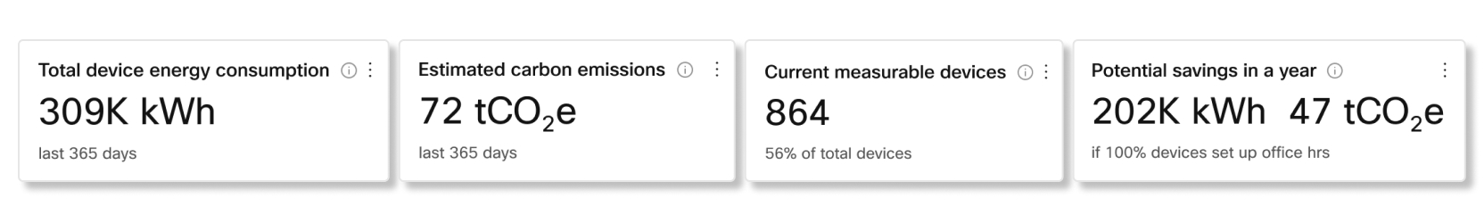
Devices energy consumption trend
This chart shows the trend of how much energy is consumed for measurable devices and phones over the selected date. You can also see how much energy is consumed from those devices and phones when they're in a standby state. You can use this chart to track how the changes you do to devices and phones affect energy consumption over time.
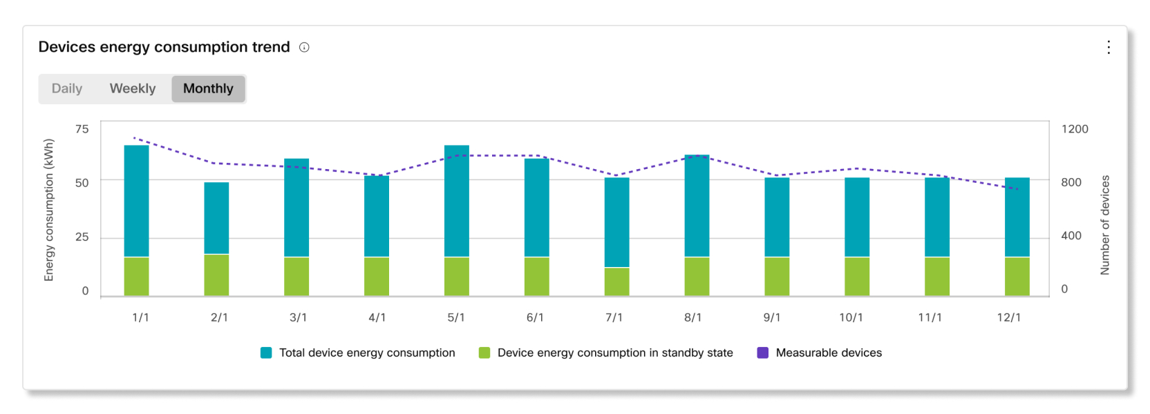
Slido analytics help you see how often users are engaging with Slido features during their meetings.
KPIs
The following KPIs related to how often Slido is used in your organization are available at the top of the page:
- Slidos created—Total number of Slido events created that had at least one active participant within the selected date range.
- Webex Meetings with Slido—Total number of Webex meetings where Slido was used within the selected date range.
- Active participants—Total number of Slido participants who've asked a question in Q&A, upvoted in Q&A, or voted in a poll within the selected date range.
Participant interactions trend
This chart shows you a trending breakdown of how participants are using Slido. You can use this chart to see what type of Slido events are more popular with users in your organization, or help drive engagement with events that aren't as popular.
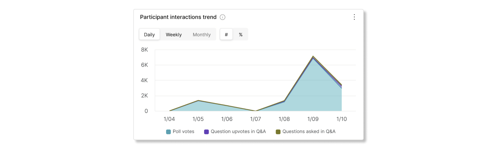
Users who have used a Slido event as admin trend
This chart shows you a trend of how many Slido administrators created at least one Slido event.
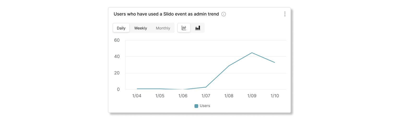
Slidos created trend
This chart shows you a trend of how many Slido events were created within a date range. You can use this chart to help users adopt Slido if you notice a downward trend.

Webex Meetings with Slido trend
This chart shows you a trend of the number of meetings where Slido was used. You can use this chart to help see if users in your organization are adopting Slido in their day to day meetings.

Active participants trend
This chart shows you a trend of users who engage with Slido events, such as asking a question in Q&A, upvoting a question in Q&A, or voting in a poll.

Video Mesh Analytics provide information about how you use your on-premises Webex Video Mesh nodes and clusters in your Cisco Webex organization. With the historical data in the metrics view, you can more effectively manage your Webex Video Mesh resources by monitoring the capacity, utilization, and availability of your on-premises resources. If your clusters are always full, you can use this information to help make decisions about adding more Webex Video Mesh nodes to a cluster or creating new clusters.
Video Mesh Analytics can be found in Control Hub under .
To help with analyzing the data in your organization, you can select one of the metrics on the chart to filter the data that you want to see.
Video Mesh Analytics show data in the time zone that's set for the local browser.
For more information on how to interact with the data, see the Deployment Guide for Cisco Webex Video Mesh.
In this page, you can monitor data for call legs that used Video Mesh within the last 4 or 24 hours.
KPIs
KPIs are available at the top of the page to show the stats for call legs that used Video Mesh in your organization. You can use these KPIs as measurable data to see if your organization has enough nodes to handle the amount of call legs during a typical day. The KPIs available are:
- Total call legs—The total number of call legs that connected to on-premises and cloud clusters.
- On-premises call legs—The number of call legs that connected to on-premises clusters.
- Overflow to cloud call legs—The total number of call legs that tried to connect to an on-premises cluster, but none were available. If this number is high, you can determine if there was a problem with any clusters during that date range, or if your organization needs more on-premises clusters to handle hosting more call legs.
- Cloud call legs—The total number of call legs that connected to a cloud cluster. If this number is high, your organization may need to consider setting up more on-premises clusters.
- Average cluster availability—The average percentage of on-premises clusters that were available for call legs to connect to. If this number is low, you can use the charts below to see which location had on-premises clusters that were always at max capacity.
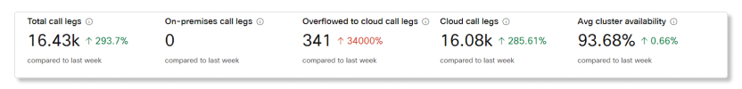
Cluster availability by node
This chart shows the percentage of node availability for each on-premises cluster that can host calls. This data helps you gain an overall perspective of offending clusters or node at the organization level. Click on any of these clusters to filter all the associated graphs to show details that are related to the selected cluster.
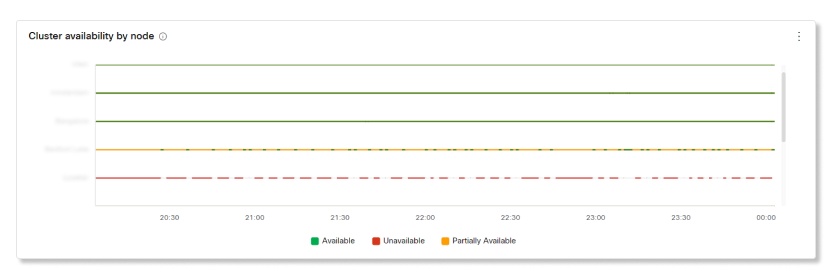
Nodes availability details
This chart shows the nodes that are available for the on-premises cluster that you selected. This data helps you see which nodes are having problems in your organization so you can troubleshoot the issue.
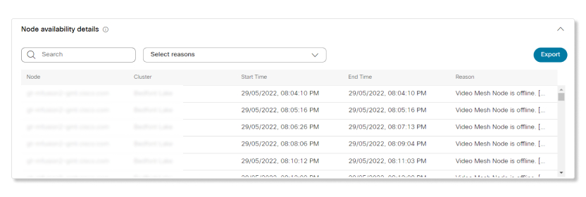
Average resource utilization by cluster trend
This chart provides a trend for the average resource utilization of media services used in on-premises clusters compared to other clusters. This information helps you decide if a specific location needs more or less on-premises clusters.
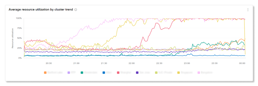
Maximum call distribution by cluster trend
This chart shows a summary and trend for how call legs are distributed across the different on-premises clusters in your organization. This information lets you compare the data about call legs that connect to various clusters in your organization overtime.
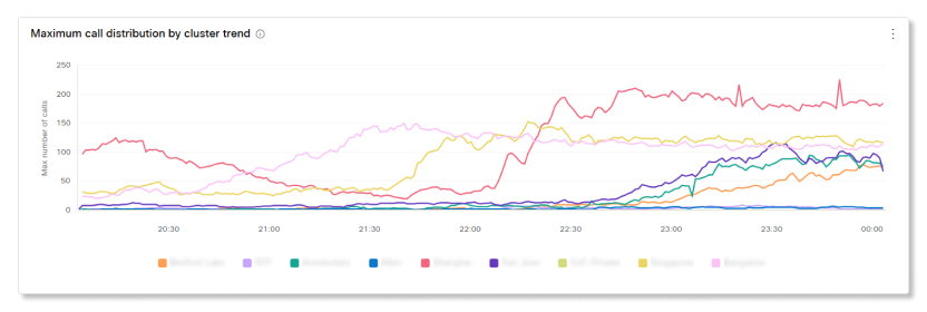
Call leg redirects by cluster trend
This chart provides details about the redirected call legs and a trend of the number of call legs that didn't connect to a specific on-premises cluster—typically because of high CPU usage or network capacity being full. These call legs redirected to another on-premises cluster that was able to connect to the meeting. This information helps you gain an overall perspective of the utilization of the clusters in your organization so that you can plan for better capacity.
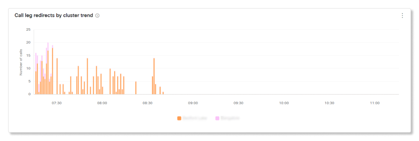
Call leg overflows to cloud by cause trend
This chart shows a trend of call legs that overflowed to cloud clusters. This can happen for a number of reasons—for example, a node exceeds its capacity, is being upgraded, has network connectivity issue, or the Webex site isn't properly enabled for Video Mesh. This information helps you pinpoint potential reasons for when call legs overflow to a cloud cluster.
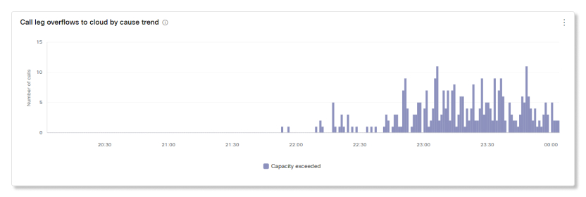
Total cascaded bandwidth usage by cluster trend
Shows a recent view of the total bandwidth used across all Webex Video Mesh clusters when cascades are established between on-premises and the cloud. Regardless of the time period that you select on the Analytics page, this data updates every 10 minutes.
The bandwidth value appears in Mbps. The graph shows a breakdown of either or both the transmitted (Tx) and received (Rx) bandwidth.
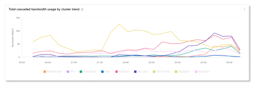
When you choose a cluster on the graph, you see a breakdown of the cascade bandwidth usage (received and transmitted bandwidth) and the streams bandwidth usage (audio, video, and content share).
Key Performance Indicators (KPIs)
There are four KPIs that show at the top of the Video Mesh Engagement tab. The range of data they measure changes as you select a new date range.
The four KPIs are:
-
Total Call Legs—The total number of call legs that connected to on-premises and cloud clusters.
-
On-Premises Call Legs—The number of call legs that connected to on-premises clusters.
-
Cloud Call Legs—The total number of call legs that connected to a cloud cluster. If this number is high, your organization may need to consider setting up more on-premises clusters.
-
Overflowed to Cloud Call Legs—The total number of call legs that tried to connect to an on-premises cluster, but none were available. If this number is high, you can determine if there was a problem with any clusters during that date range, or if your organization needs more on-premises clusters to handle hosting more call legs.
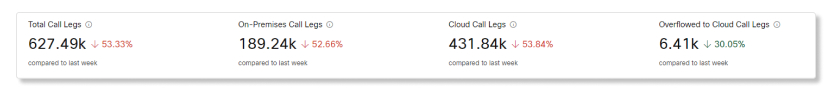
Call Legs by Cluster Type and Cluster Type Trend
These charts provide a summary and historical trend of call leg activity based on the clusters that call legs connected to. The chart gives an overall perspective of the number of call legs that connected to cloud clusters compared to the number of call legs that connected to on-premises clusters in an organization.
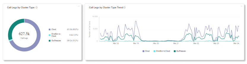
Call Legs by Endpoint Type and Endpoint Type Trend
These charts provide a summary and historical trend of endpoint types used to join meetings in your organization. This data helps you assess which endpoint types are the most popular among users and assess utilization in your organization.
Common endpoint types include:
-
Webex for Mobile
-
Webex for Desktop
-
Video Endpoint
-
SIP Endpoint
-
PSTN In
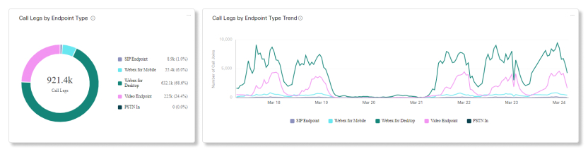
Meeting Connections by Call Legs and Call Legs Trend
These charts provide a summary and historical trend of call leg connections within a meeting. Depending on which clusters call legs connected to, meetings are classified as either:
-
On-Premises—All call legs in the meeting connected to an on-premises cluster.
-
Cloud—All call legs in the meeting connected to a cloud cluster.
-
Cloud and On-Premises—A mix of call legs in the meeting that connected to either an on-premises or cloud cluster.
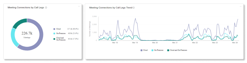
KPIs
There are three KPIs that show at the top of the Video Mesh Resources tab. The range of data they measure changes as you select a new date range.
The three KPIs are:
-
Avg Cluster Availability—The average percentage of on-premises clusters that were available for call legs to connect to. If this number is low, you can use the charts below to see which location had on-premises clusters that were always at max capacity.
-
Overflowed to Cloud Call Legs—The number of call legs that tried to connect to an on-premises cluster, but none were available, so the call legs connected to a cloud cluster. If this number is high, you can determine if there was a problem with any clusters during that date range, or if your organization needs more on-premises clusters to handle hosting more call legs.
-
Redirected Call Legs—The number of call legs that failed to connect to a specific on-premises cluster and had to be redirected to a different cluster. If this number is high, you can use the charts below to see which on-premises cluster is having trouble, or if certain on-premises clusters are always exceeding capacity.
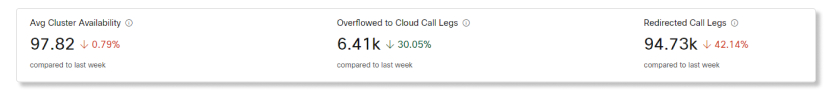
Cluster Availability by Percentage and Node
These charts show the percentage of node availability for each on-premises cluster that can host calls. This data helps you gain an overall perspective of offending clusters or node at the organization level. Click on any of these clusters to filter all the associated graphs to show details that are related to the selected cluster.
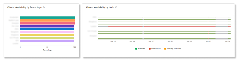
Node Availability
This chart shows the nodes that are available for the on-premises cluster that you selected. This data helps you see which nodes are having problems in your organization so you can troubleshoot the issue.
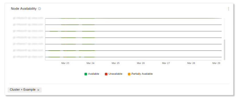
Call Leg Overflows to Cloud by Cause and Cause Trend
These charts show a summary and trend of call legs that overflowed to cloud clusters. This can happen for a number of reasons—for example, a node exceeds its capacity, is being upgraded, has network connectivity issue, or the Webex site isn't properly enabled for Video Mesh. This information helps you pinpoint potential reasons for when call legs overflow to a cloud cluster.
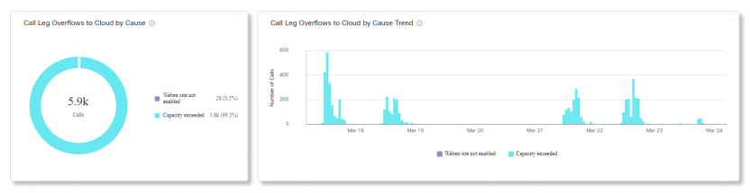
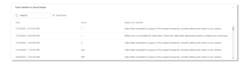
Call Leg Redirects by Cause and Cause Trend
These charts provide details about the redirected call legs and a trend of the number of call legs that didn't connect to a specific on-premises cluster—typically because of high CPU usage or network capacity being full. These call legs redirected to another on-premises cluster that was able to connect to the meeting. This information helps you gain an overall perspective of the utilization of the clusters in your organization so that you can plan for better capacity.
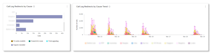
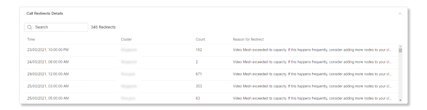
Maximum Call Distribution by Cluster and Cluster Trend
These charts show a summary and trend for how call legs are distributed across the different on-premises clusters in your organization. This information lets you compare the data about call legs that connect to various clusters in your organization overtime.
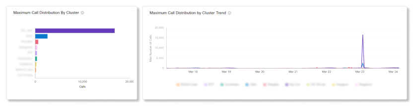
Average Resource Utilization by Cluster and Cluster Trend
These charts provide a summary and trend for the average resource utilization of media services used in on-premises clusters compared to other clusters. This information helps you decide if a specific location needs more or less on-premises clusters.
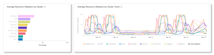
KPIs
There are five KPIs that show at the top of the Video Mesh Bandwidth Usage tab. The range of data they measure changes as you select a new date range.
The five KPIs are:
-
Total Data Usage—The total number of audio and video data that were transmitted and received from on-premises clusters.
-
Transmitted Data Usage—The number of audio and video data that were transmitted from on-premises clusters.
-
Received Data Usage—The number of audio and video data that were received from on-premises clusters.
-
Audio Data Usage—The amount of audio data that was transmitted and received from on-premises clusters.
-
Video Data Usage—The amount of video data that was transmitted and received from on-premises clusters.
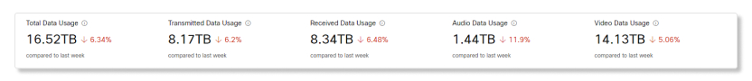
Total Cascaded Data Usage by Cluster and Cascaded Bandwidth Usage by Cluster Trend
These charts show the summary and trend of total bandwidth used across all on-premises clusters when cascades are established between on-premises and cloud clusters. The value appears in Mbps. This information helps you see if your organization should add more on-premises clusters to a specific location if cascaded data usage is always high there.
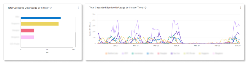
Total Cascaded Data Usage by Data Transmission and Cascaded Bandwidth Usage by Data Transmission Trend
These charts show a summary and trend of total bandwidth usage across all on-premises clusters, broken down between transmitted and received data, when cascades are established between on-premises and cloud clusters.
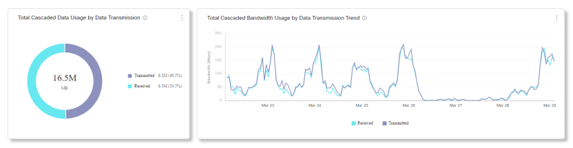
Total Cascaded Data Usage by Stream and Cascaded Bandwidth Usage by Stream Trend
These charts show a summary and trend of total bandwidth usage across all on-premises clusters, broken down between audio, video, and share data, when cascades are established between on-premises and cloud clusters.
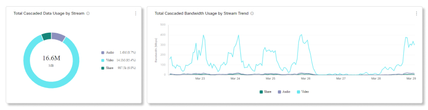
Reports now have its own section under Monitoring in the left navigation of Control Hub, along with a separate article for it.
You can see Jabber Analytics data in Control Hub if your organization has:
-
On-premises Jabber with full Unified Communications.
-
On-premises Jabber with Instant Messaging-only.
-
On-premises Jabber with Phone-only.
-
Jabber with Webex Messenger.
You must complete the configurations below so Jabber data is sent to Control Hub. Once completed, you will start seeing Jabber metrics in Control Hub within two days. The date for Jabber data in Control Hub starts once these configurations are complete. Jabber data doesn’t backfill.
If your organization has set up more than one jabber-config.xml file, then you must complete the configurations below for all the jabber-config.xml files that you want Control Hub to report data from. See the Security and Monitoring chapter in the Feature Configuration for Cisco Jabber 12.8.
-
TelemetryEnabledto true. -
TelemetryEnabledOverCellularDatato true. -
TelemetryCustomerIDwith the organization ID that you can find in Control Hub.
Key Performance Indicators (KPIs)
There are four KPIs that show at the top of the Jabber Analytics page. They don't change as you navigate through the different tabs, but the range of data they measure changes as you select a new date range.
The four KPIs are:
-
Active Users—Total number of unique active users per device over the selected time period. For example, if a user is active on their desktop computer and mobile device, then they'll be counted as two active users.
-
Total Messages Sent—Total number of messages sent from the Jabber client over the selected time period.
-
Total Calls—Total number of calls made and received over the selected time period.
-
Screen Sharing—Total number of times a screen was shared over the selected time period. This includes sharing through RDP and BFCP.
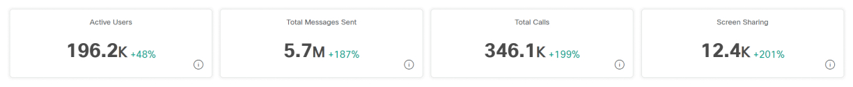
Total Active Users
You can use this report to see a trend of active unique users per device on Jabber. This graph provides a summary of how many unique users have signed in to Jabber over a time period.
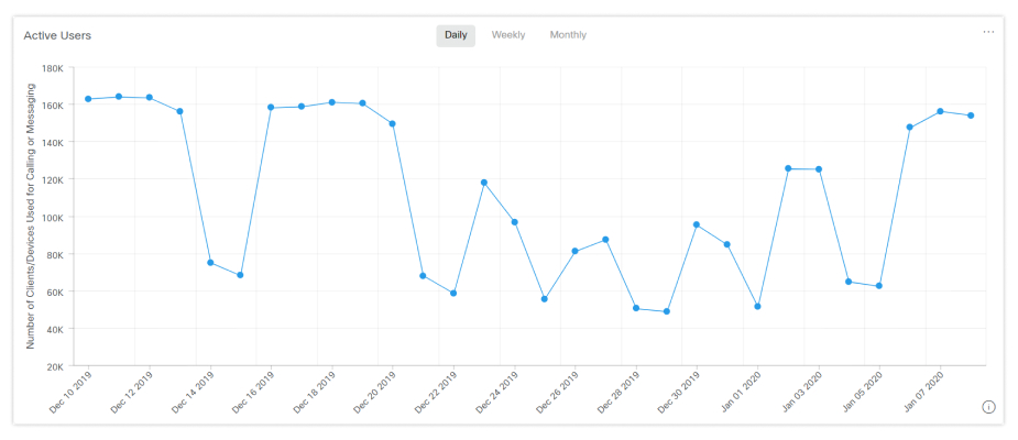
Total Messages Sent
You can use this report to see the total number of messages sent, broken down by a daily, weekly, or monthly view.
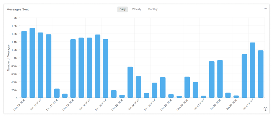
Chats
The Chats report shows the ratio of different chat methods used.
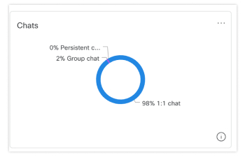
Client Version
The Client Version report shows the ratio of different Jabber versions used.
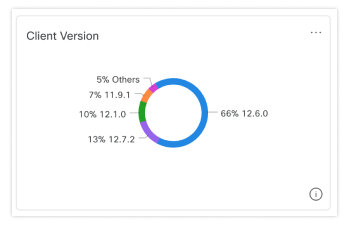
Operating System
The Operating System report shows the ratio of different operating systems used.
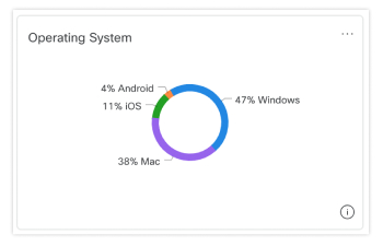
Remote Access
The Remote Access report shows the ratio of how many users signed into Jabber either inside or outside your organization's network.
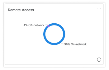
Total Call Minutes
You can use this report to see a trend of how many audio and video minutes were used for calls. This graph provides a summary of how many minutes were used in total over a time period.
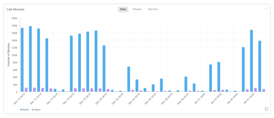
Number of Active Users that Made a Call
You can use this report to see the number of how many calls were made by active users per device, broken down by a daily, monthly, or weekly view.
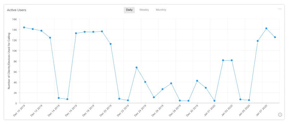
Video Call Screen Resolution
The Video Call Screen Resolution report shows the ratio of video calls by screen resolution.
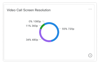
Calling
The Calling report shows the ratio of audio calls and video calls.
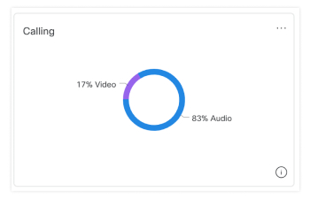
For information about Cisco Webex Cloud-Connected UC (CCUC) Analytics, refer to Analytics for Your Cisco Webex Cloud-Connected UC.


